Once we know what indicators are, their role in the management process, and the types of indicators that exist, we ask ourselves:
Which indicators should we use?
How many indicators should we have?
What is an appropriate set of indicators?
How do we document and share them?
Although there are some indicators that could be generally applied to any company, each company has its own strategy, its own priorities, and its particular competitive environment
Therefore, the most appropriate set of indicators depends on each organization.
Here we describe models for finding the appropriate number and set of indicators.
Models for defining indicators
The models for defining indicators depend on the type of strategic planning.
Three strategic planning frameworks are:
Management by Objectives (MBO; Peter Drucker, 1954).
It’s a model that helps organizations translate strategy into operational (measurable) objectives, resulting in actions, behaviors, and performance.
The BSC includes all critical success factors in a measurement system, giving organizations a better chance of achieving their goals.
BSC’s objectives
Translate the strategy into measurable objectives.
Align the strategy components: objectives, indicators, and initiatives.
Communicate the strategy to the organization.
Create the basis for strategic management.
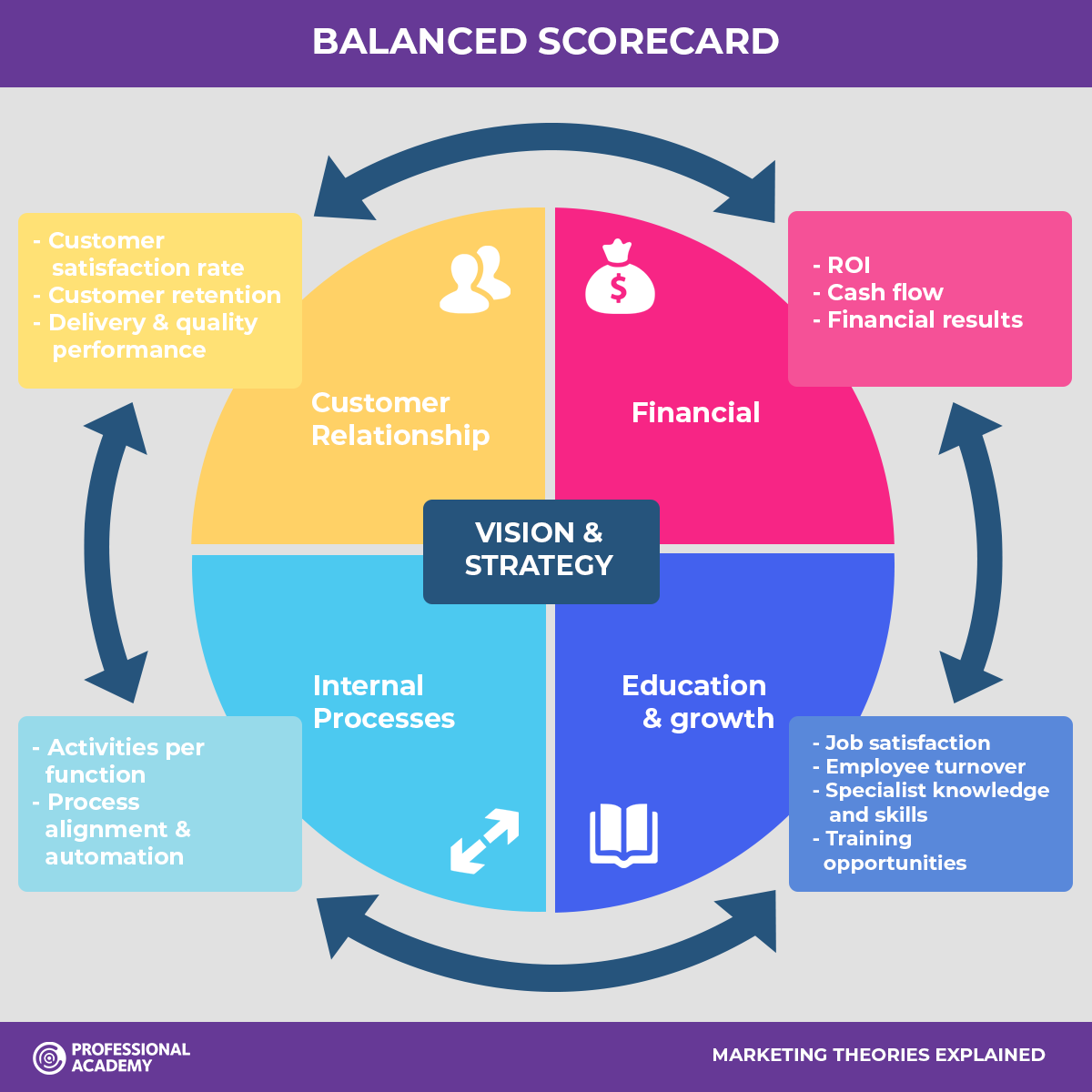
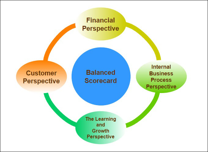
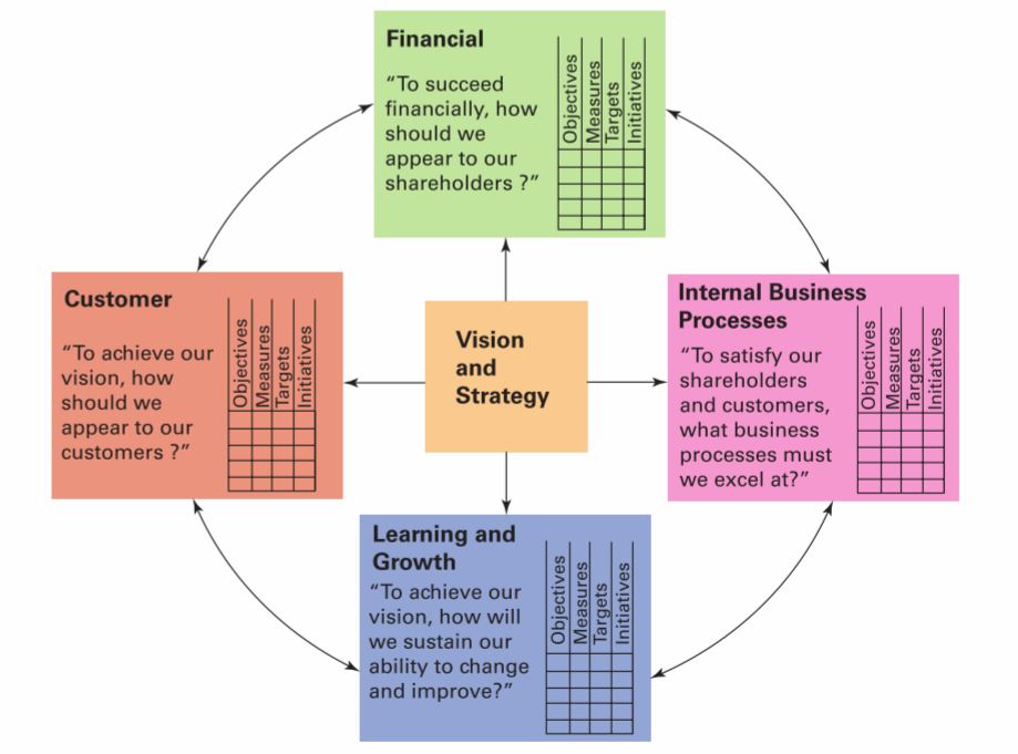
BSC transforms strategy into an integrated system defined through four perspectives:
Financial
Clients
Internal Processes
Learning and Growth
The four perspectives
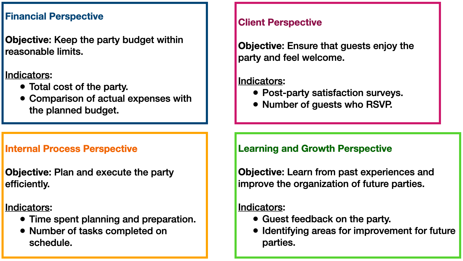
Financial. Includes objectives related to profitability, productivity, profits, stock price, etc.; these are the objectives that the organization must achieve from the shareholders’ perspective.
Customers. Includes objectives related to the company’s value proposition, are market-oriented, and are established from the customer’s perspective. Includes customer perception objectives regarding service, delivery time, quality, and value/price.
Internal Processes. Includes objectives related to the performance of processes that are critical to meeting customer perspective objectives. Performance objectives for the business’s primary value chain.
Learning and growth. These are the objectives related to the enablers for achieving the objectives of the other perspectives. These are objectives related to competency development, the work environment, the physical environment, technological infrastructure, etc.
Planning your birthday party
Model components
For each perspective, the following should be defined:
A small set of strategic objectives
For each objective, one (or more if necessary) metric as a performance indicator
For each indicator, establish long- and short-term goals
Initiatives (programs, projects, actions) to close the gaps between current and desired performance according to the goals.
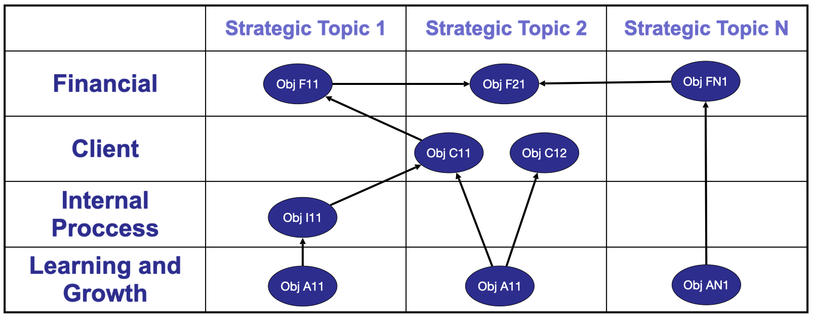
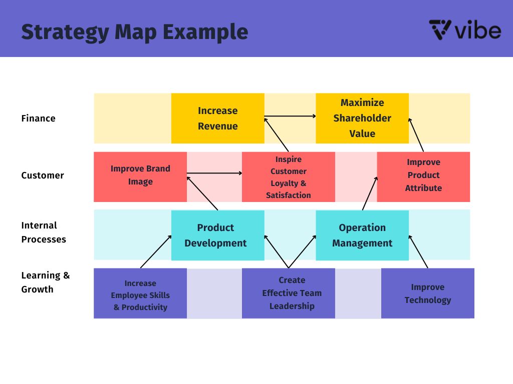
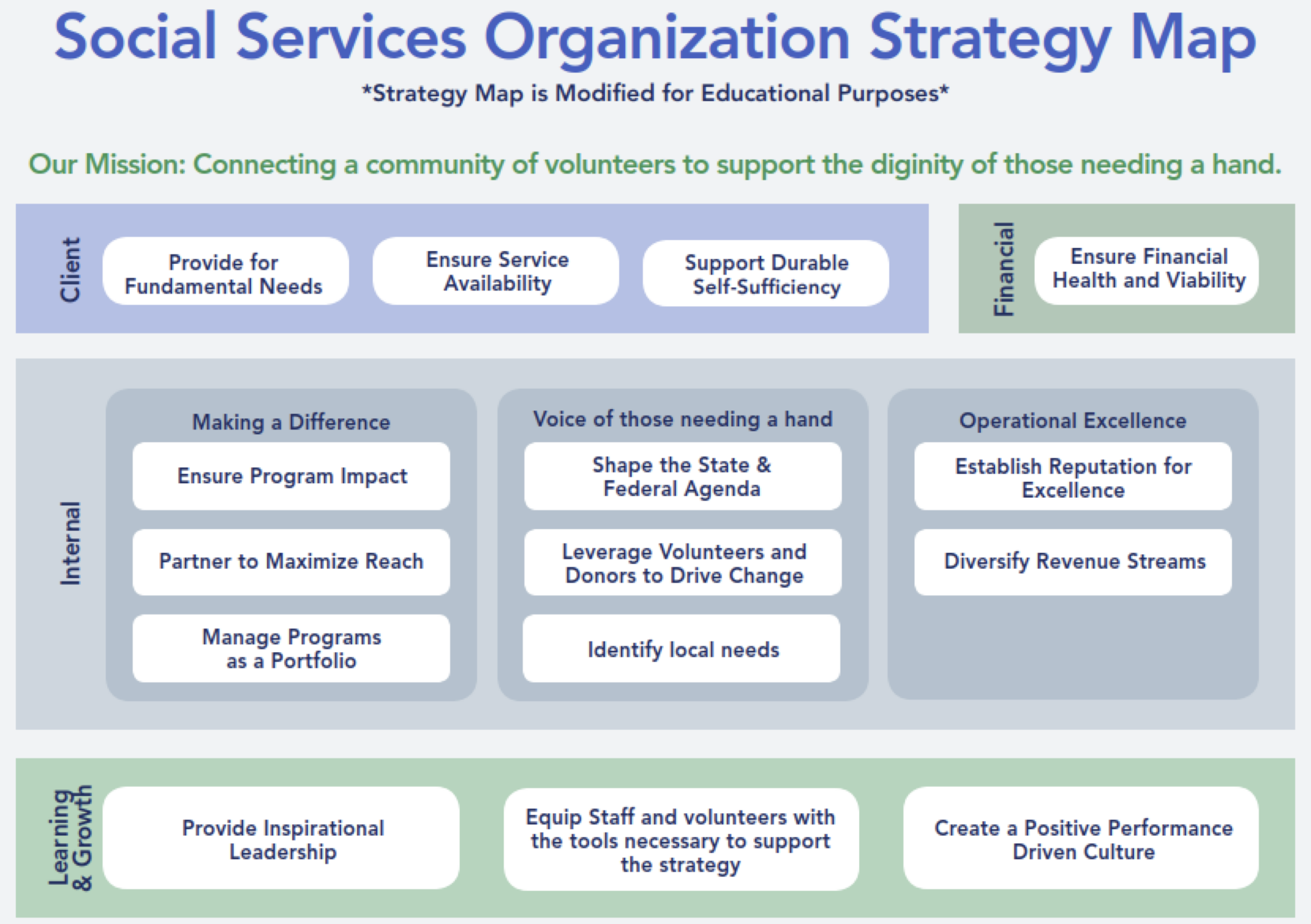
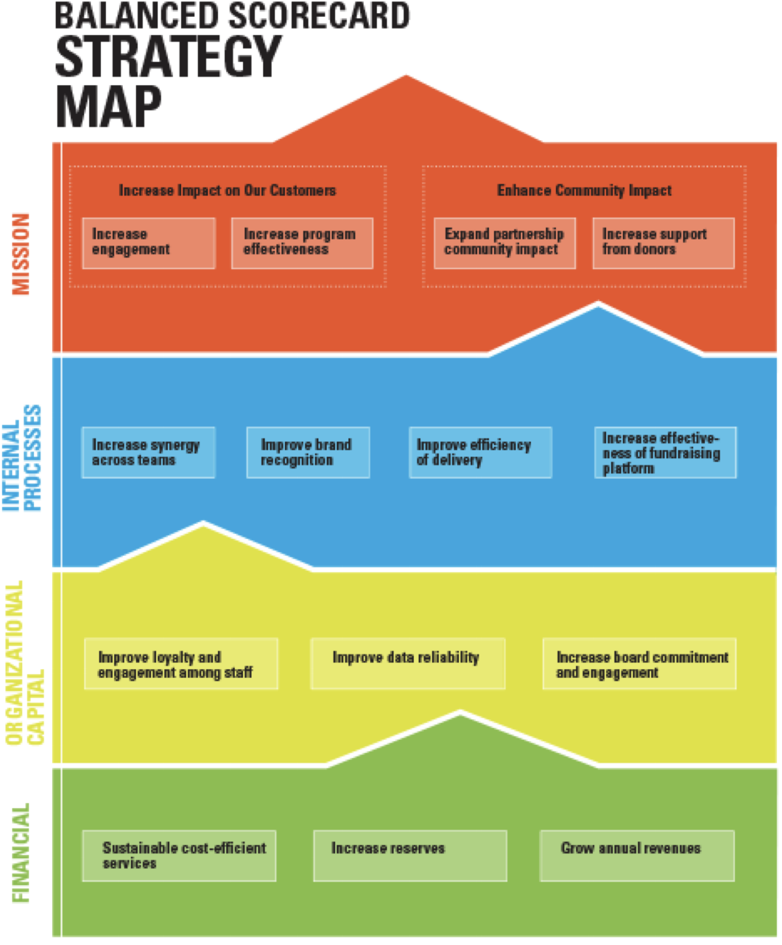
Strategy map
The strategy map displays the strategic objectives within each perspective using a matrix.
Possible causal relationships between objectives are also shown using arrows.
If the organization’s strategic charter (Vision and Mission) is reviewed, Strategic Themes can be included to show whether the organization is explicitly addressing these themes in its planning.
Strategy map structure
Examples
More on strategy maps
Activity 1.2 (cooperative mode)
Form teams of three.
Build a strategy map as part of the Balanced Scorecard model application.
Read the introduction to the Muebles Finos MF mini-case study in CANVAS.
The activity consists of mapping the company’s objectives to the perspectives of the BSC model and to the business’s strategic lines.
Once you have placed the objectives on the map, link them to each other, establishing cause-and-effect relationships between them.
Finally, you will write the justification for the established causal relationships.
Final comments
Once the company-level Balanced Scorecard (BSC) is defined, each functional area develops its own BSC aligned with the overall strategy.
At the departmental level, leading indicators are more common than lagging indicators, since managers need timely signals to act.
Not all strategic themes or BSC perspectives must appear in every functional area; relevance depends on the area’s role in achieving company outcomes.
Functional managers must clearly understand how their indicators contribute to organization-level outcomes.
The person responsible for BSC deployment must ensure alignment and coherence across functional BSCs, avoiding conflicting signals.
Some organization-level lagging indicators are obtained by aggregating or consolidating departmental indicators.
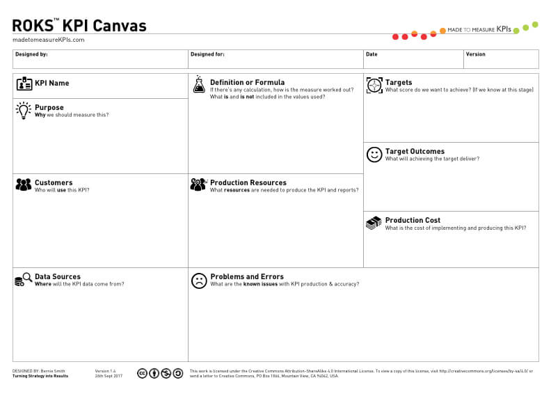
Indicator Documentation
Indicator documentation
When selecting and/or designing indicators, it is necessary to formally document the definition of each indicator.
Documentation is very useful because:
It helps clarify the meaning of the indicators.
It facilitates communication between users and indicator creators.
It serves as a future reference when revising the system.
Basic documenting format
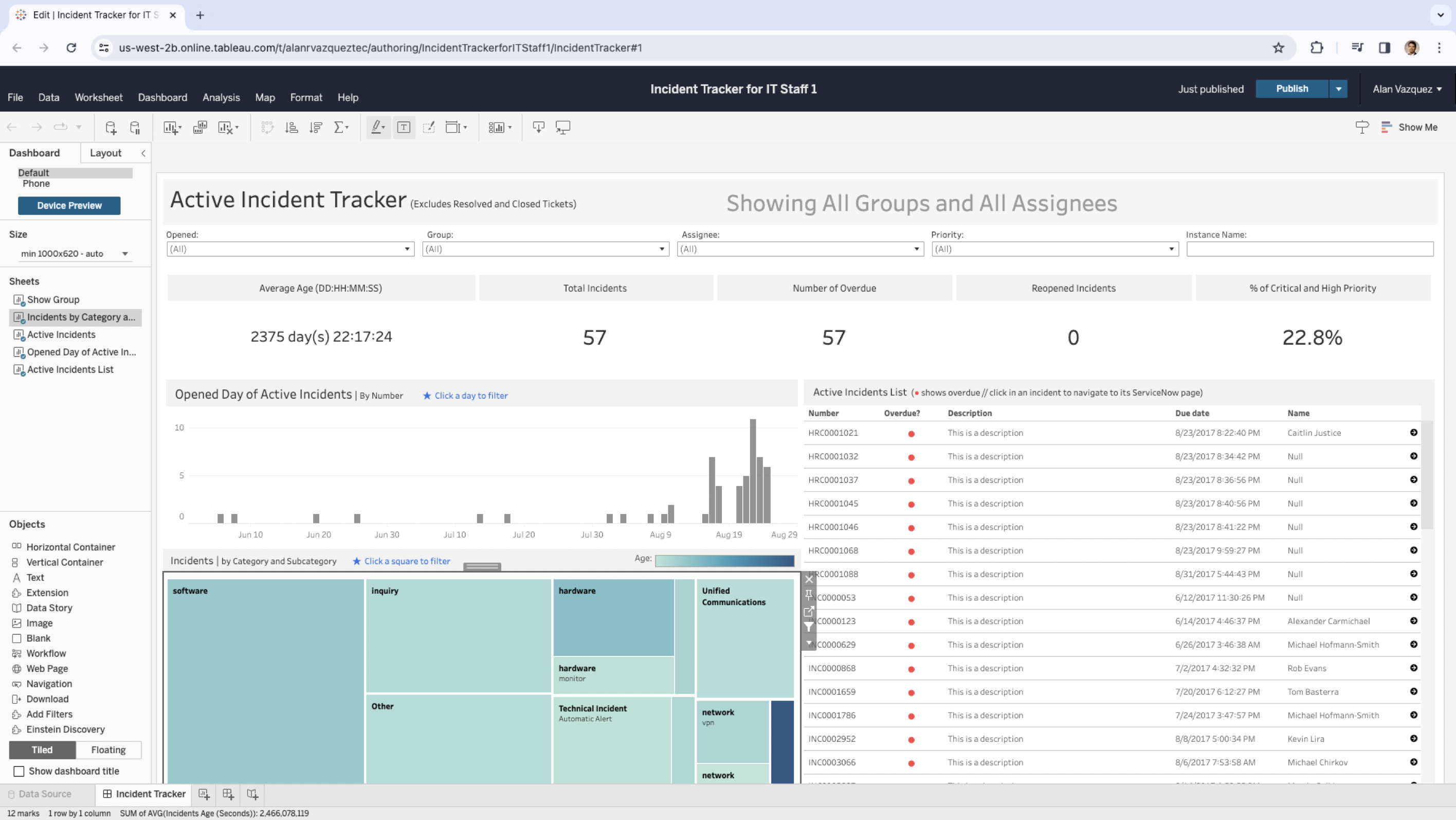
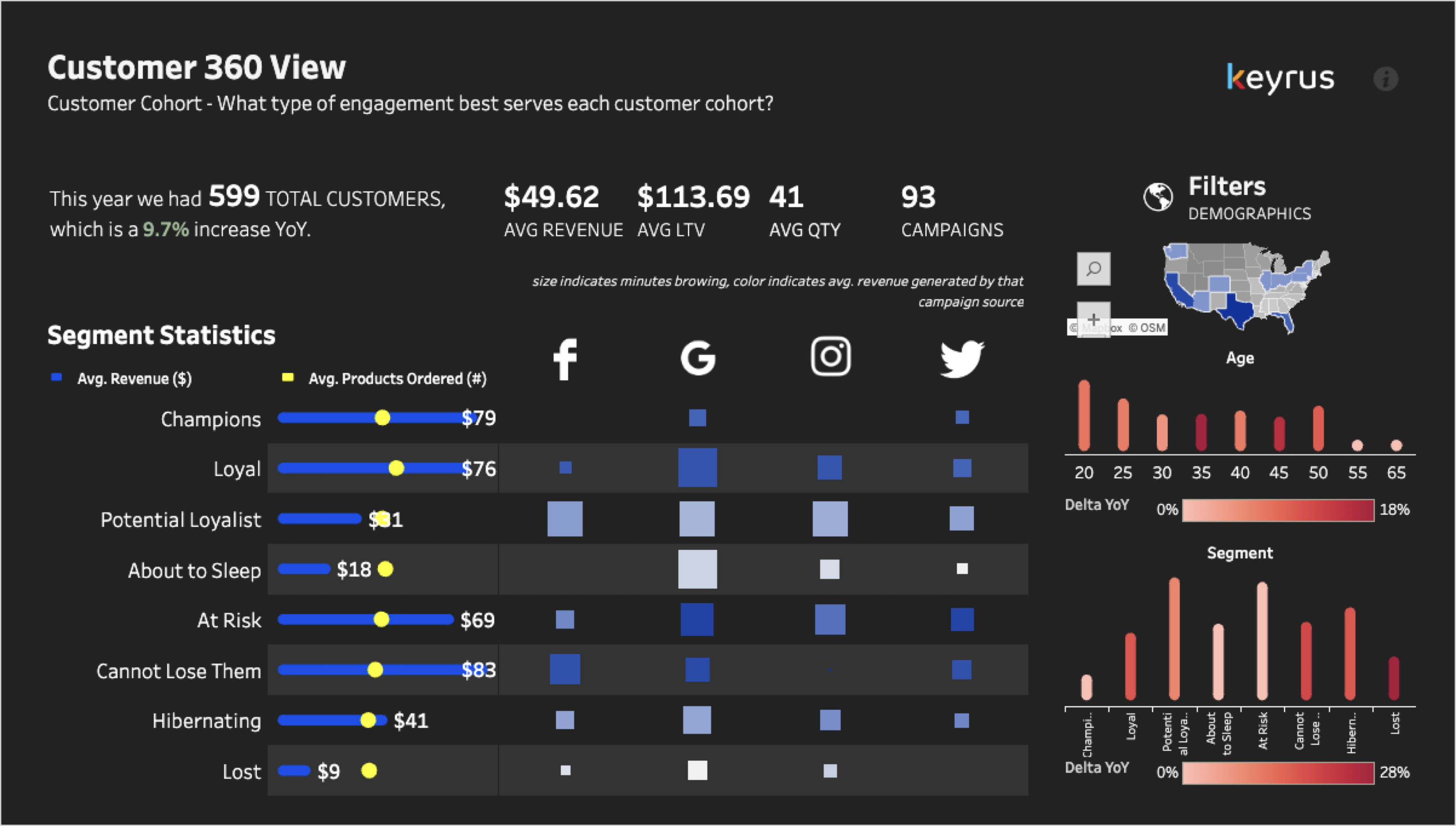
Dashboards for Visualizing Indicators
Indicator visualization
Once the indicators are defined using the Balanced Scorecard (BSC) and the documentation format, we design dashboards with:
Screens.
Chart and table styles.
Aggregation levels.
Default reports.
Drill-down requirements.
This applies to both the overall organizational level and the functional BSCs.
Dashboard deployment
Various strategies can be followed to implement the dashboards, for example:
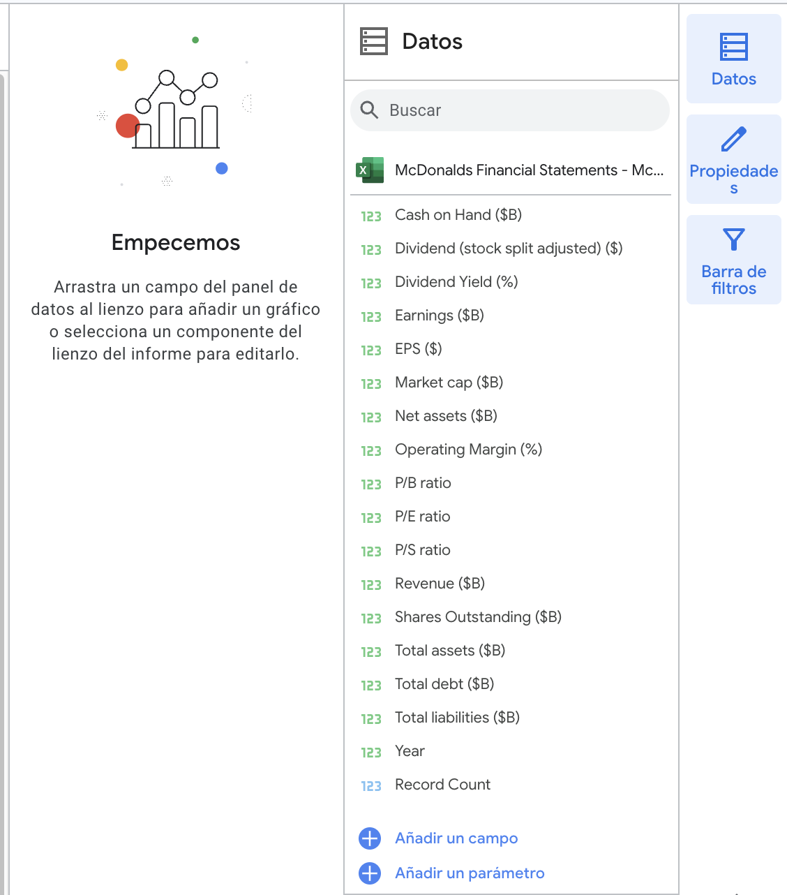
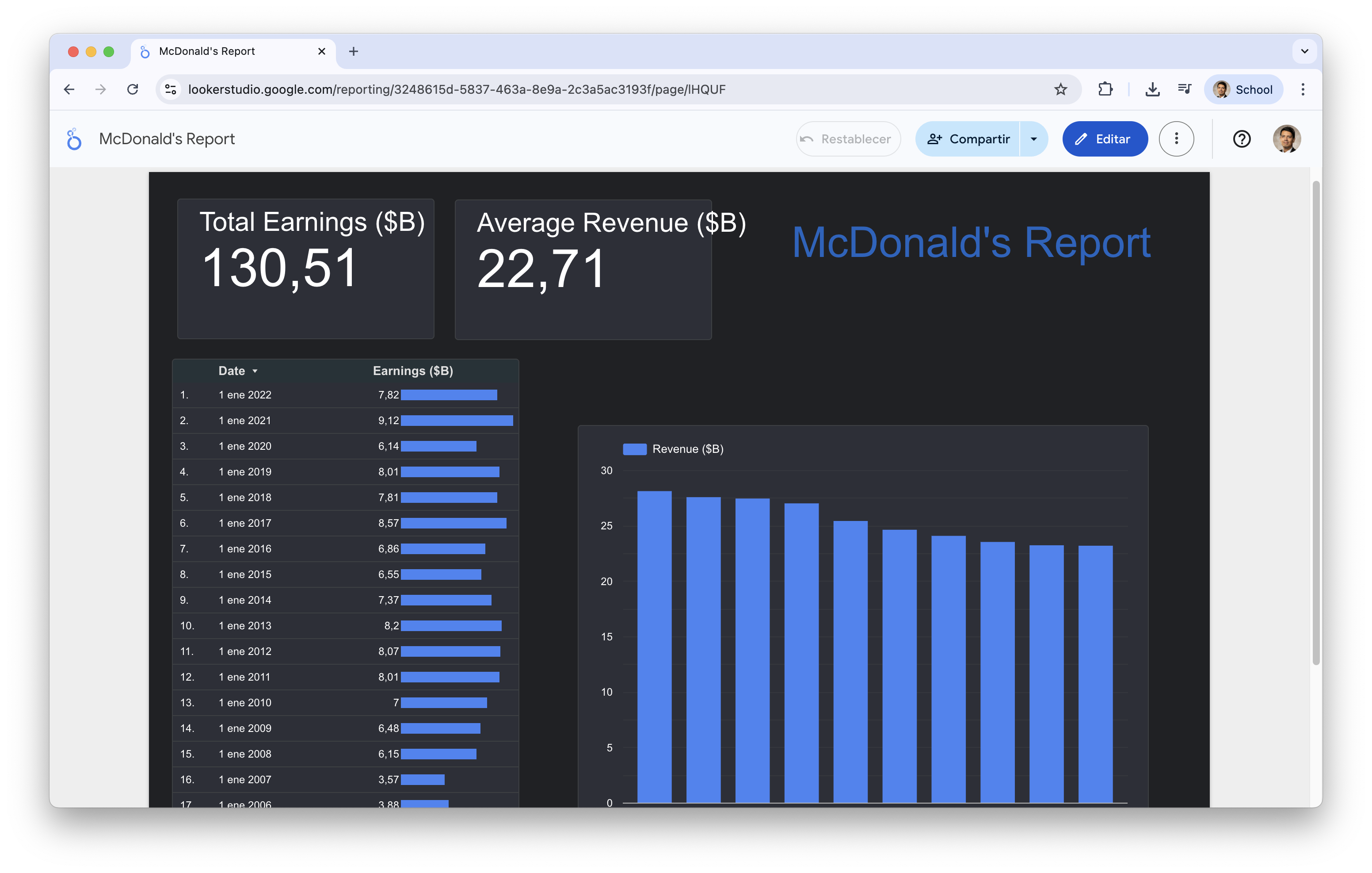
The dataset “McDonalds Financial Statements.xlsx” includes McDonald’s annual financial data over two decades, offering insights into its economic performance. The dataset contains records of the following indicators:
Market cap ($B)
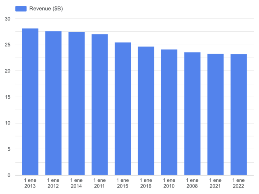
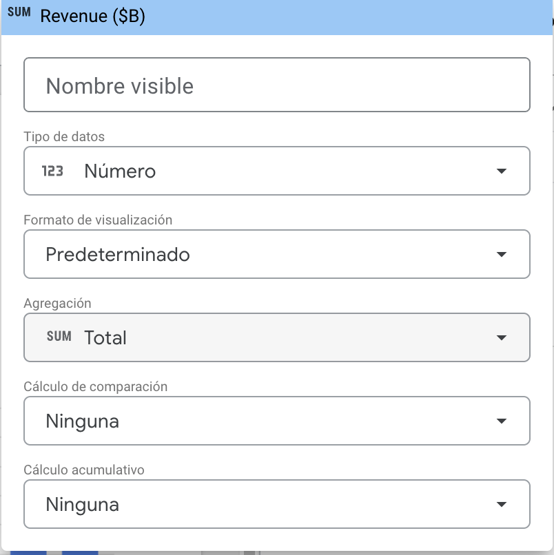
Revenue ($B)
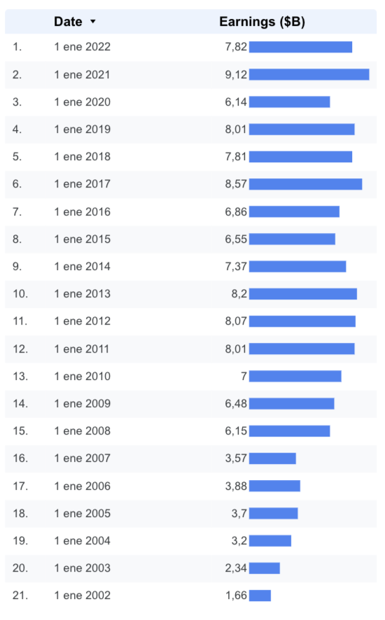
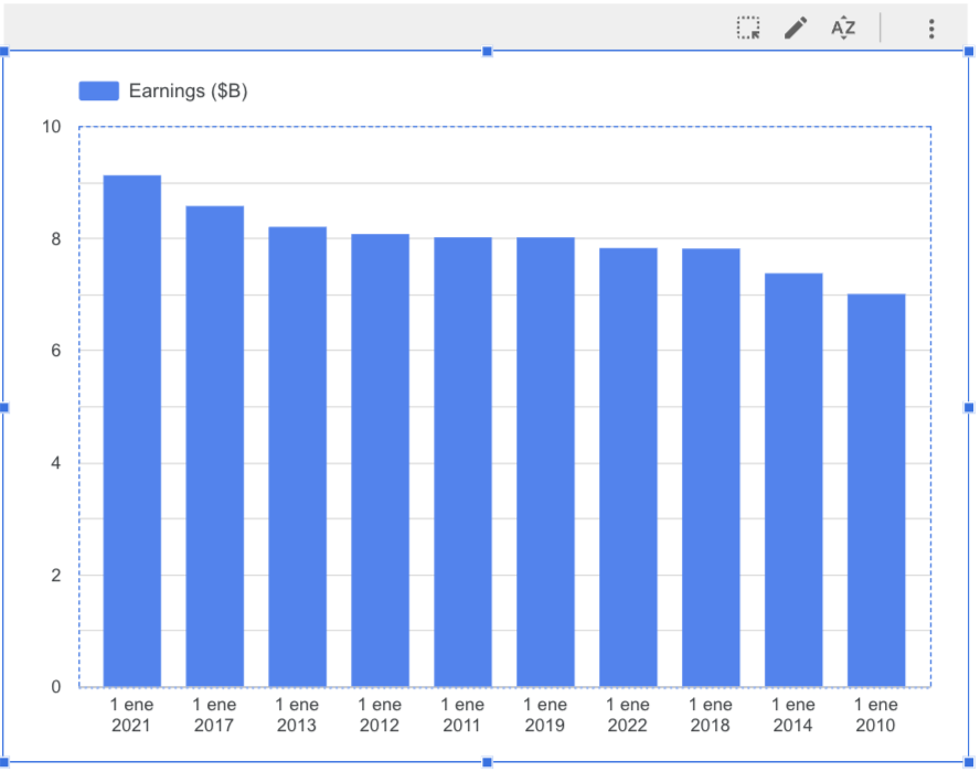
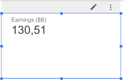
Earnings ($B)
P/E ratio
P/S ratio
P/B ratio
Operating Margin
EPS ($)
Shares Outstanding
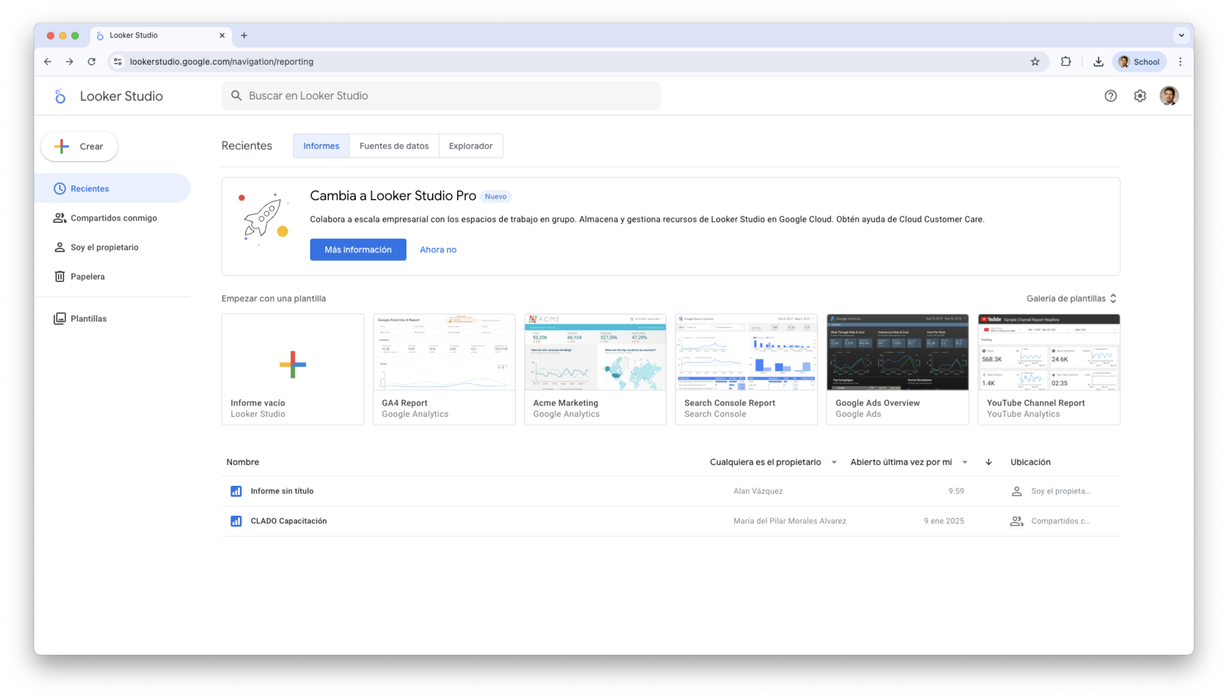
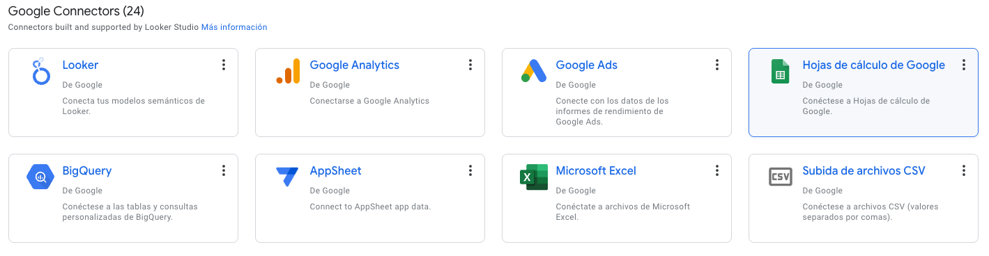
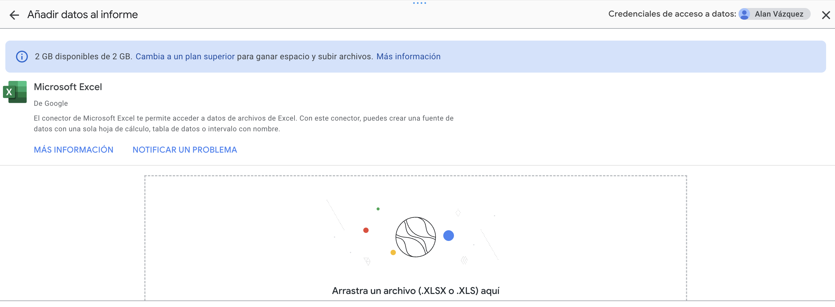
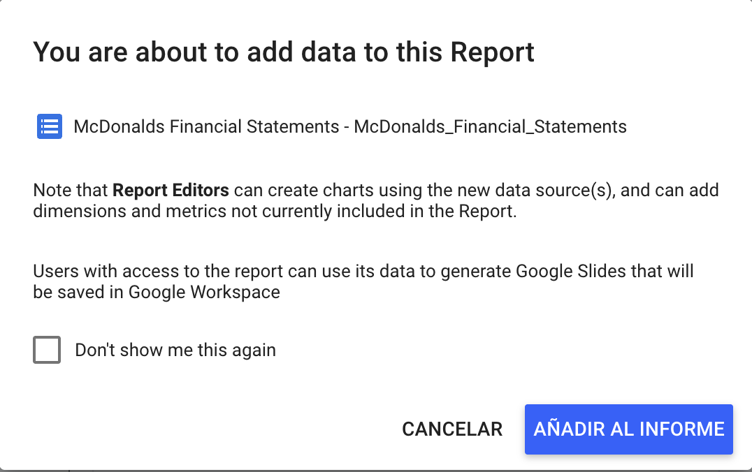
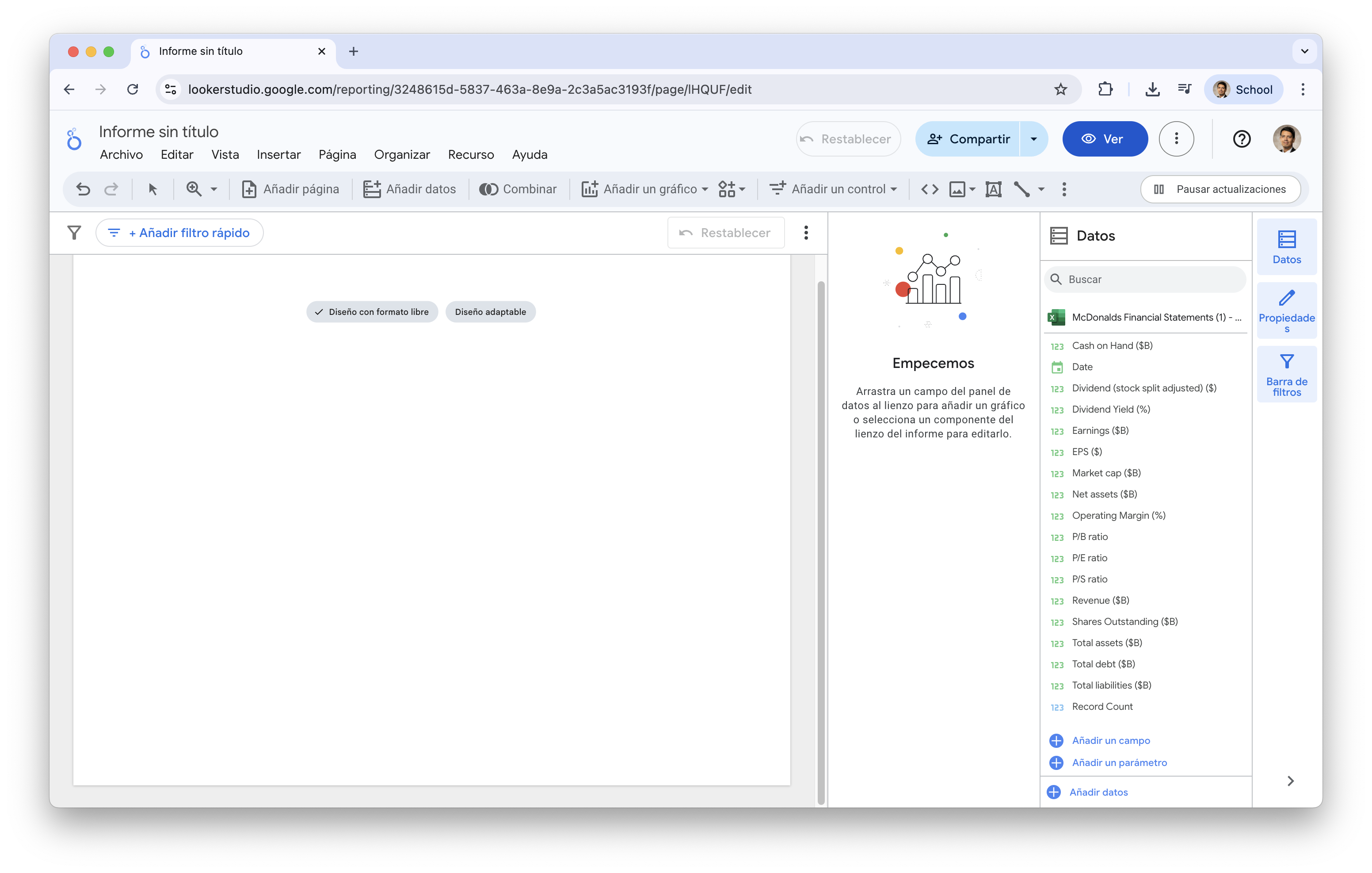
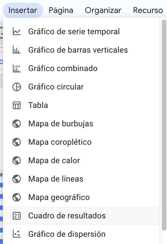
Let’s load the data into looker studio
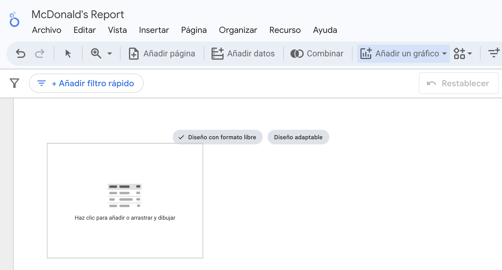
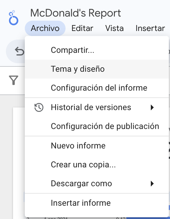
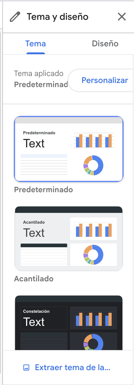
We rename the report.
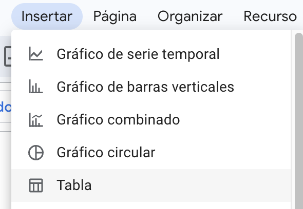
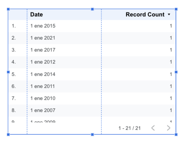
Let’s insert our first table
We can place the table anywhere in the dashboard canvas.
The default table
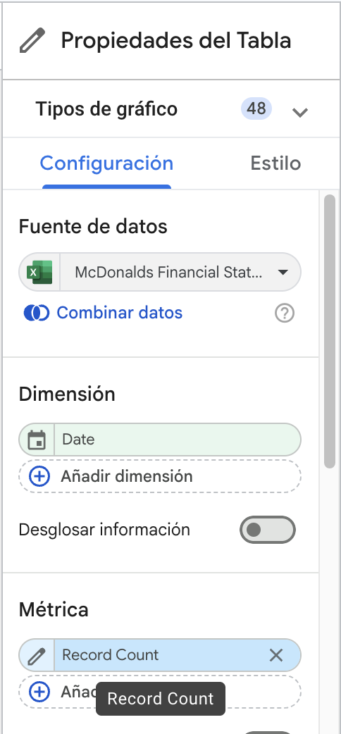
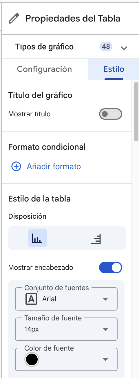
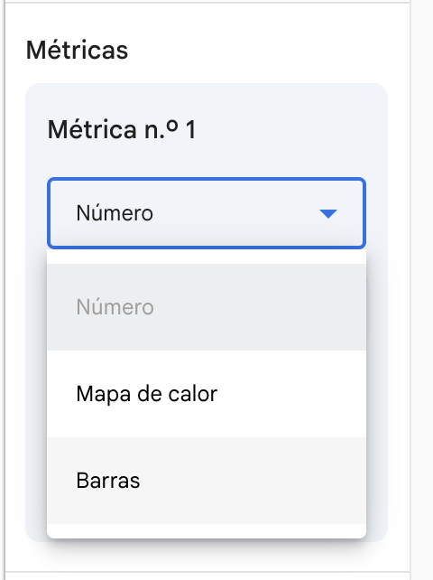
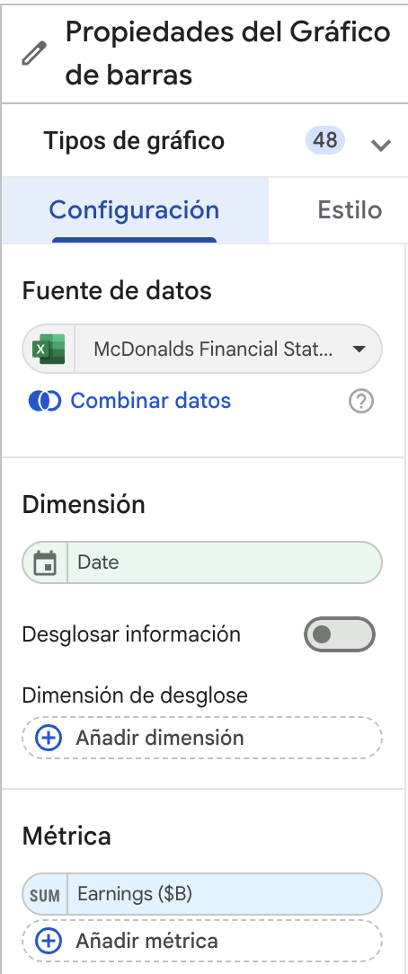
We change the graphic type by going to its properties.
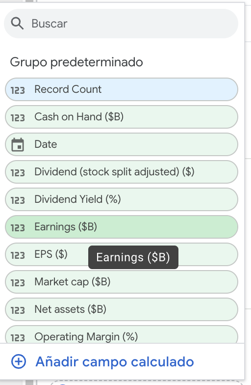
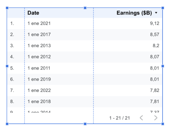
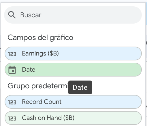
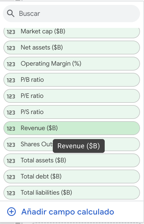
Select another variable
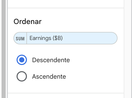
We can sort the table according to date
Improving the table
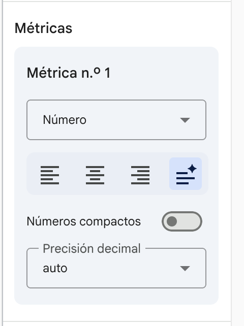
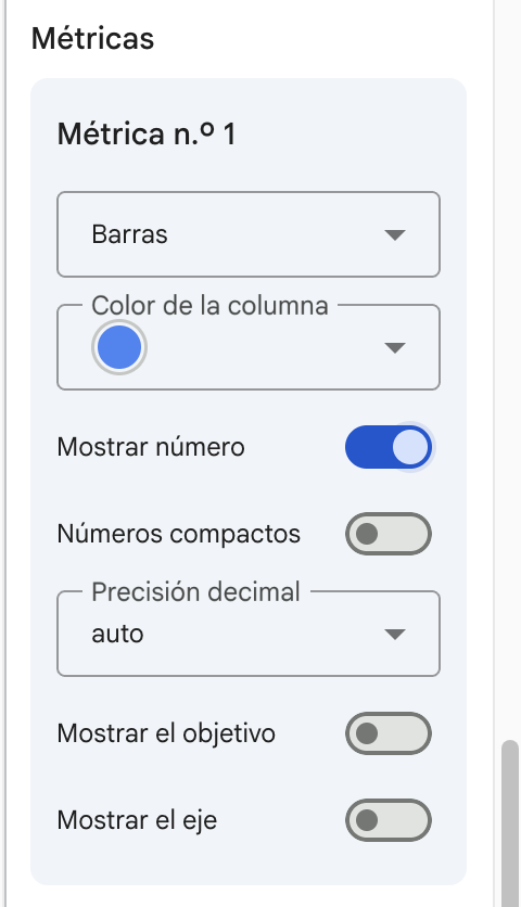
We can change the layout of the table by changing the metrics in the style of the table
Change it to bars.
Show the number too.
The result
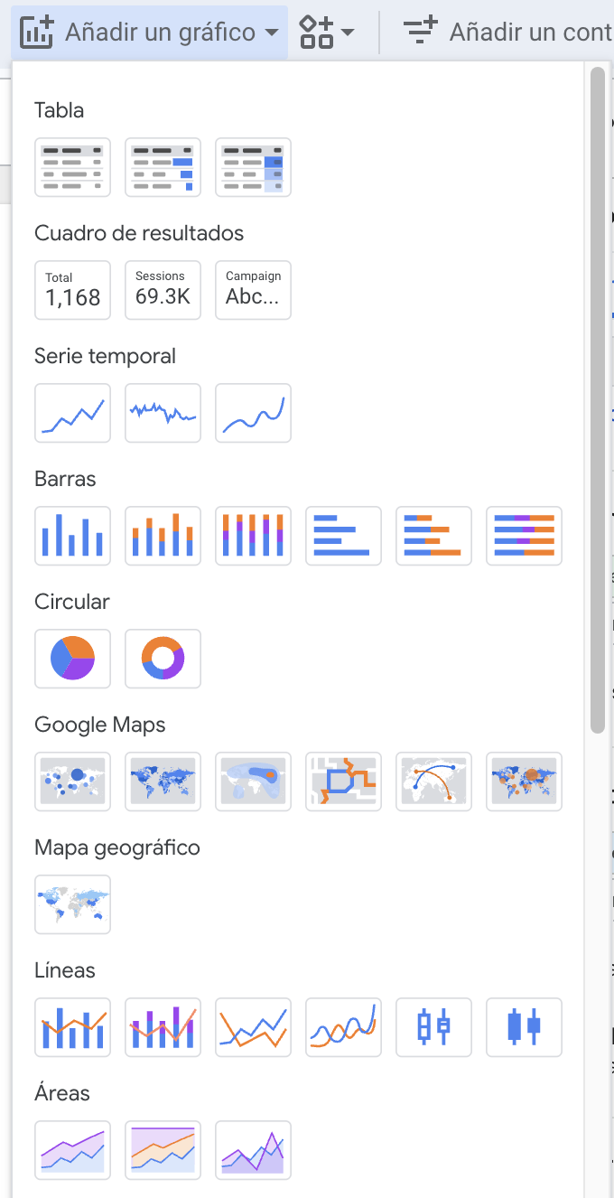
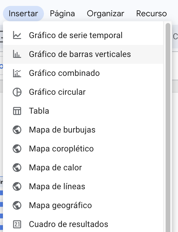
Let’s create a bar chart
Let’s change the variable or metric
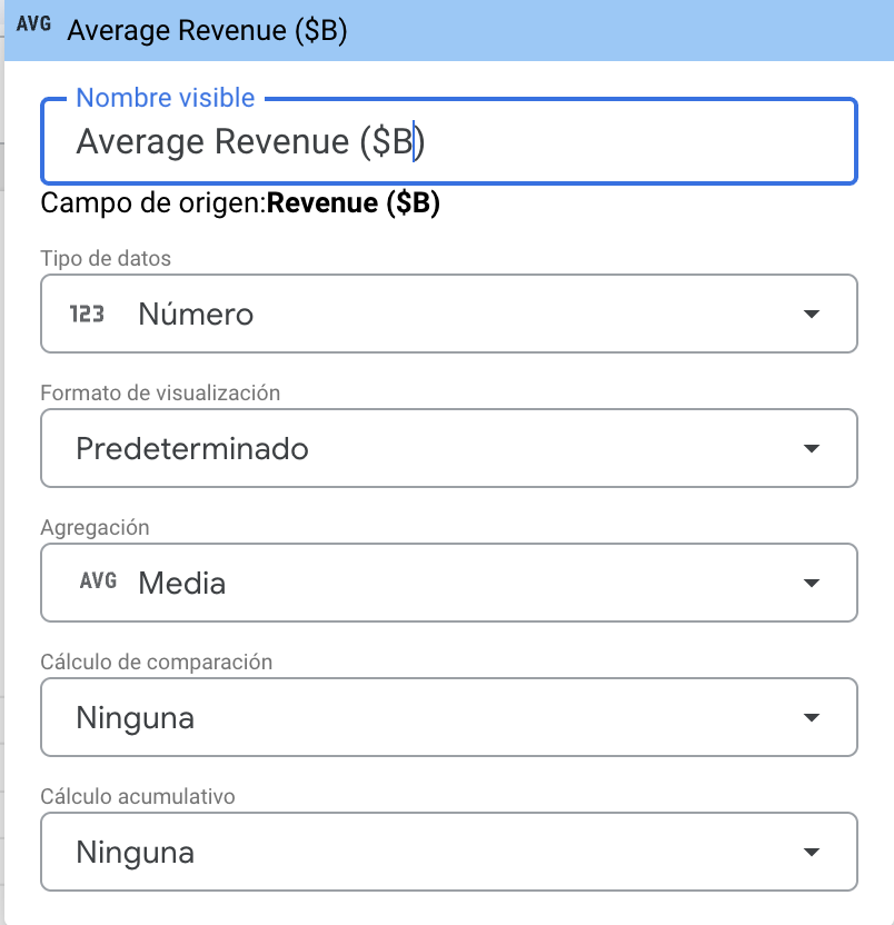
We can also add a box
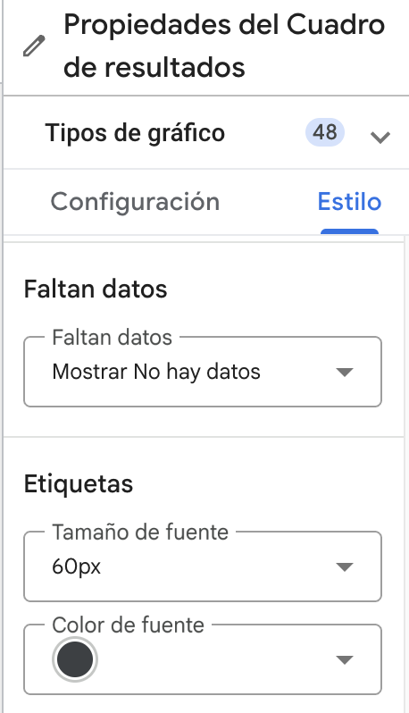
We can edit the properties or layout of the number.
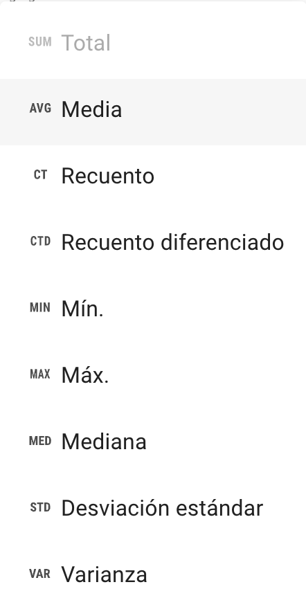
Select the mean
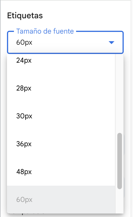
We can increase the font size
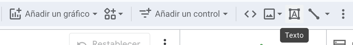
Add a text or a header to the report
Change the style
The report
Tutorials on looker studio
Tips for effective dashboards
Keep it simple — focus on the key indicators.
Use color to draw attention, not decorate.
Provide context: compare current value vs. target.