Linear regression models do not incorporate the dependence between consecutive values in a time series.
This is unfortunate because responses recorded over close time periods tend to be correlated. This correlation is called the autocorrelation of the time series.
Autocorrelation helps us develop a model that can make better predictions of future responses.
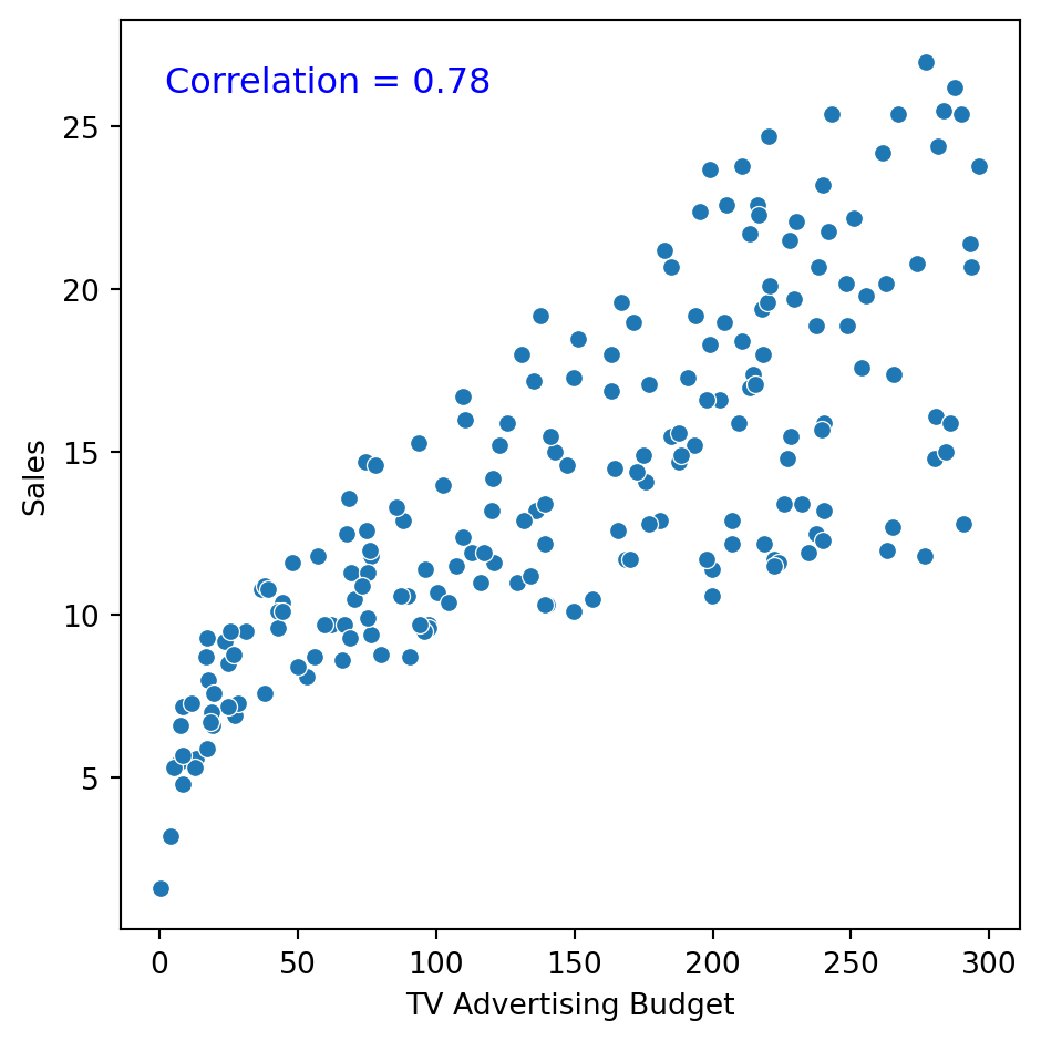
What is correlation?
It is a measure of the strength and direction of the linear relationship between two numerical variables.
Specifically, it is used to assess the relationship between two sets of observations.
Correlation is between \(-1\) and 1.
How do we measure autocorrelation?
There are two formal tools for measuring the correlation between observations in a time series:
The autocorrelation function.
The partial autocorrelation function.
The autocorrelation function
Measures the correlation between responses separated by \(j\) periods.
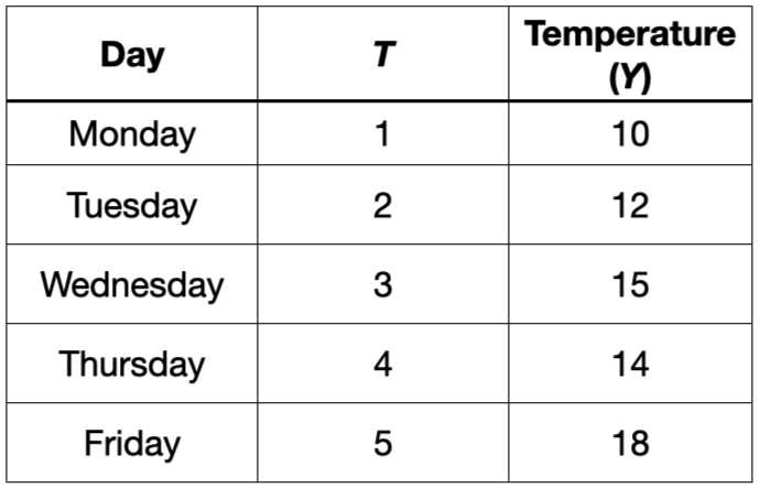
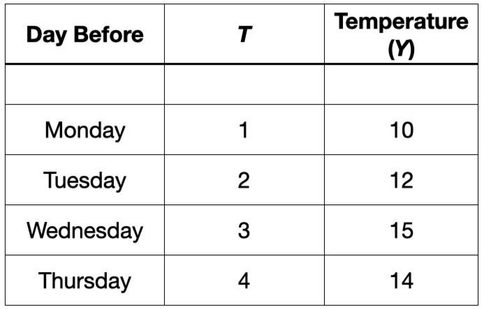
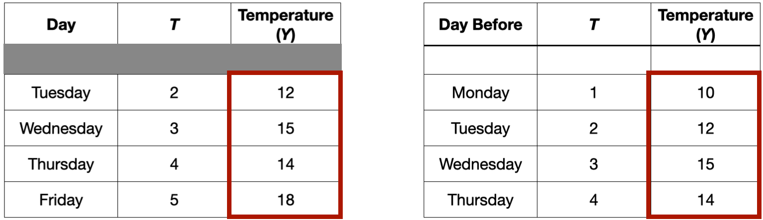
For example, consider the autocorrelation between the current temperature and the temperature recorded the day before.
The autocorrelation function
Measures the correlation between responses separated by \(j\) periods.
For example, consider the autocorrelation between the current temperature and the temperature recorded the day before.
The autocorrelation function
Measures the correlation between responses separated by \(j\) periods.
For example, consider the autocorrelation between the current temperature and the temperature recorded the day before. This would be the correlation between these two columns
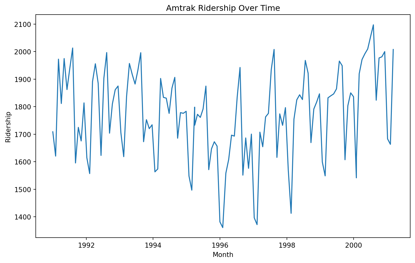
Example 1
Let’s consider again the dataset in the file “Amtrak.xlsx.” The file contains records of Amtrak passenger numbers from January 1991 to March 2004.
Month
t
Ridership (in 000s)
Season
0
1991-01-01
1
1708.917
Jan
1
1991-02-01
2
1620.586
Feb
2
1991-03-04
3
1972.715
Mar
3
1991-04-04
4
1811.665
Apr
4
1991-05-05
5
1974.964
May
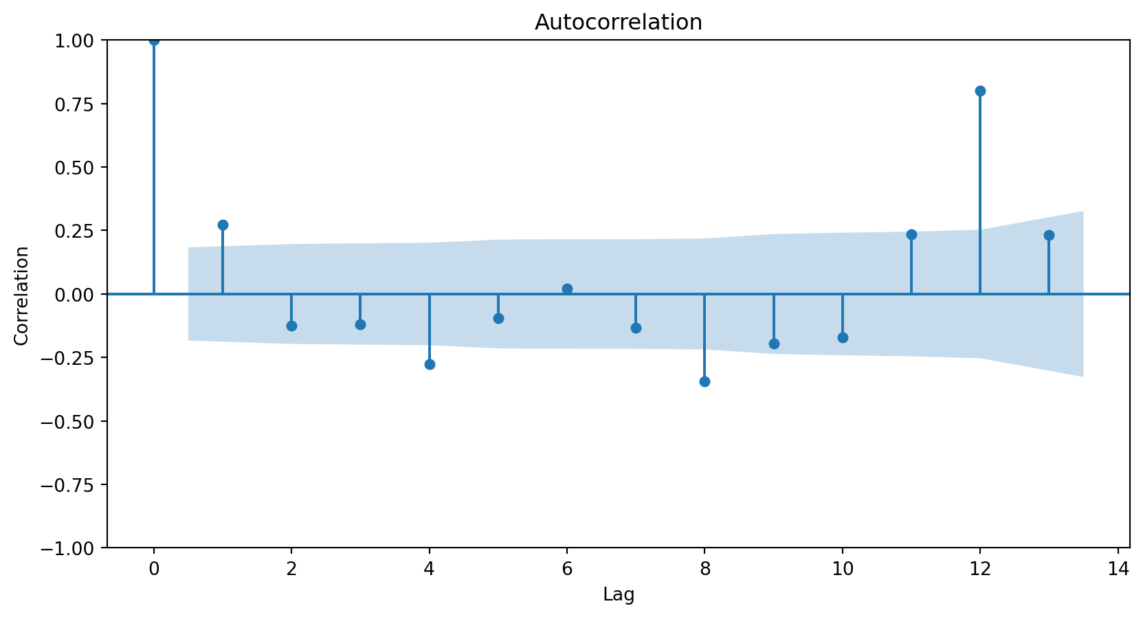
Autocorrelation function
The autocorrelation function measures the correlation between responses that are separated by a specific number of periods.
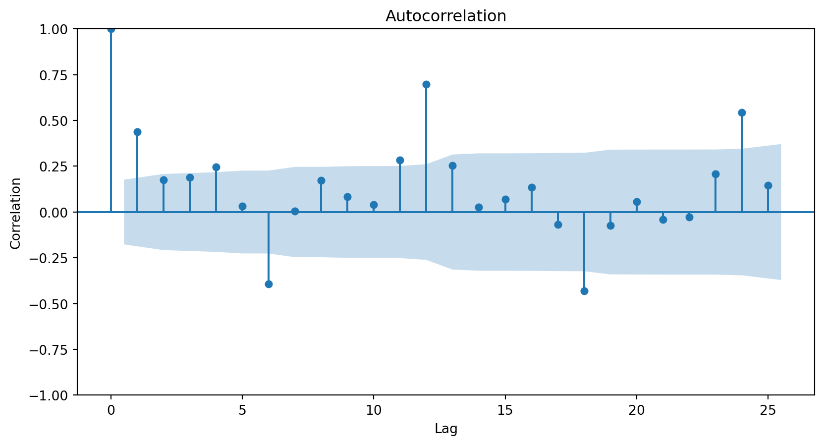
The autocorrelation function is commonly visualized using a bar chart.
The horizontal axis shows the differences (or lags) between the periods considered, and the vertical axis shows the correlations between observations at different lags.
Autocorrelation plot
In Python, we use the plot_acf function from the statsmodels library.
plt.figure(figsize=(10, 6))plot_acf(Amtrak_data['Ridership (in 000s)'], lags =25)plt.xlabel("Lag")plt.ylabel("Correlation")plt.show()
The lags parameter controls the number of periods for which to compute the autocorrelation function.
The resulting plot
<Figure size 960x576 with 0 Axes>
The autocorrelation plot shows that the responses and those from zero periods ago have a correlation of 1.
The autocorrelation plot shows that the responses and those from one period ago have a correlation of around 0.45.
The autocorrelation plot shows that the responses and those from 24 periods ago have a correlation of around 0.5.
<Figure size 384x384 with 0 Axes>
Autocorrelation patterns
A strong autocorrelation (positive or negative) with a lag\(j\)greater than 1 and its multiples (\(2k, 3k, \ldots\)) typically reflects a cyclical pattern or seasonality.
Positive lag-1 autocorrelation describes a series in which consecutive values generally move in the same direction.
Negative lag-1 autocorrelation reflects oscillations in the series, where high values (generally) are immediately followed by low values and vice versa.
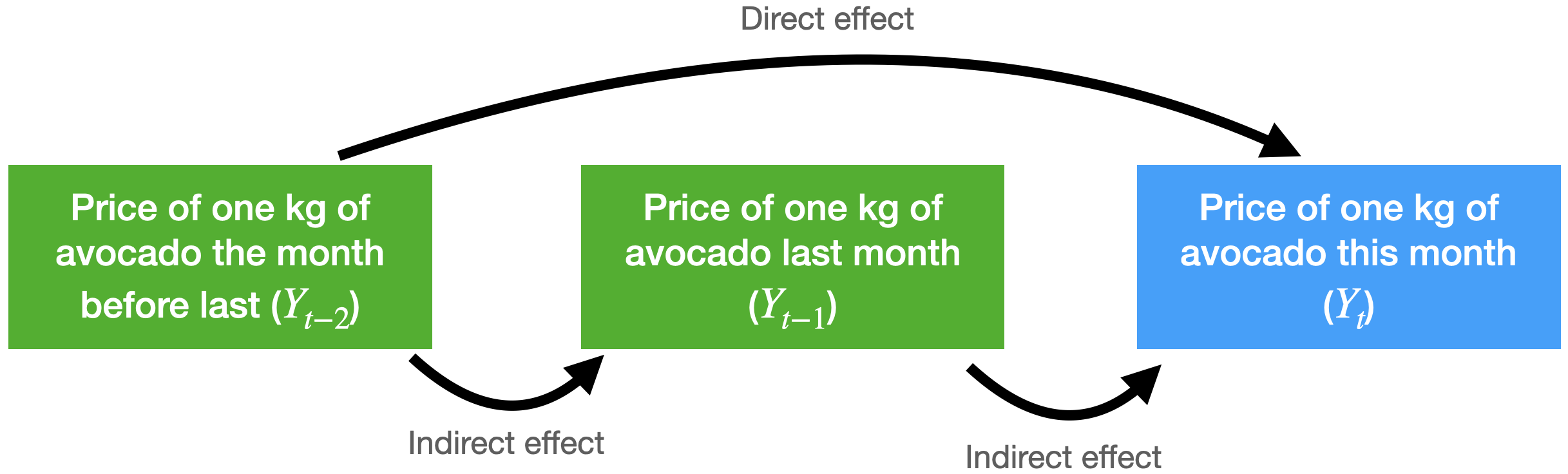
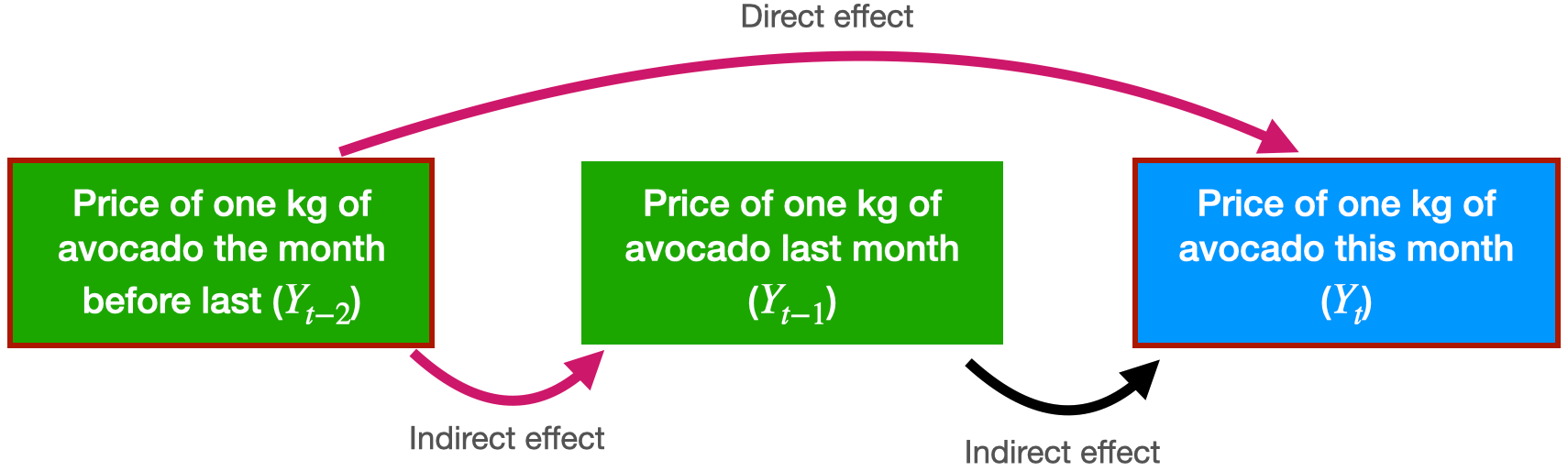
More about the autocorrelation function
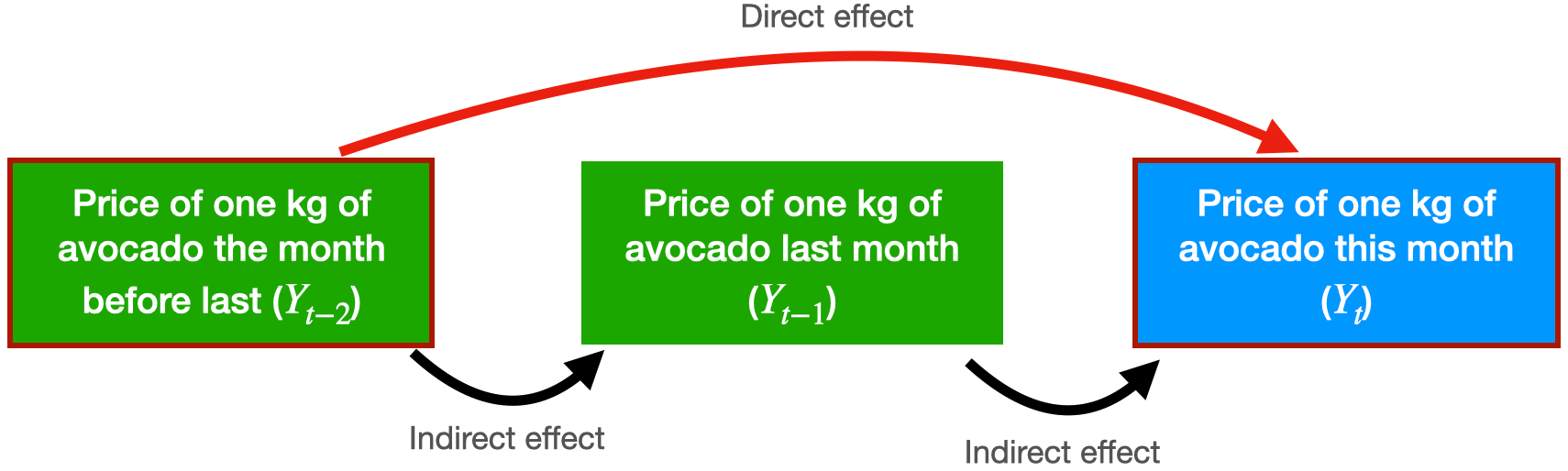
Consider the problem of predicting the average price of a kilo of avocado this month.
For this, we have the average price from last month and the month before that.
The autocorrelation function for \(Y_t\) and \(Y_{t-2}\) includes the direct and indirect effect of \(Y_{t-2}\) on \(Y_t\).
Partial autocorrelation function
Measures the correlation between responses that are separated by \(j\) periods, excluding correlation due to responses separated by intervening periods.
In technical terms, the partial autocorrelation function fits the following linear regression model
\(\hat{Y}_{t}\) is the predicted response at the current time (\(t\)).
\(\hat{\beta}_1\) is the direct effect of \(Y_{t-1}\) on predicting \(Y_{t}\).
\(\hat{\beta}_2\) is the direct effect of \(Y_{t-2}\) on predicting \(Y_{t}\).
The partial autocorrelation between \(Y_t\) and \(Y_{t-2}\) is equal to \(\hat{\beta}_2\).
The partial autocorrelation function is visualized using a graph similar to that for autocorrelation.
The vertical axis shows the differences (or lags) between the periods considered, and the horizontal axis shows the partial correlations between observations at different lags.
In Python, we use the plot_pacf function from statsmodels.
plt.figure(figsize=(10, 6))plot_pacf(Amtrak_data['Ridership (in 000s)'], lags =25)plt.xlabel("Lag")plt.ylabel("Correlation")plt.show()
The partial autocorrelation plot shows that the responses and those from one period ago have a correlation of around 0.45. This is the same for the autocorrelation plot.
The partial autocorrelation plot shows that the responses and those from two periods ago have a correlation near 0.
<Figure size 960x576 with 0 Axes>
The ARIMA Model
Autoregressive models
Autoregressive models are a type of linear regression model that directly incorporate the autocorrelation of the time series to predict the current response.
Their main characteristic is that the predictors of the current value of the series are its past values.
An autoregressive model of order 2 has the mathematical form: \(\hat{Y}_t = \hat{\beta}_0 + \hat{\beta}_1 Y_{t-1} + \hat{\beta}_2 Y_{t-2}.\)
A model of order 3 looks like this: \(\hat{Y}_t = \hat{\beta}_0 + \hat{\beta}_1 Y_{t-1} + \hat{\beta}_2 Y_{t-2} + \hat{\beta}_3 Y_{t-3}.\)
ARIMA models
A special class of autoregressive models are ARIMA (Autoregressive Integrated Moving Average).
An ARIMA model consists of three elements:
Integrated operators (integrated).
Autoregressive terms (autoregressive).
Stochastic terms (moving average).
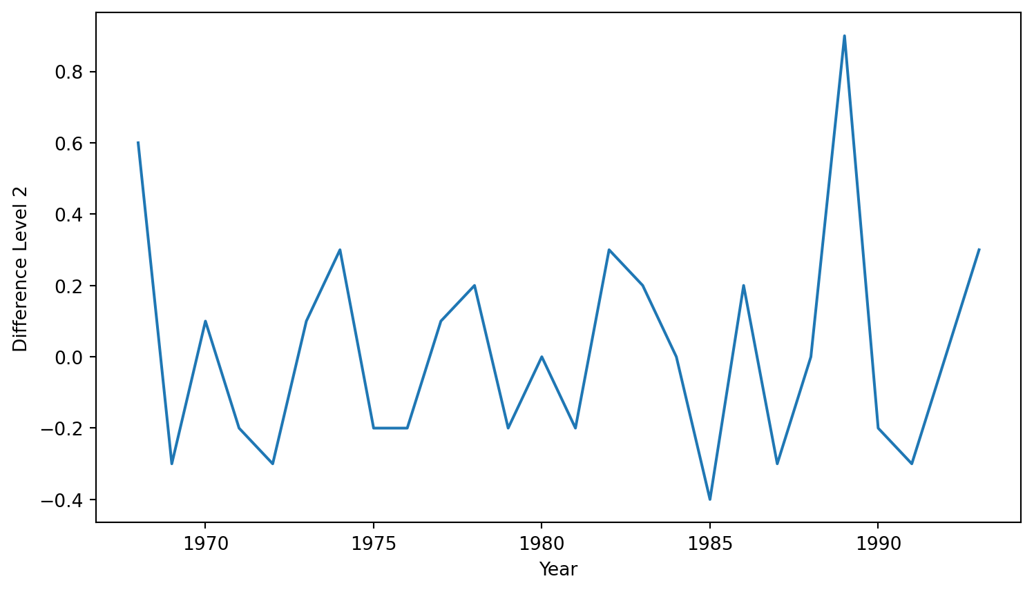
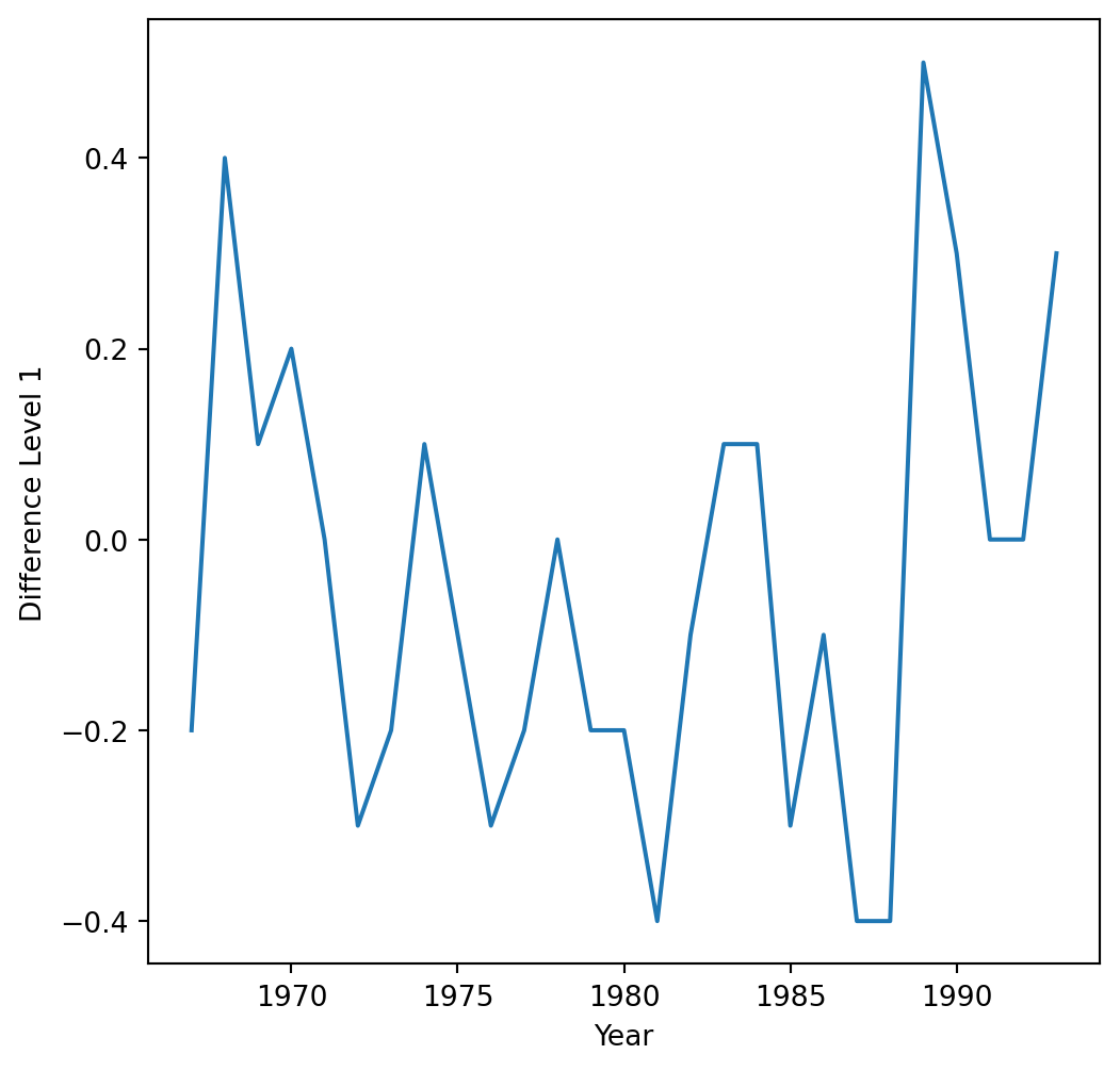
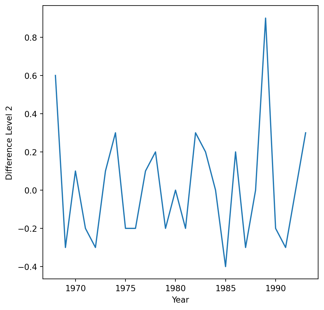
1. Integrated or differentiated operators (I)
They create a new variable \(Z_t\), which equals the difference between the current response and the delayed response by a number of periods or lags.
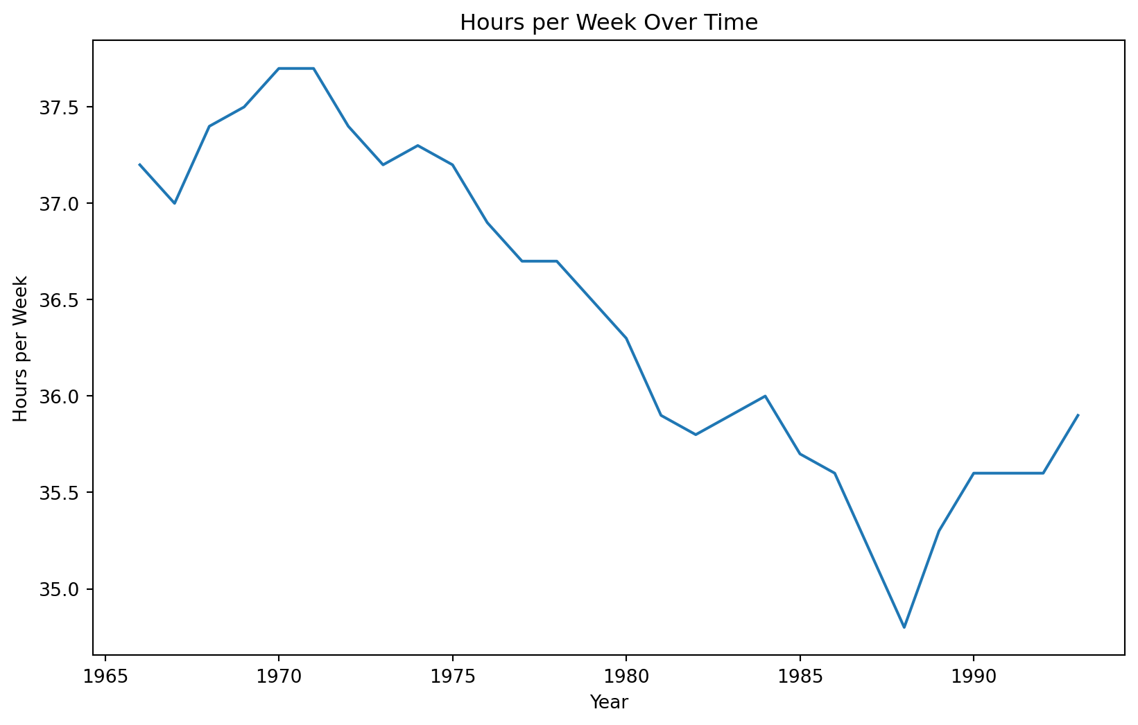
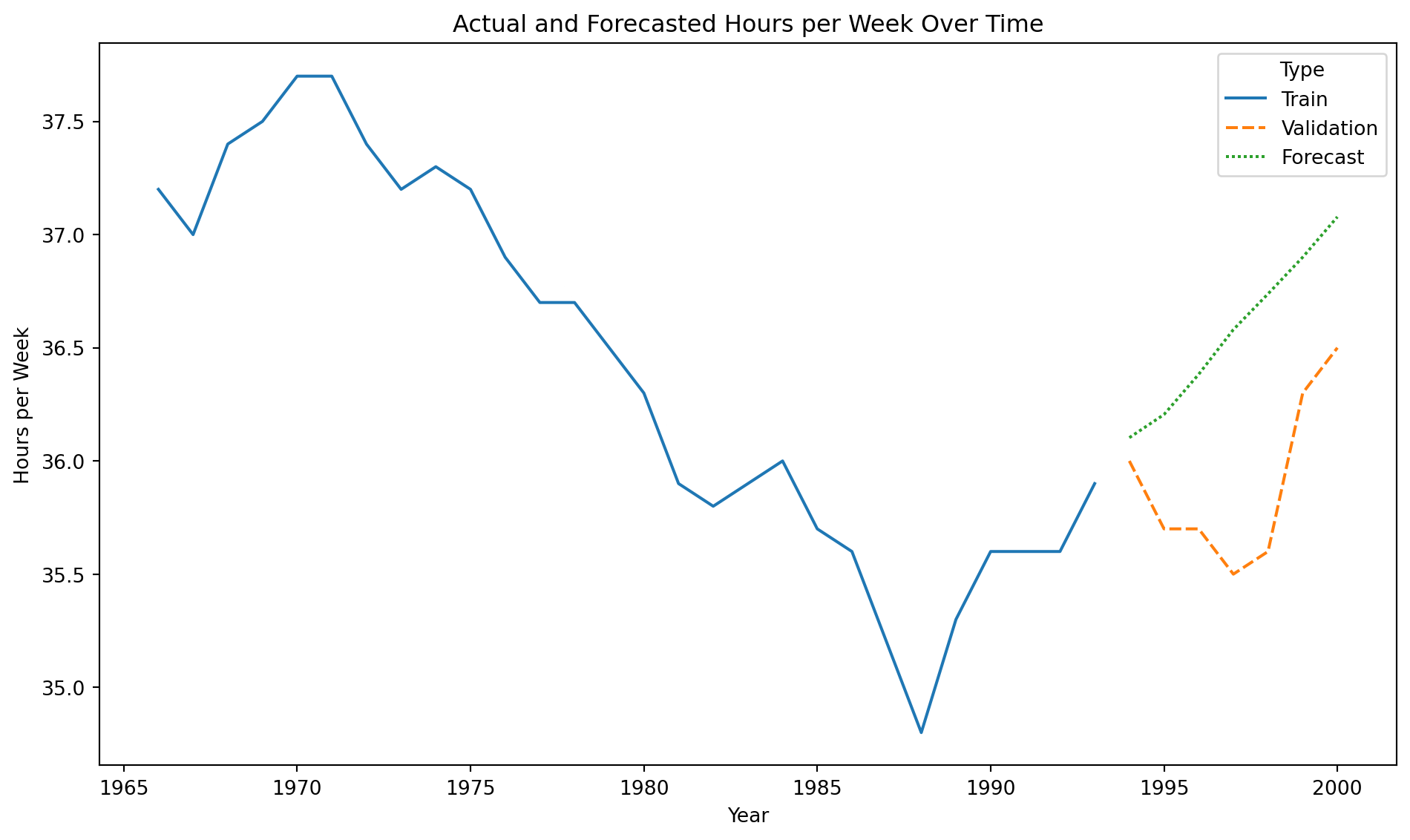
We consider the time series “CanadianWorkHours.xlsx” that contains the average hours worked by a certain group of workers over a certain range of years.
Recall that we would like to train the model on earlier time periods and test it on later ones. To this end, we make the split using the code below.
# Define the split pointsplit_ratio =0.8# 80% train, 20% testsplit_point =int(len(CanadianWorkHours) * split_ratio)# Split the dataCanadian_train = CanadianWorkHours[:split_point]Canadian_validation = CanadianWorkHours[split_point:]
We use 80% of the time series for training and the rest for validation.
Training data
Code
plt.figure(figsize=(10, 6))sns.lineplot(x='Year', y='Hours per Week', data = Canadian_train)plt.xlabel('Year')plt.ylabel('Hours per Week')plt.title('Hours per Week Over Time')plt.show()
In statsmodels, we apply the integration operator using the pre-loaded diff() function. The function’s k_diff argument specifies the order or level of the operator.
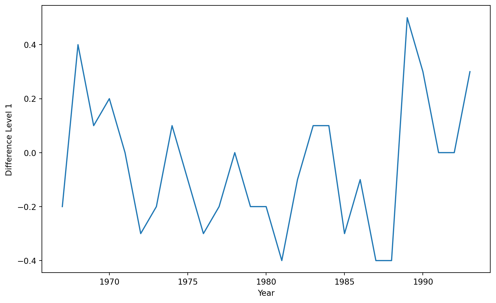
First, let’s use a level-1 operator.
Z_series_one = diff(Canadian_train['Hours per Week'], k_diff =1)
The time series with a level-1 operator looks like this.
If necessary, we can exclude the constant coefficient \(\hat{\beta}_0\) from the model.
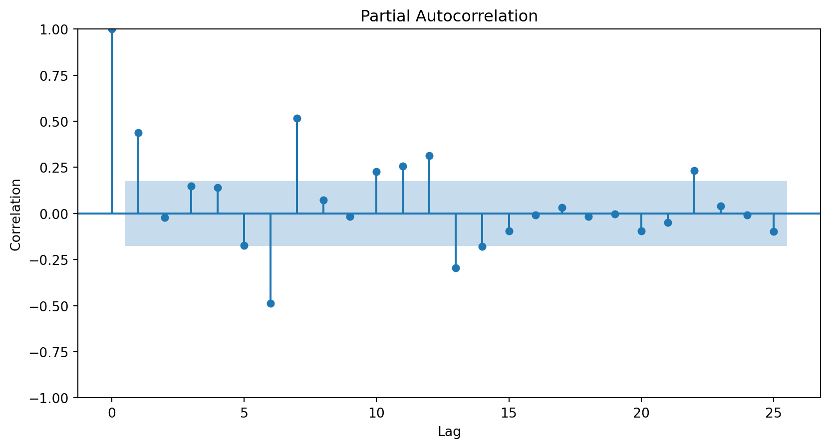
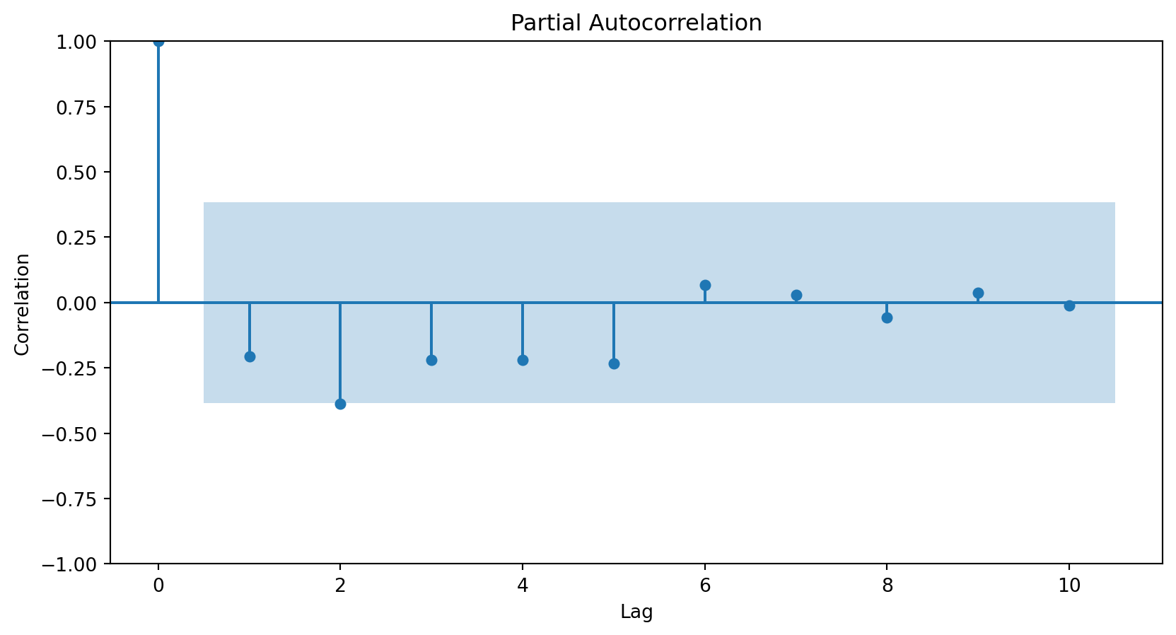
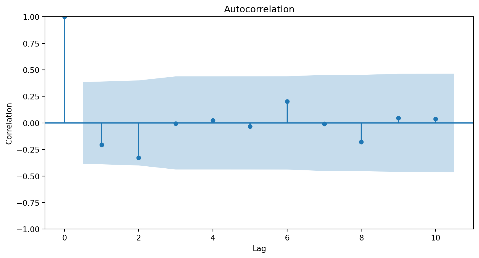
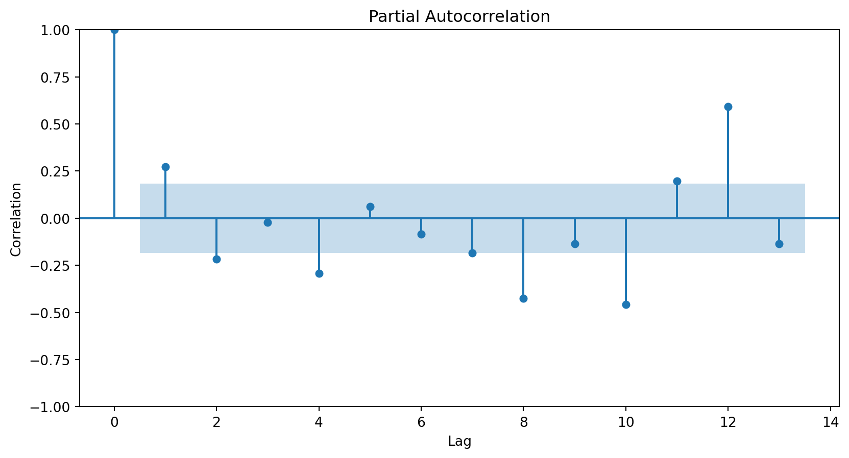
How do we determine the number of terms?
Using the partial autocorrelation function (PACF) of the differenced series.
A first-order autoregressive model has a PACF with a single peak at the first period difference (lag).
A second-order autoregressive model has a PACF with two peaks at the first lags.
In general, the lag at which the PACF cuts off from the confidence limits in the software is the indicated number of AR terms.
<Figure size 288x288 with 0 Axes>
Using the PACF, we conclude that an autoregressive term of order 2 will be sufficient to capture the relationships between the elements of the series.
<Figure size 288x288 with 0 Axes>
3. Stochastic Terms (Moving Averages, MA)
Instead of using past values of the response variable, a moving average model uses stochastic terms to predict the current response. The model has different versions depending on the number of errors used to predict the response. For example:
MA of order 1: \(Z_t = \theta_0 + \theta_1 a_{t-1}\);
MA of order 2: \(Z_t = \theta_0 + \theta_1 a_{t-1} + \theta_2 a_{t-2}\),
where \(\theta_0\) is a constant and \(a_t\) are terms from a white noise series (i.e., random terms).
How do I choose the order of the MAs?
Using the autocorrelation function (ACF) of the differenced series.
In general, the lag at which the ACF cuts off from the confidence limits in the software is the indicated number of MA terms.
Since there is no significant correlation for any lag above 0, we do not need any MA elements to model the series.
<Figure size 288x288 with 0 Axes>
ARIMA
Define the response differentiation level and create \(Z_t\).
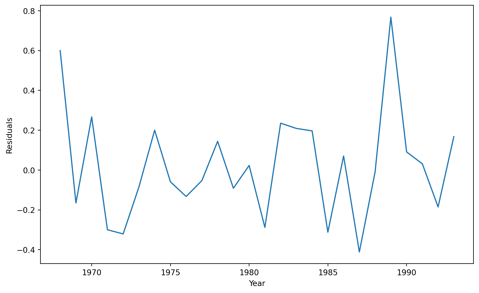
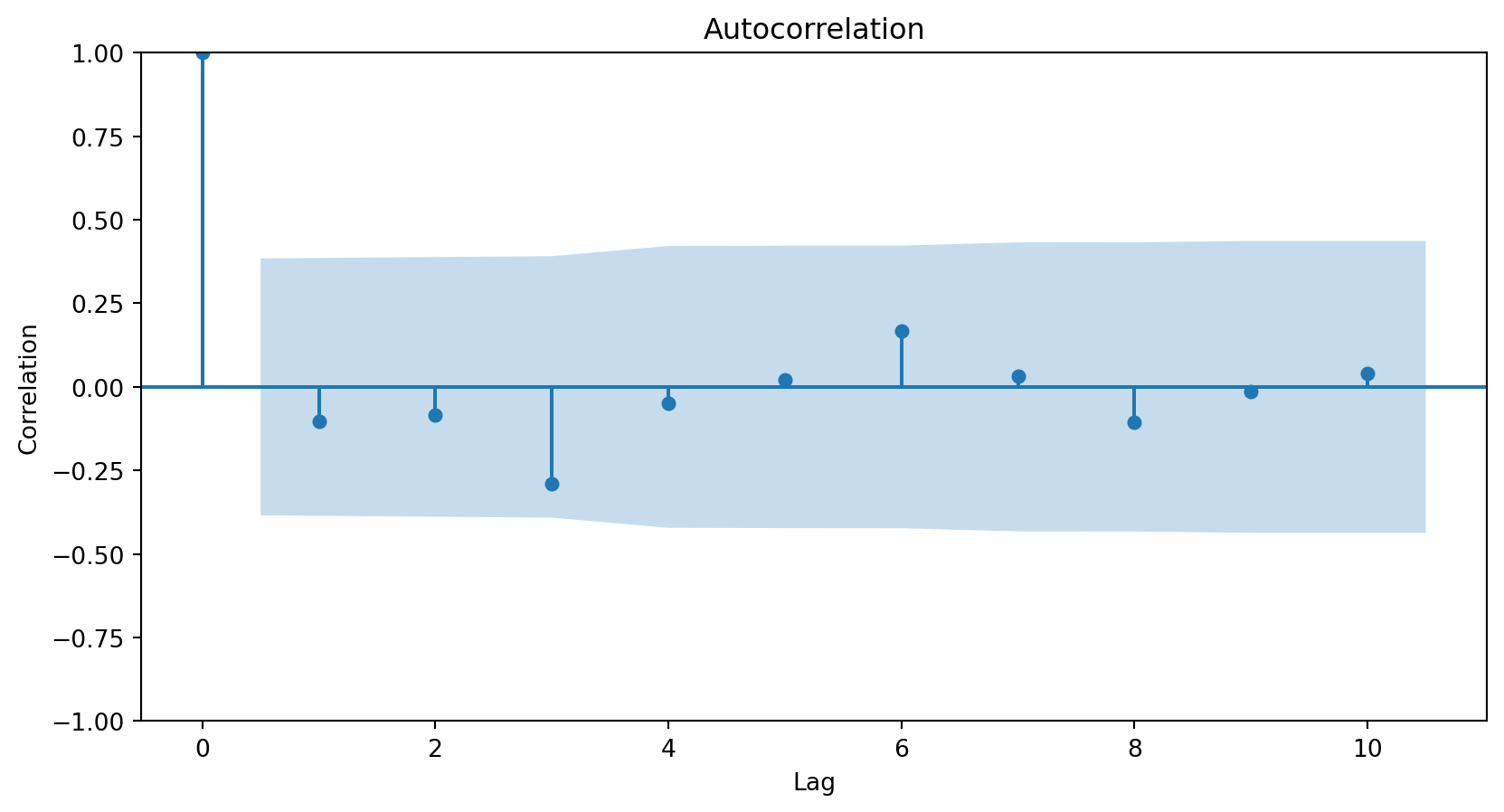
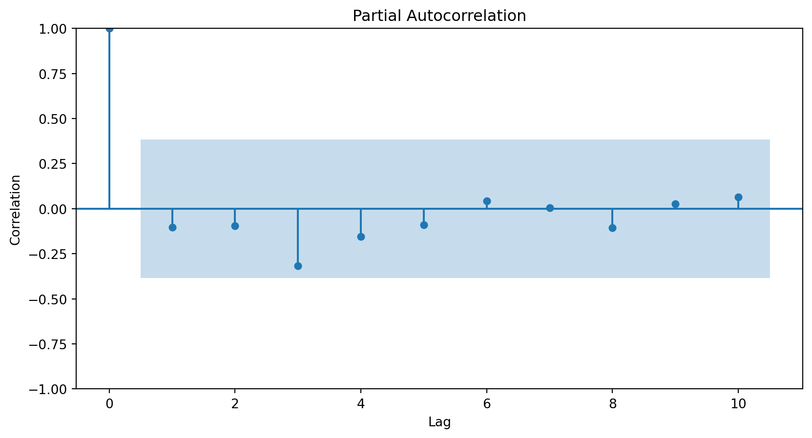
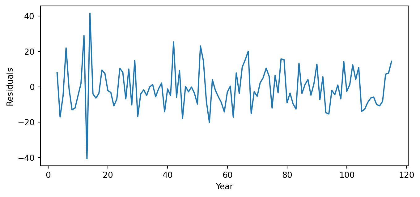
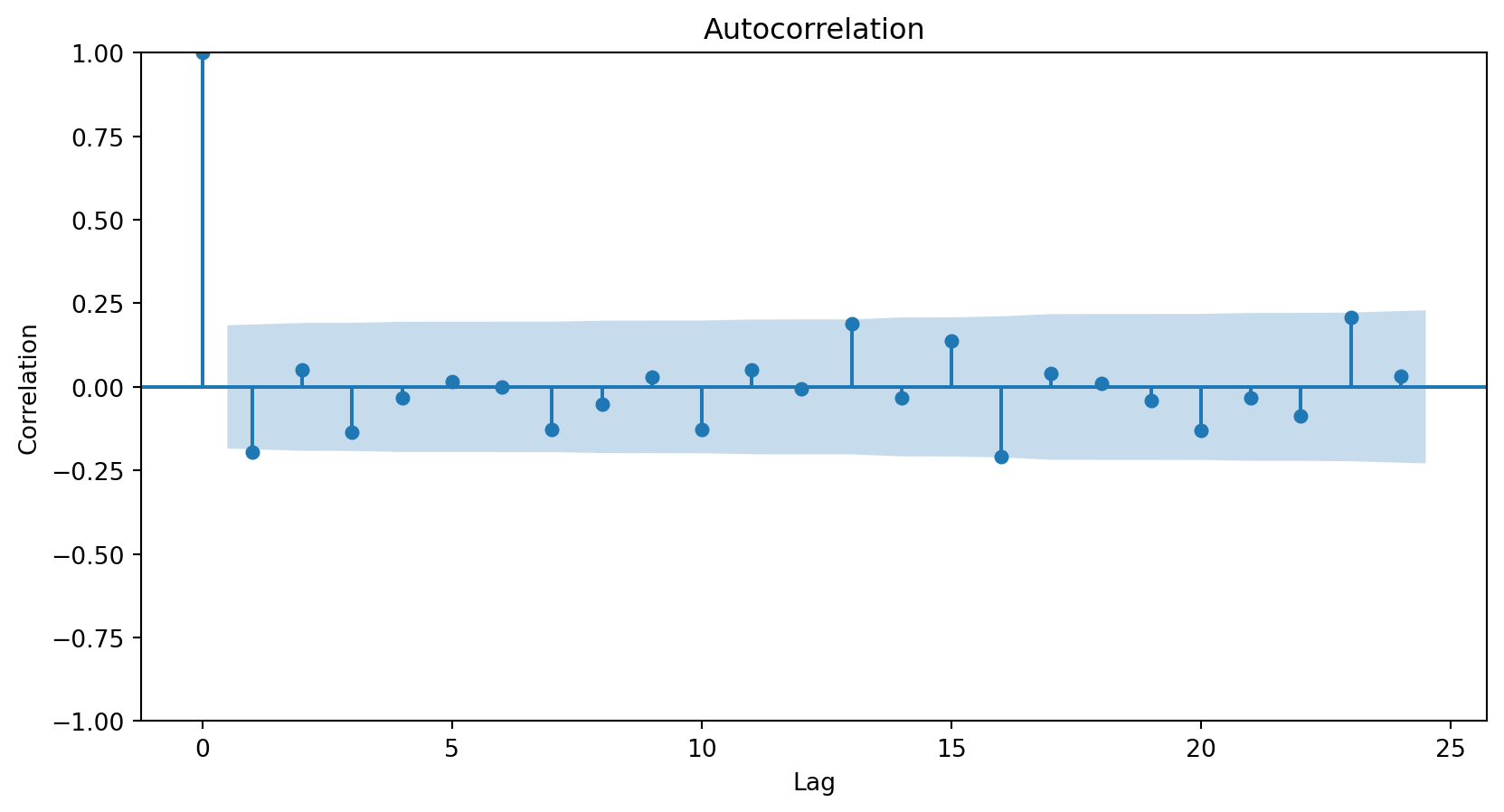
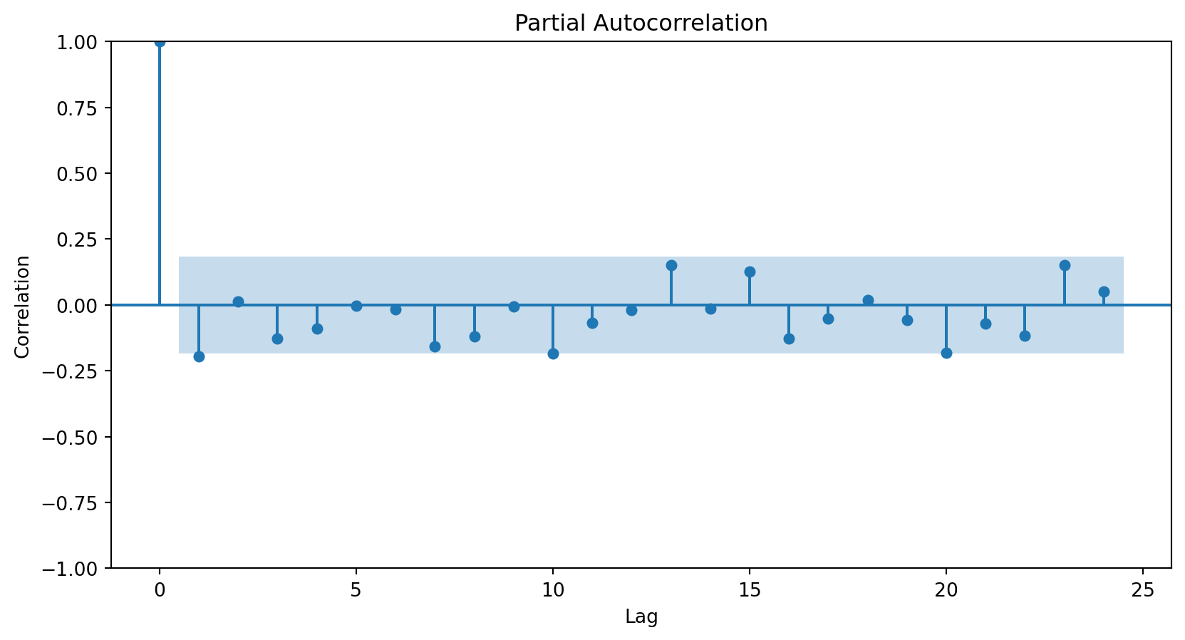
The next step in evaluating an ARIMA model is to study the model’s residuals to ensure there is nothing else to explain in the model.
However, since the ARIMA model has two AR terms, we must inspect the residuals starting from the third observation. We achieve this using the code below.
# Extract the residuals.ARIMA_residuals = results_ARIMA_Canadian.resid# Select residuals starting from observation 3 and onwards.ARIMA_residuals = ARIMA_residuals[2:]
The three graphs show no obvious patterns or significant correlations between the residuals. Therefore, we say the model is good.
Forecast
Once the model is validated, we make predictions for elements in the time series.
To predict the average number of hours worked in the next, say, 3 years, we use the .forecast() function. The steps argument indicates the number of steps in the future to make the predictions.
Instead of evaluating the ARIMA model using graphical analyses of the residuals, we can take a more data-driven approach and evaluate the model using the root mean squared error (RMSE).
To this end, we use the root_mean_squared_error() function with the validation responses and our predictions.
Validation data
Canadian_validation
Year
Hours per Week
28
1994
36.0
29
1995
35.7
30
1996
35.7
31
1997
35.5
32
1998
35.6
33
1999
36.3
34
2000
36.5
The validation data has 7 time periods that can be determined using the command below.
len(Canadian_validation)
7
So, we must forecast 7 periods ahead using our ARIMA model.
Using the forecast and validation data, we compute the RMSE.
rmse = root_mean_squared_error(Canadian_validation["Hours per Week"],
                         forecast_Canadian)
print(round(rmse, 2))
0.75
Naive forecast
To determine if the RMSE is high or small, we must compare it with a naive forecast that predicts the response \(Y_t\) with the previous one \(Y_{t-1}\). To build this forecast, we follow three steps.
First, we shift the time series in the validation data by one position using the .shit(1) function.
naive_forecast = Canadian_validation["Hours per Week"].shift(1)naive_forecast.head()
28     NaN
29    36.0
30    35.7
31    35.7
32    35.5
Name: Hours per Week, dtype: float64
Second, we notice that the first element of the shifted series is missing or not available (NaN). We thus fill it in with the last observation in our training dataset, which we can obtain using the .iloc() function.
Canadian_train.iloc[-1]
Year              1993.0
Hours per Week      35.9
Name: 27, dtype: float64
Third, we input 35.9 as the first record in naive_forecast. The first record of the object is indexed by a 28.
naive_forecast[28] =35.9
Our naive forecast of the time series in the validation data would be these one:
Naive Forecast
Hours per week
28
35.9
36.0
29
36.0
35.7
30
35.7
35.7
31
35.7
35.5
32
35.5
35.6
33
35.6
36.3
34
36.3
36.5
The RMSE of the naive forecast is calculated below.
naive_rmse = root_mean_squared_error(Canadian_validation["Hours per Week"], naive_forecast)print(round(naive_rmse, 2))
0.31
We conclude that predicting with the previous response is a better approach than predicting with an ARIMA model. This is because the RMSE for the naive forecast is 0.31, and that of the ARIMA model is 0.75.
The SARIMA Model
Seasonality
Seasonality consists of repetitive or cyclical behavior that occurs with a constant frequency.
It can be identified from the series graph or using the ACF and PACF.
To do this, we must have removed the trend.
Example 3
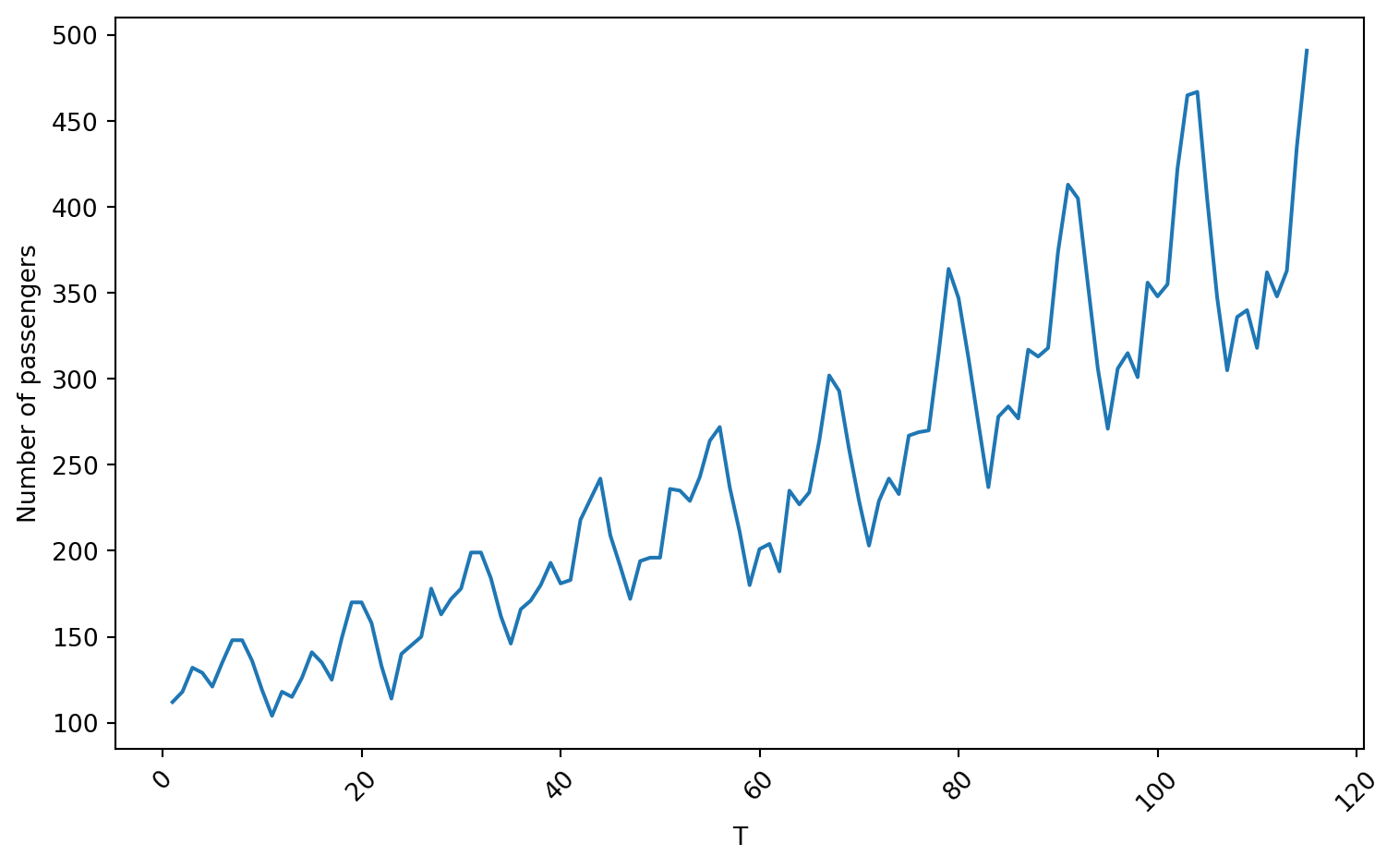
We use the Airline data containing the number of passengers of an international airline per month between 1949 and 1960.
We use 80% of the time series for training and the rest for validation.
# Define the split pointsplit_ratio =0.8# 80% train, 20% testsplit_point =int(len(Airline_data) * split_ratio)# Split the dataAirline_train = Airline_data[:split_point]Airline_validation = Airline_data[split_point:]
Training data
Code
plt.figure(figsize=(8, 5))sns.lineplot(x='T', y='Number of passengers', data = Airline_train)plt.xlabel('T')plt.ylabel('Number of passengers')plt.xticks(rotation=45)plt.tight_layout()plt.show()
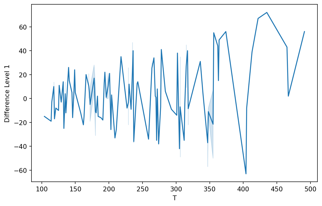
First, let’s use a level-1 operator.
Z_series_one = diff(Airline_train['Number of passengers'], k_diff =1)
Code
plt.figure(figsize=(8, 5))sns.lineplot(x=Airline_train['Number of passengers'], y=Z_series_one)plt.xlabel('T')plt.ylabel('Difference Level 1')plt.show()
Autocorrelation plots
<Figure size 288x288 with 0 Axes>
<Figure size 288x288 with 0 Axes>
SARIMA model
The SARIMA (Seasonal Autoregressive Integrated Moving Average) model is an extension of the ARIMA model for modeling seasonality patterns.
The SARIMA model has three additional elements for modeling seasonality in time series.
Differenced or integrated operators (integrated) for seasonality.
Autoregressive terms (autoregressive) for seasonality.
Stochastic terms or moving averages (moving average) for seasonality.
Notation
Seasonality in a time series is a regular pattern of change that repeats over \(S\) time periods, where \(S\) defines the number of time periods until the pattern repeats again.
For example, there is seasonality in monthly data, where high values always tend to occur in some particular months and low values always tend to occur in other particular months.
In this case, \(S=12\) (months per year) is the length of periodic seasonal behavior. For quarterly data, \(S=4\) time periods per year.
Seasonal differentiation
This is the difference between a response and a response with a lag that is a multiple of \(S\).
For example, with monthly data \(S=12\),
A level 1 seasonal difference is \(Y_{t} - Y_{t-12}\).
A level 2 seasonal difference is \((Y_{t-12}) - (Y_{t-12} - Y_{t-24})\).
Seasonal differencing eliminates the seasonal trend and can also eliminate a type of nonstationarity caused by a seasonal random walk.
Seasonal AR and MA Terms
In SARIMA, the seasonal AR and MA component terms predict the current response (\(Y_t\)) using responses and errors at times with lags that are multiples of \(S\).
For example, with monthly data \(S = 12\),
The first-order seasonal AR model would use \(Y_{t-12}\) to predict \(Y_{t}\).
The second-order seasonal AR model would use \(Y_{t-12}\) and \(Y_{t-24}\) to predict \(Y_{t}\).
The first-order seasonal MA model would use the stochastic term \(a_{t-12}\) as a predictor.
The second-order seasonal MA model would use the stochastic terms \(a_{t-12}\) and \(a_{t-24}\) as predictors.
To fit the SARIMA model, we use the ARIMA() function from statsmodels, but with an additional argument, seasonal_order=(0, 0, 0, 0).
This is the order (P, D, Q, s) of the seasonal component of the model for the autoregressive parameters, differencing operator levels, moving average parameters, and periodicity.
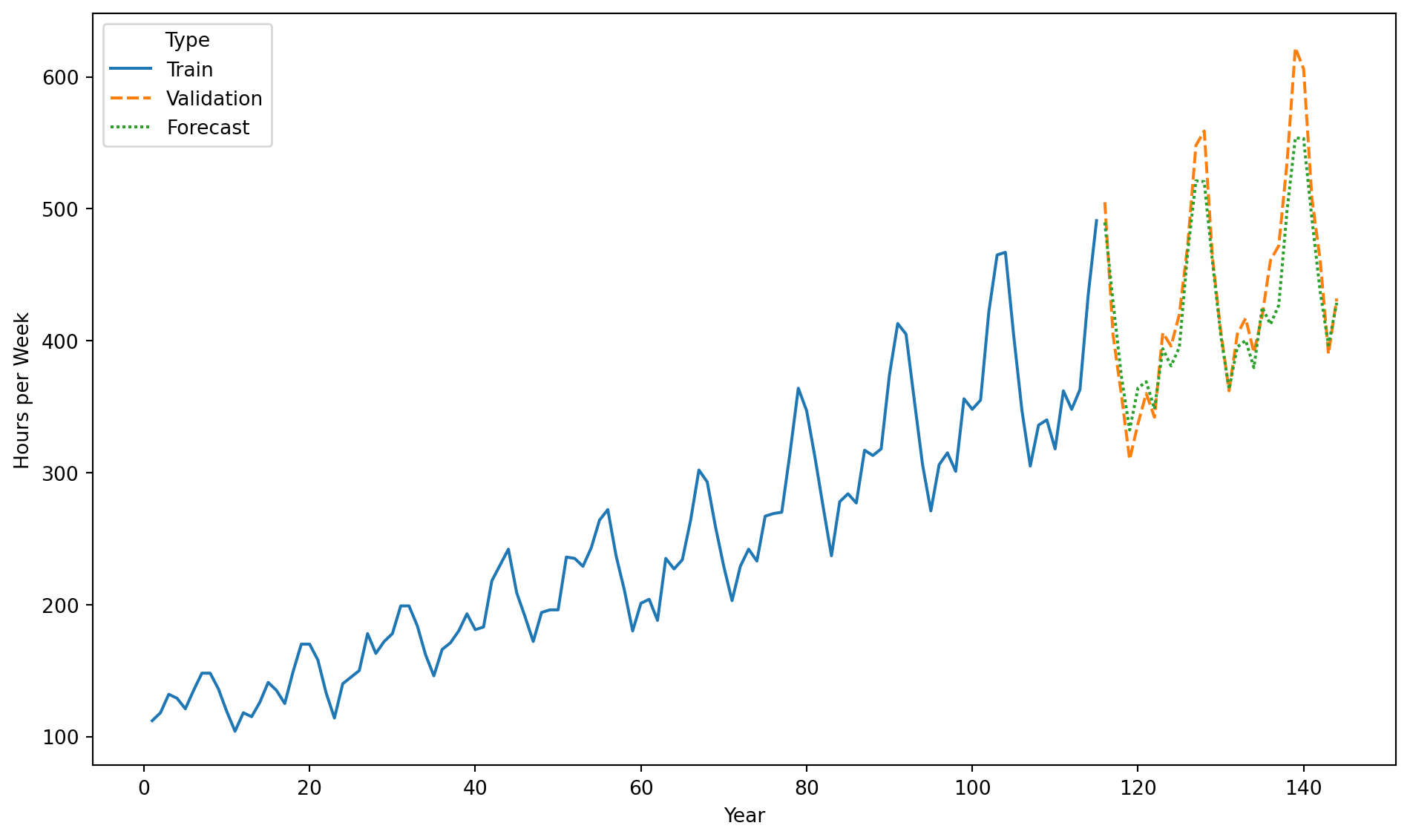
Using the forecast and validation data, we compute the RMSE.
rmse = root_mean_squared_error(Airline_validation["Number of passengers"],
                        forecast_Airline)
print(round(rmse, 2))
26.39
Comparison with a naive forecast
Now, we build a naive forecast to study the performance of our SARIMA model. To this end, we shift the validation data by one period using the code below.
naive_forecast = Airline_validation["Number of passengers"].shift(1)naive_forecast.head()
115      NaN
116    505.0
117    404.0
118    359.0
119    310.0
Name: Number of passengers, dtype: float64
Next, we determine the last element of the training data.
Airline_train.iloc[-1]
T                       115
Number of passengers    491
Name: 114, dtype: int64
Finally, we assemble our naive forecast by replacing the first entry of naive_forecast with the last entry of the response in the training dataset.
naive_forecast[115] =491naive_forecast.head()
115    491.0
116    505.0
117    404.0
118    359.0
119    310.0
Name: Number of passengers, dtype: float64
Let’s calculate the RMSE of the naive forecast.
naive_rmse = root_mean_squared_error(Airline_validation["Number of passengers"], naive_forecast)print(round(naive_rmse, 2))
52.49
The RMSE of the SARIMA model is 26.38, while that of the naive forecast is 54.15. Therefore, the SARIMA model is better than the naive forecast.


Comments
The differentiation operator de-trends the time series.