Introduction to Data Visualization
IN2039: Data Visualization for Decision Making
Data science is …
a multidisciplinary field that uses scientific methods, processes, algorithms and systems to extract knowledge and insights from vast amounts of structured and unstructured data.
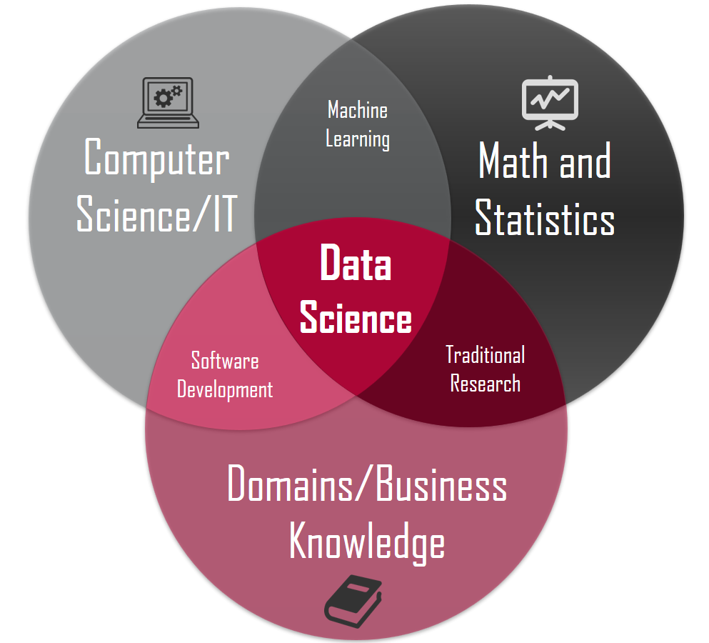
The scheme of data science
Provost, F., & Fawcett, T. (2013). Data Science for Business: What you need to know about data mining and data-analytic thinking. O’Reilly Media, Inc.
Data types
Text

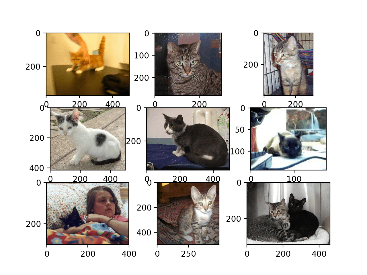
Images
Video
Audio

Numerical data
Data science methodology is based on numerical data given in tables.
In fact, texts, images, videos or audios are transformed into this format to process them.
In this course, we will assume that the data is in a table.
What is data visualization?
“A visualization [of data] is any visual presentation intended to reveal evidence, making the invisible visible.” Alberto Cairo (2015).

Principle 1: Define the Message or Question
Formulate the question of interest or the message you want to convey.


Principle 2: Turn Data into Information
Your graph should use data to convey the message or answer the question. In other words, it should transform data into information.
Enhance your graph with color symbols and text to convey additional information.
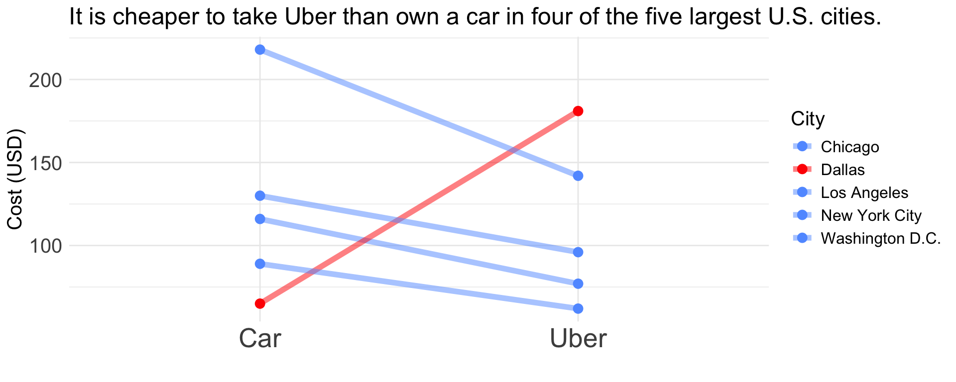
Principle 3: Apply Graphic Design Principles
- Objects are easily identifiable by color.
- Use direct labels instead of a legend.
- Elements such as text, lines, and shapes of the same nature should look similar.
- Balance graphics and text.
- Be cautious with default settings in visualization software.
- Use a grid-based layout to organize your visualization.
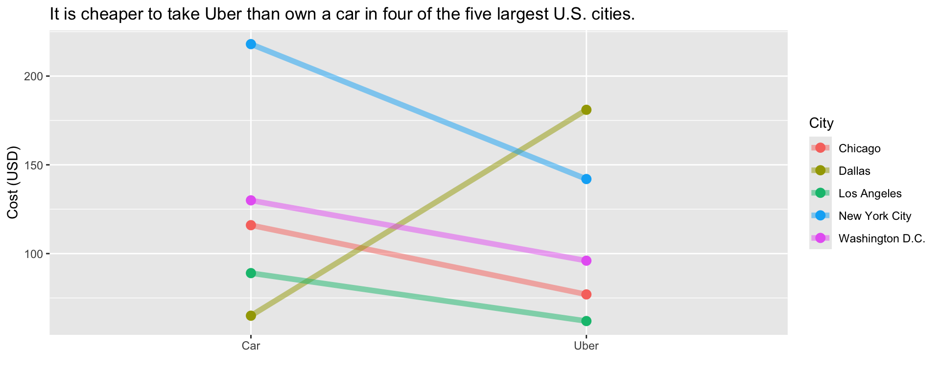
Example
Principle 1: It is cheaper to take Uber than to own a car in four of the five largest cities in the USA.
| City | Uber | Car |
|---|---|---|
| New York City | 142 | 218 |
| Washington D.C. | 96 | 130 |
| Chicago | 77 | 116 |
| Los Angeles | 62 | 89 |
| Dallas | 181 | 65 |

Principle 2: Turn data into information.
Principle 3: Apply Graphic Design Principles.
“The greatest value of a picture is when it forces us to notice what we never expected to see.” – John W. Tukey.

https://www.storytellingwithdata.com/ is an excellent guide on data visualization.
“The most powerful person in the world is the storyteller.” – Steve Jobs

The advice is based on