Main page
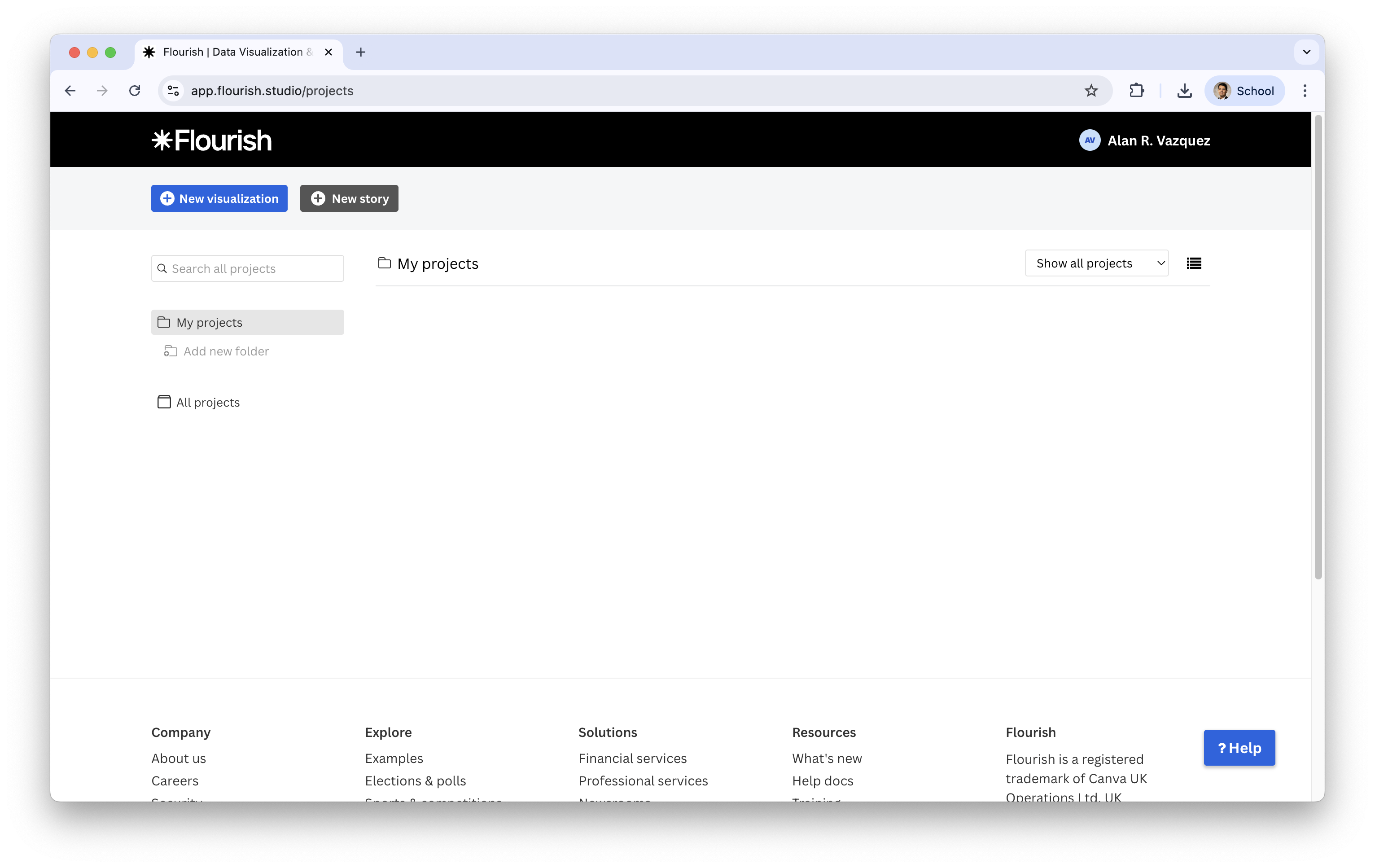
The main page shows:
Projects (your visualizations)
Templates you can choose from
Team tools (ignore for now)
Options to Create a new visualization
IN2039: Data Visualization for Decision Making
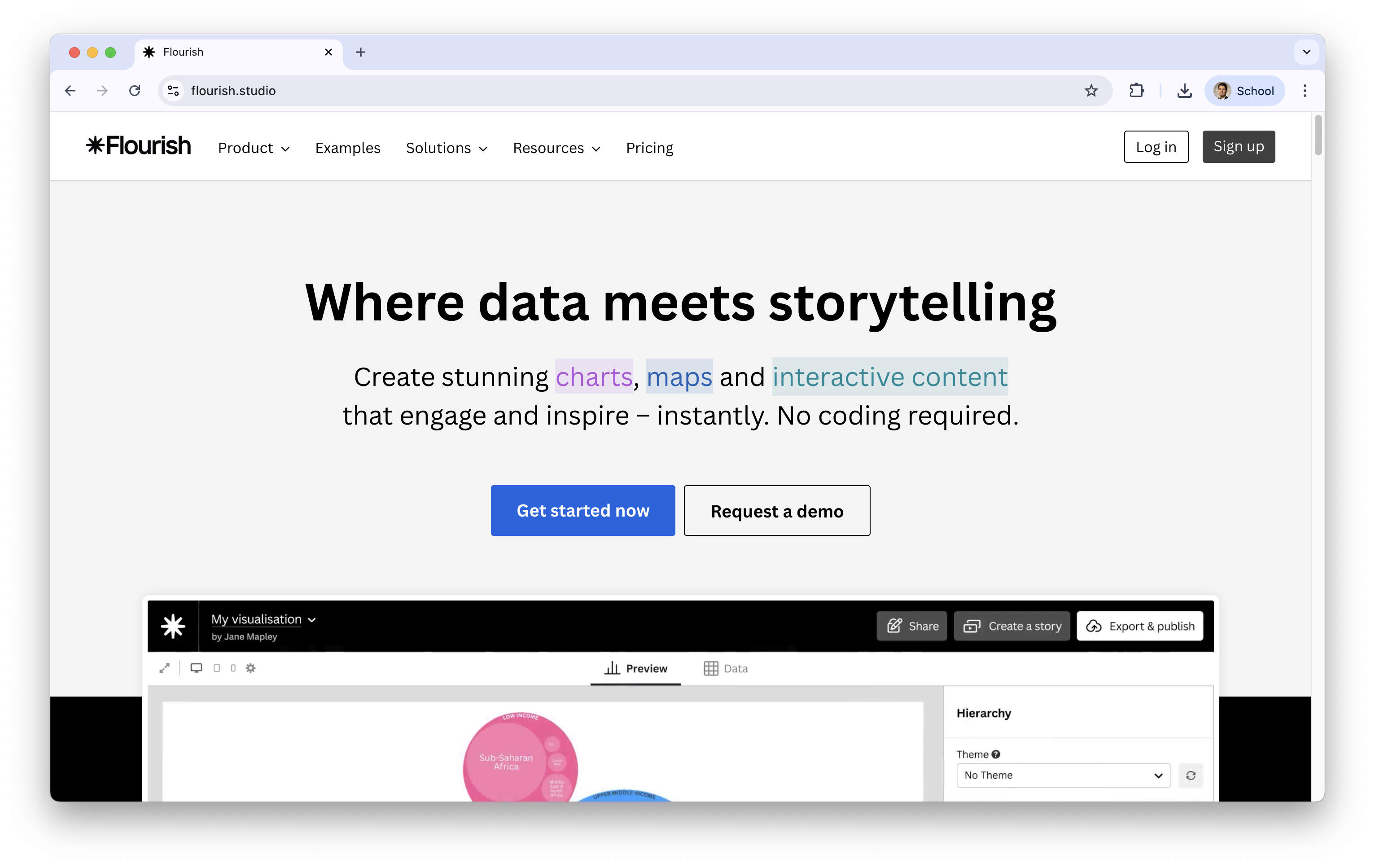
A web-based tool for building interactive charts, maps, and stories.
Designed for accessibility: beginner-friendly, but powerful.
It is free!
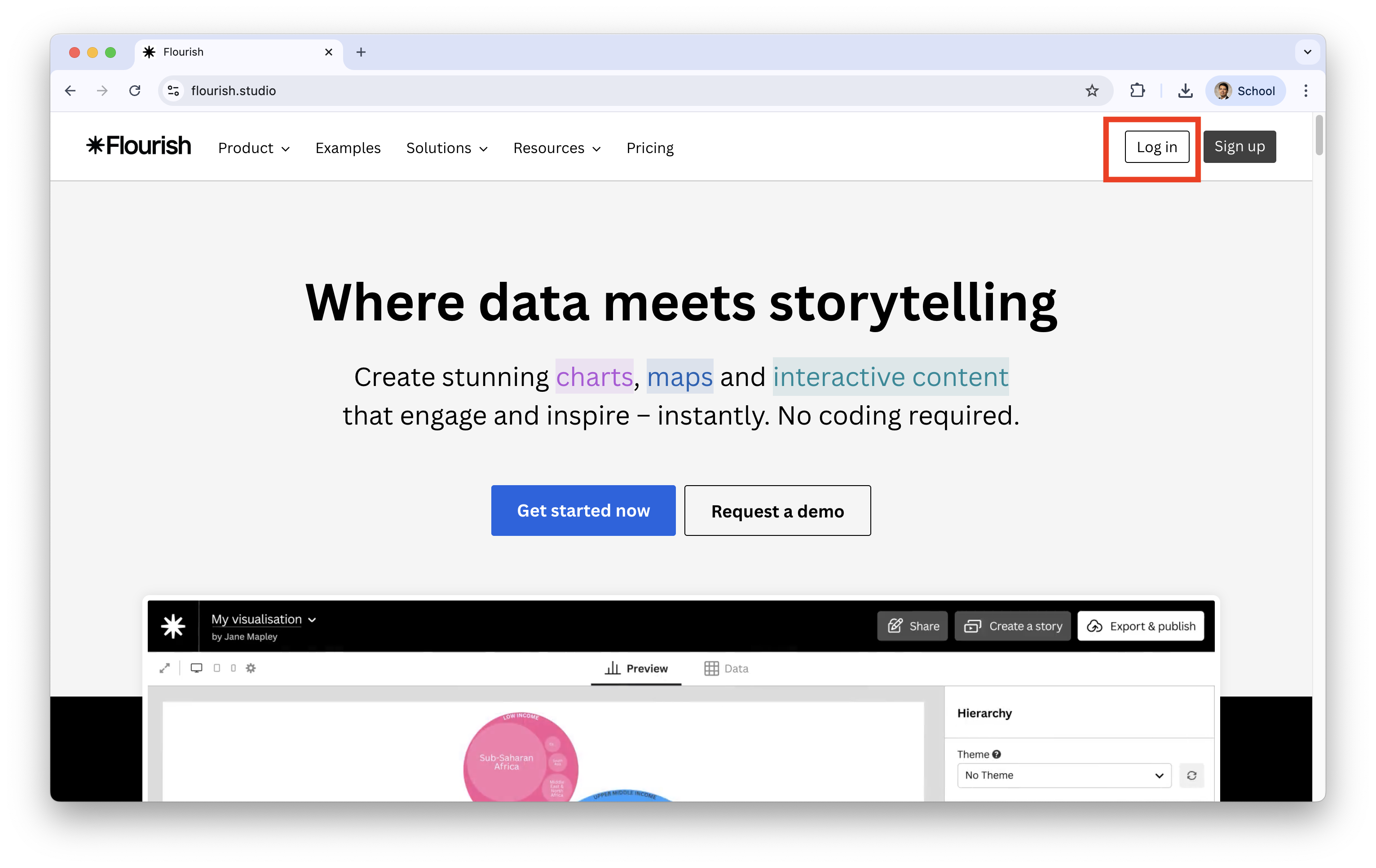
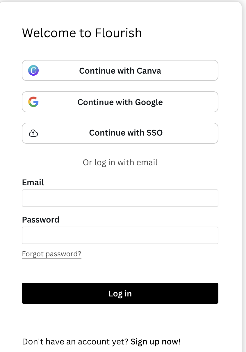
If you already have an account, simply log in.
The main page shows:
Projects (your visualizations)
Templates you can choose from
Team tools (ignore for now)
Options to Create a new visualization
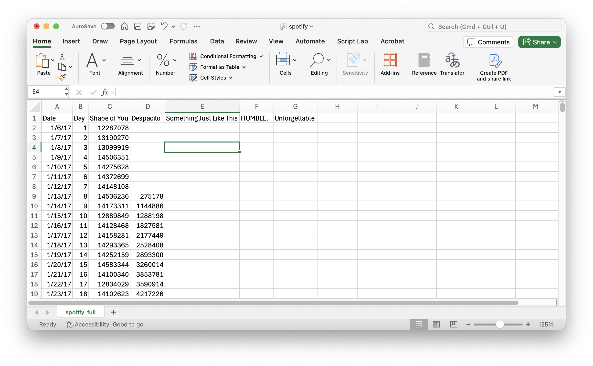
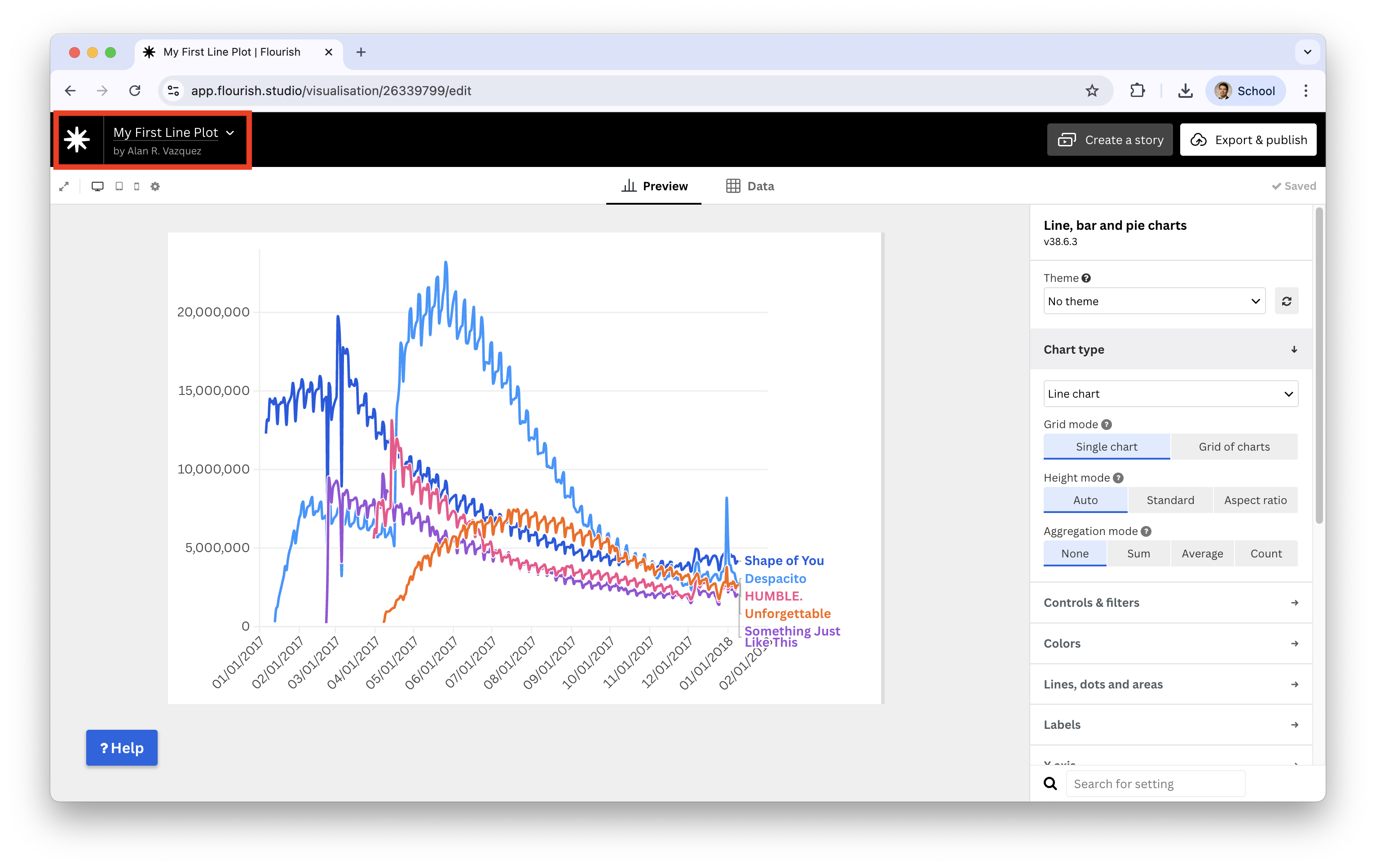
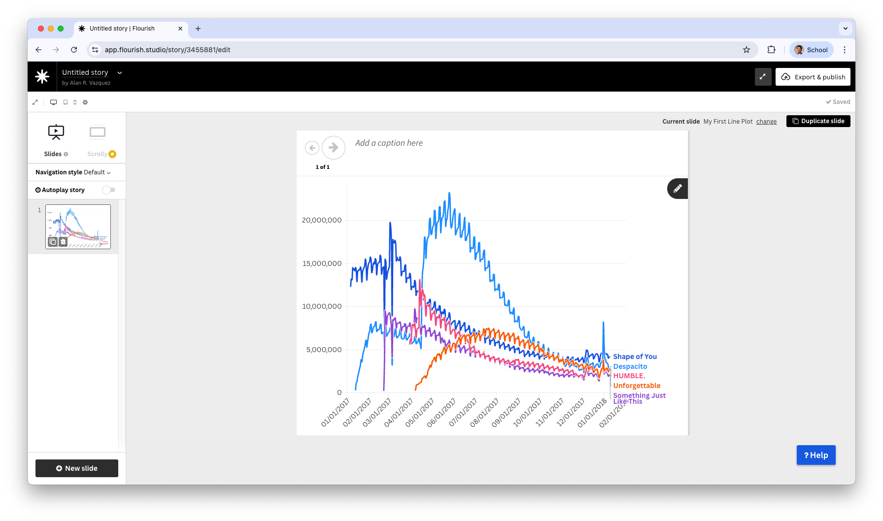
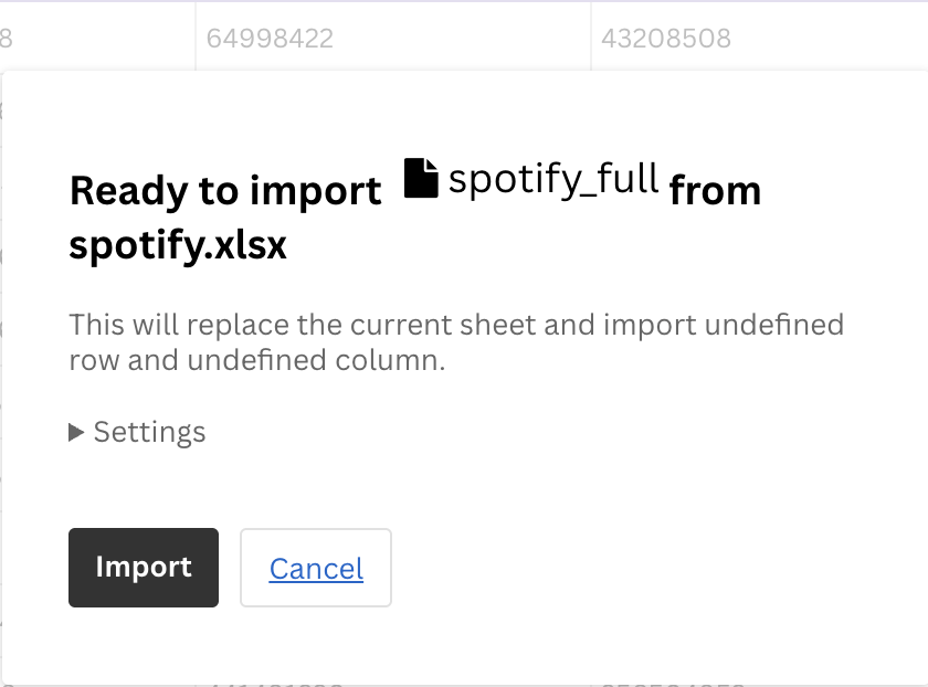
Consider the data in the file “spotify.xlsx”. This dataset contains the global daily plays of the five most popular songs on the Spotify music streaming service in 2017. Our goal is to create a line chart on the number of plays per song.
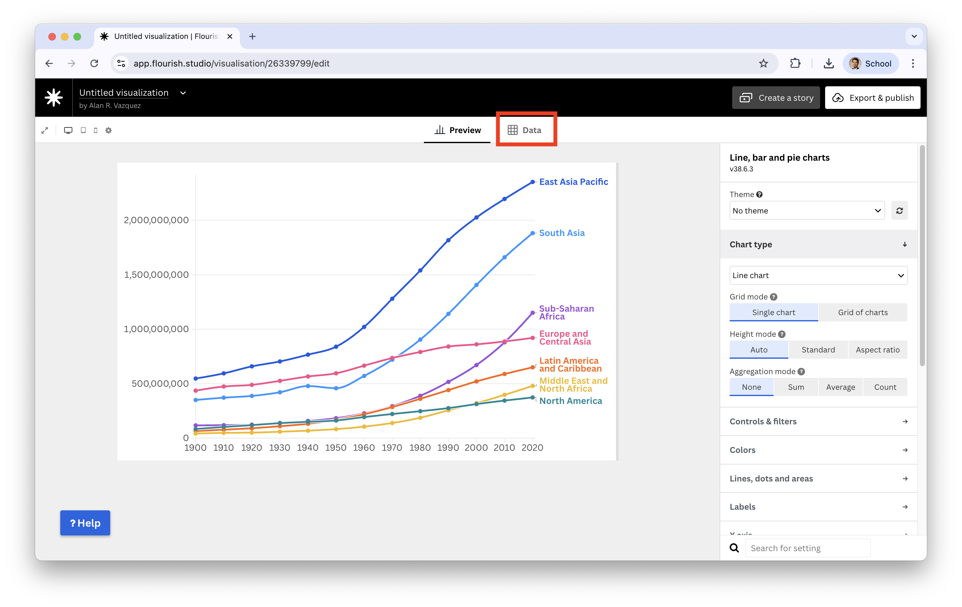
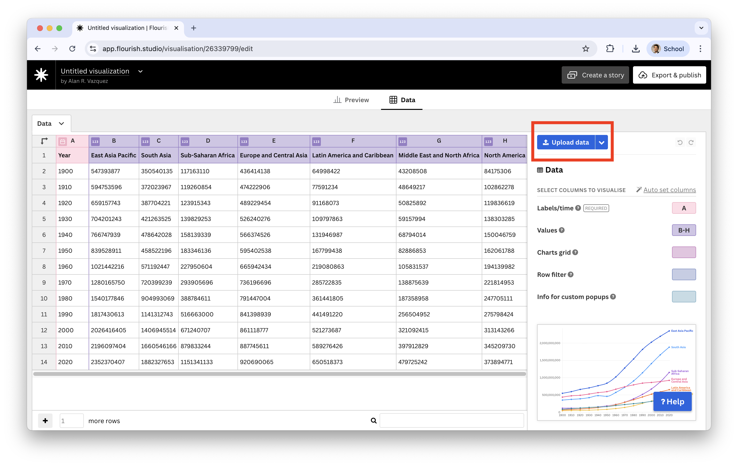
To load a dataset, we select the option Data.
We see a predefined dataset, but we replace it by clicking on Upload data.
Next, we click on Import and see that 367 rows or observations were uploaded successfuly.

Flourish studio successfully recognized that there is a column Data containing times, which must go in the horizontal axis.
Using the Values section we can set the columns that contain te number of plays of the songs.
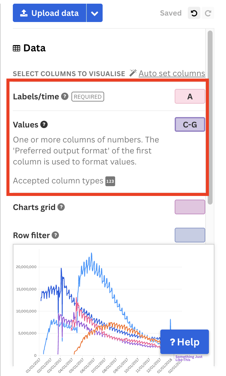
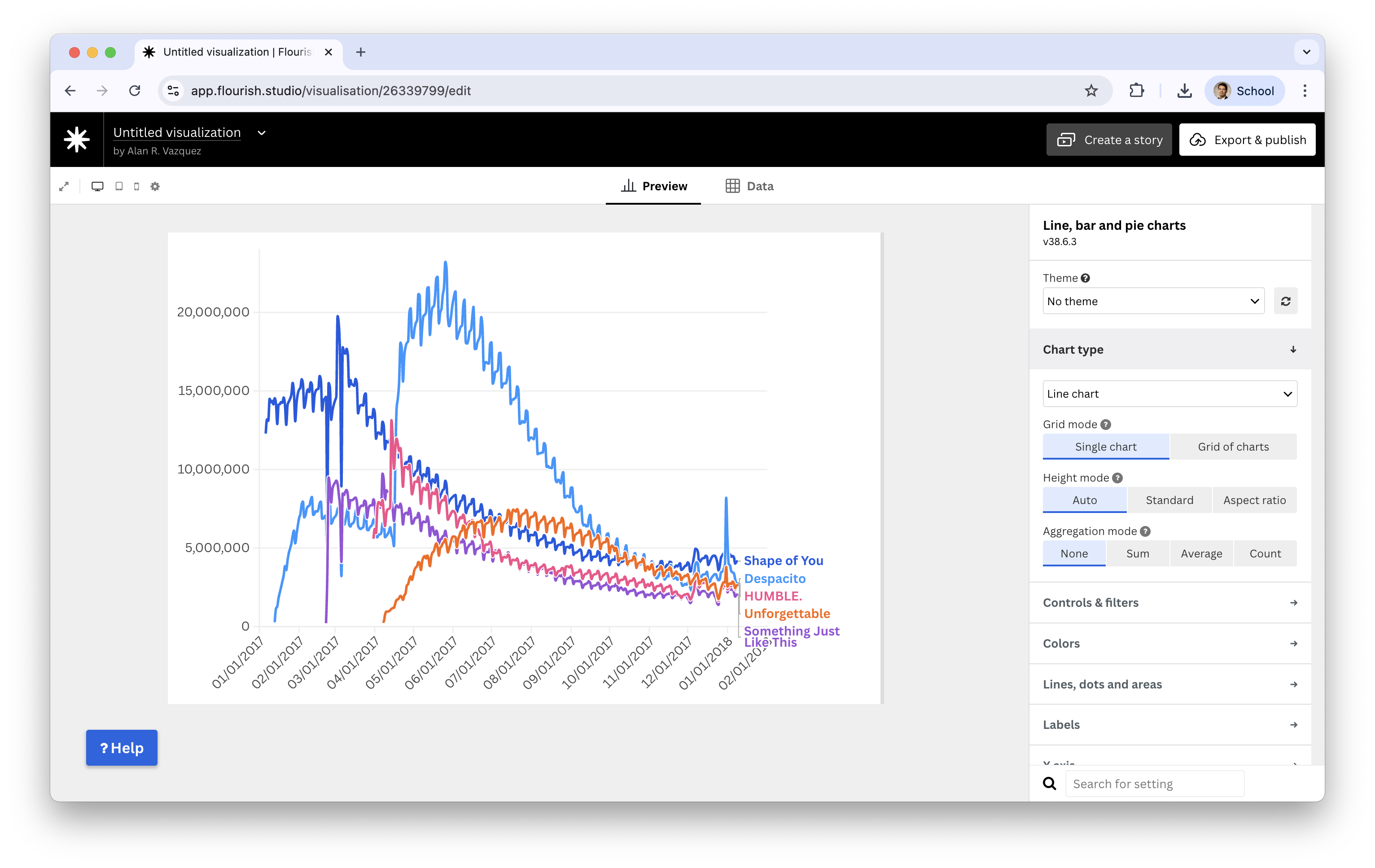
If we go back to the Preview, we see the resulting line plot.
We will give more details about this and other plots in later lectures.
To save the plot we rename it as “My First Line Plot” and go click on the Flourish studio icon next to the neame to go back to the main panel.
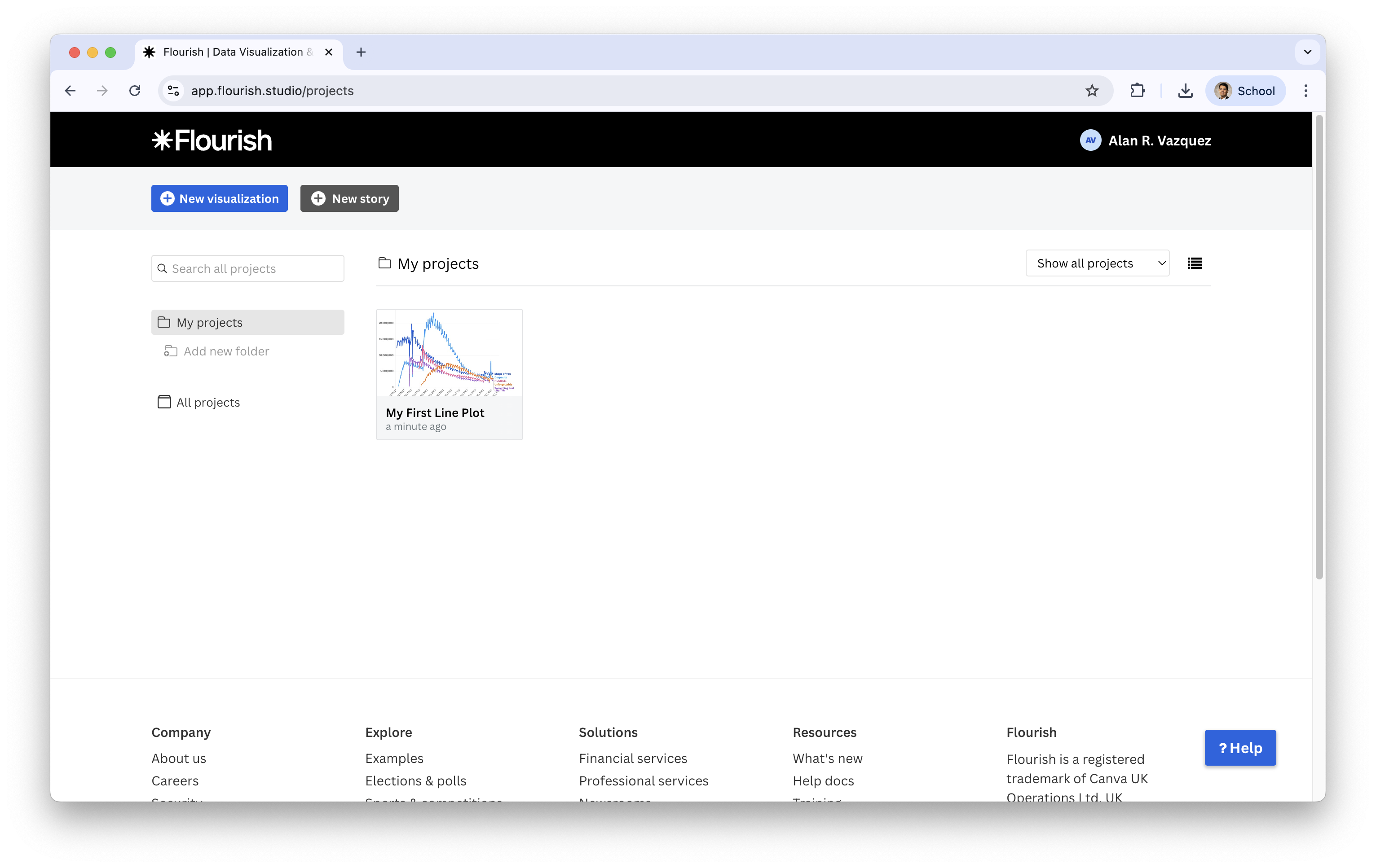
You now see that the plot is now in your projects.
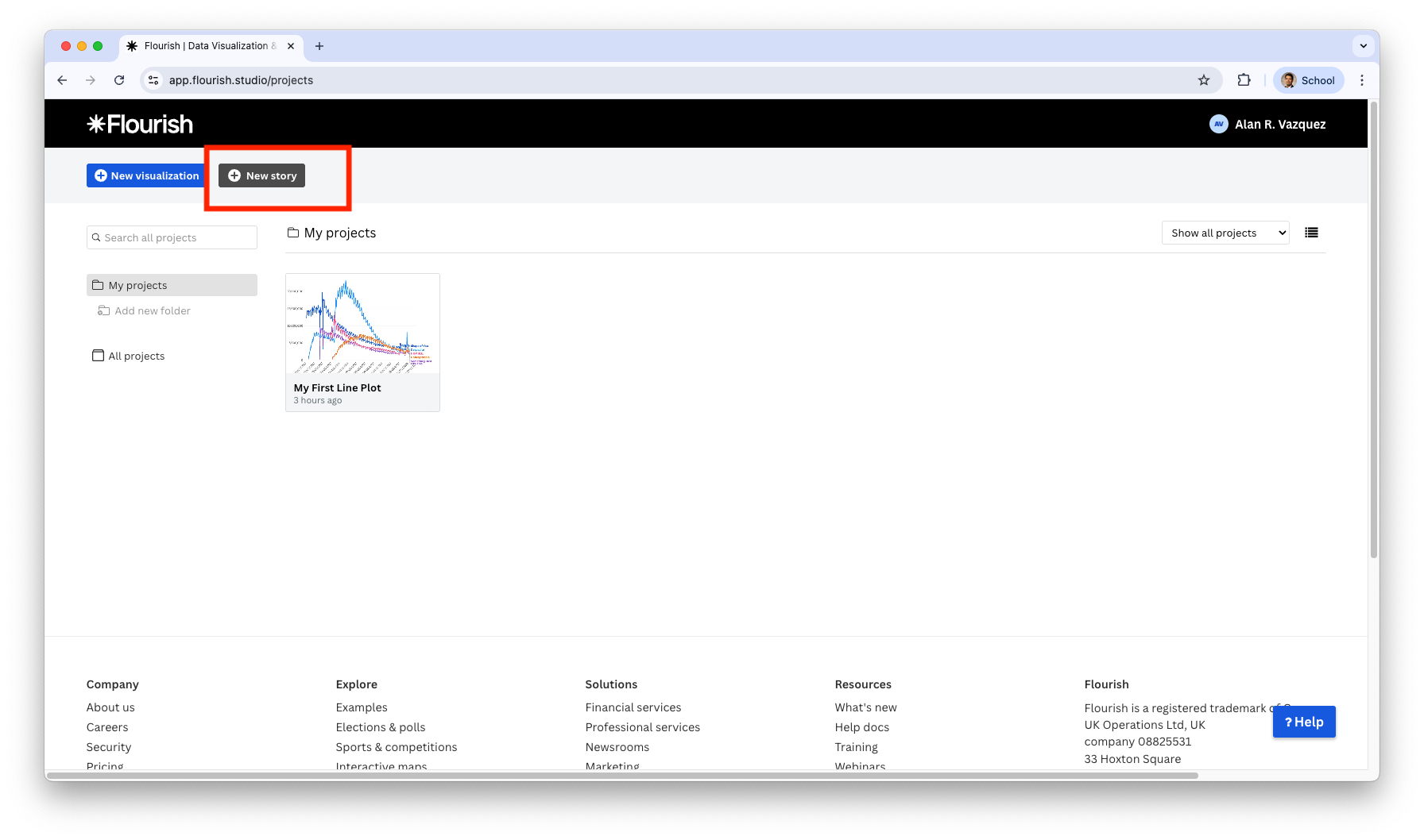
You can create a story by clicking on New Story in the main panel.
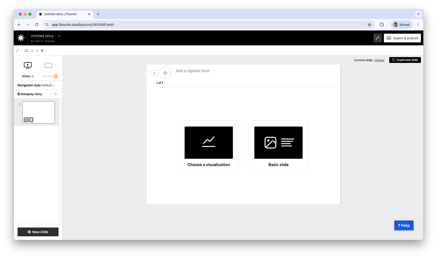
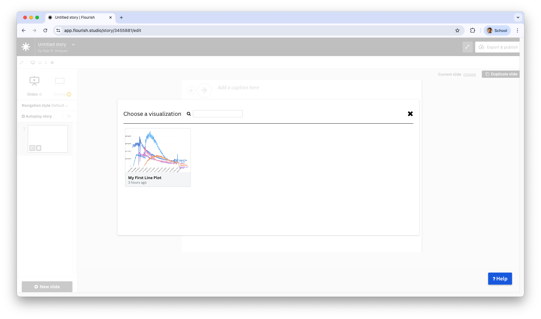
If you click on choose visualization, you can add the previously created line plot to the story.
After selecting the plot, we see a new slide in our story.
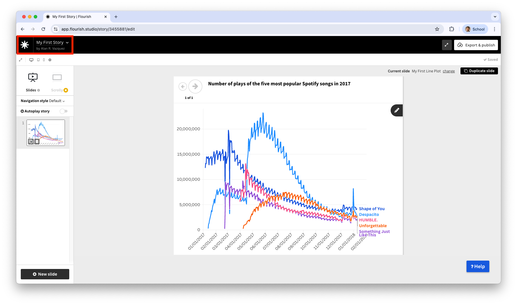
We can add an informative title to the plot by filling end the section Add a caption here.
After you are done, assign a name to your story.
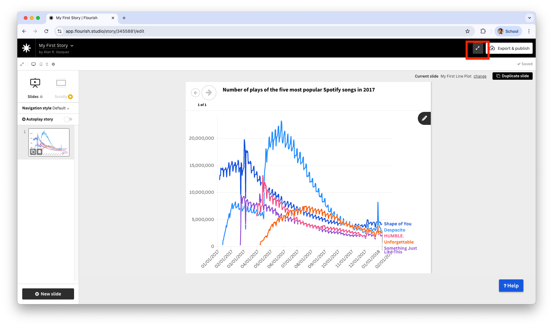
You can present your story by clicking on the icon with two opposite arrows.
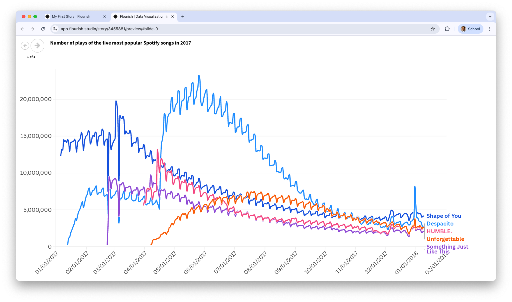
You are now in presentation mode and can start telling your story.