| species | island | bill_length_mm | bill_depth_mm | flipper_length_mm | body_mass_g | sex | year | |
|---|---|---|---|---|---|---|---|---|
| 0 | Adelie | Torgersen | 39.1 | 18.7 | 181.0 | 3750.0 | male | 2007 |
| 1 | Adelie | Torgersen | 39.5 | 17.4 | 186.0 | 3800.0 | female | 2007 |
| 2 | Adelie | Torgersen | 40.3 | 18.0 | 195.0 | 3250.0 | female | 2007 |
Data Types and Visualization
IN5148: Statistics and Data Science with Applications in Engineering
Department of Industrial Engineering
Agenda
- Review of data types and summary statistics
- Data visualizations
Review of data types and summary statistics
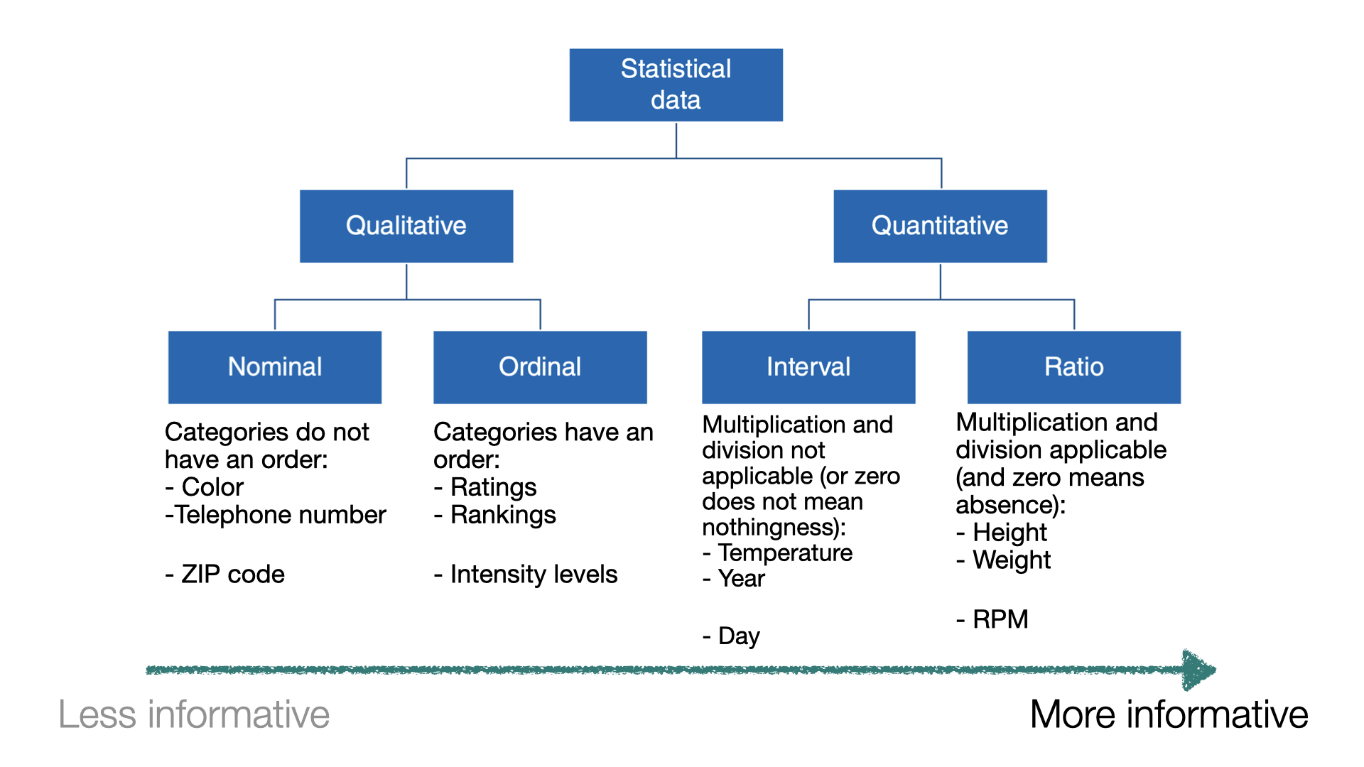
Types of data I
When a numerical quantity designating how much or how many is assigned to each item in the sample, the resulting set of values is numerical or quantitative.
- Height (in ft).
- Weight (in lbs).
- Age (in years).
Types of data II
When sample items are placed into categories and category names are assigned to the sample items, the data are categorical or qualitative.
- Hair color.
- Country of origin.
- ZIP code.
Data types
Example 1
Let’s load the data in “penguins.xlsx”.
In Python, we check the type of each variable in a dataset using the function info().
<class 'pandas.core.frame.DataFrame'>
RangeIndex: 344 entries, 0 to 343
Data columns (total 8 columns):
 #   Column             Non-Null Count  Dtype
---  ------             --------------  -----
 0   species            344 non-null    object
 1   island             344 non-null    object
 2   bill_length_mm     342 non-null    float64
 3   bill_depth_mm      342 non-null    float64
 4   flipper_length_mm  342 non-null    float64
 5   body_mass_g        342 non-null    float64
 6   sex                333 non-null    object
 7   year               344 non-null    int64
dtypes: float64(4), int64(1), object(3)
memory usage: 21.6+ KB
General Python formats
float64format for numerical variables with decimals.int64format for numerical variables with integers.objectformat for general variables with characters.
Define categorical variables
Technically, the variable sex in penguins_data is categorical. To explicitly tell this to Python, we use the following code.
Setting sex to categorical allows us to use effective visualization for this data.
We do the same for the other categorical variables species and island.
Let’s check the type of variables again.
<class 'pandas.core.frame.DataFrame'>
RangeIndex: 344 entries, 0 to 343
Data columns (total 8 columns):
 #   Column             Non-Null Count  Dtype
---  ------             --------------  -----
 0   species            344 non-null    category
 1   island             344 non-null    category
 2   bill_length_mm     342 non-null    float64
 3   bill_depth_mm      342 non-null    float64
 4   flipper_length_mm  342 non-null    float64
 5   body_mass_g        342 non-null    float64
 6   sex                333 non-null    category
 7   year               344 non-null    int64
dtypes: category(3), float64(4), int64(1)
memory usage: 14.9 KB
Summary statistics
A sample is often a long list of numbers. To help make the important features of a sample stand out, we compute summary statistics.
For numerical data, the most popular summary statistics are:
- Sample mean
- Sample variance and sample standard deviation
- Sample quartiles
- Sample maximum and minimum
Sample mean
Let \(y_1, y_2, \ldots, y_n\) be an observed sample of size \(n\).
The sample mean is
\[\bar{y} = \frac{1}{n}\sum_{i=1}^{n} y_i = \frac{y_1 + y_2 + \cdots + y_n}{n}.\]
The sample mean gives an indication of the center of the data.
In Python
The sample mean is calculated using the function .agg() with “mean”.
bill_length_mm    43.92193
dtype: float64
We use the function print to show the number. Otherwise, Python will show the computer type of value stored in bill_length_mean.
You can also round the result to, say, three decimals.
Sample variance
Let \(y_1, y_2, \ldots, y_n\) be an observed sample of size \(n\). The sample mean is
\[ s^2 = \frac{1}{n-1} \sum_{i=1}^{n} (y_i - \bar{y})^2 = \frac{(y_1 - \bar{y})^2 + \cdots + (y_n - \bar{y})^2}{n-1} \]
The sample variance is like an average of the squared differences between each observation and the sample mean.
It gives an indication of how spread out the data are.
In Python, the sample variance is calculated using the function agg() with “var”.
Sample standard deviation
A drawback of the sample variance is that it is not on the same scale as the actual observations.
To obtain a measure of spread whose units are the same as those of the sample, we simply take the squared root of the sample variance
\[ s = \left(\frac{1}{n-1} \sum_{i=1}^{n} (y_i - \bar{y})^2 \right)^{1/2} \]
This quantity is known as the sample standard deviation. It is in the same units as the observations.
In Python, the sample variance is calculated using the function agg() with “std”.
Sample quartiles
The sample median is the middle number of the ordered data values.
Sample quartiles divide the data as nearly as possible into quarters:
First quartile (\(Q_1\)) is the median of the lower half of the data.
Second quartile (\(Q_2\)) is the median of the data.
Third quartile (\(Q_3\)) is the median of the upper half of the data.

In Python, the quartiles are calculated using the function quantile().
Sample maximum and minimum
Other relevant summary statistics are the maximum and minimum, which are calculated using the functions max() and min(), respectively.
bill_length_mm    59.6
dtype: float64Summary statistics for categorical data
The most commonly used statistical summaries for categorical data are:
The frequency of a category is the number of observations that belong to that category.
The relative frequency is the frequency divided by the total number of observations.
Frequency table
Summarizes a categorical variable by counting the values per category.
| Specie | Frequency |
|---|---|
| Adelie | 152 |
| Chinstrap | 68 |
| Gentoo | 124 |
| Total | 344 |
Frequency: Number of observations in each category.
Total: Total sum of observations.
Relative Frequency Table
Summarizes a categorical variable by calculating the proportion of values per category.
| Specie | Relative Frequency |
|---|---|
| Adelie | 0.4418605 |
| Chinstrap | 0.1976744 |
| Gentoo | 0.3604651 |
| Sum | 1 |
- Relative frequency: Number of observations in each category divided by the total.
Data visualizations
Example 2
A criminologist is developing a rule-based system to classify the types of glasses encountered in criminal investigations.
The data consist of 214 glass samples labeled as one of seven class categories.
There are nine predictors, including refractive index and percentages of eight elements: Na, Mg, AL, Is, K, Ca, Ba, and Fe. The response is the type of glass.
The dataset is in the file “glass.xlsx”. Let’s load it using pandas.
The variable Type is categorical. So, let’s ensure Python knows this using the code below.
matplotlib library
- matplotlib is a comprehensive library for creating static, animated, and interactive visualizations in Python
- It is widely used in the data science community for plotting data in various formats
- Ideal for creating simple visualizations like line plots, bar charts, scatter plots, and more
- https://matplotlib.org/

seaborn library
- seaborn is a Python library built on top of Matplotlib
- Designed to make statistical data visualization easy and beautiful
- Ideal for creating informative and attractive visualizations with minimal code
- https://seaborn.pydata.org/index.html

Importing the libraries
The matplotlib and seaborn libraries are pre-installed in Google Colab. However, we need to inform Google Colab that we want to use them and its functions using the following command:
Similar to pandas, the command as sns allows us to have a short name for seaborn. Similarly, we rename matplotlib as plt.
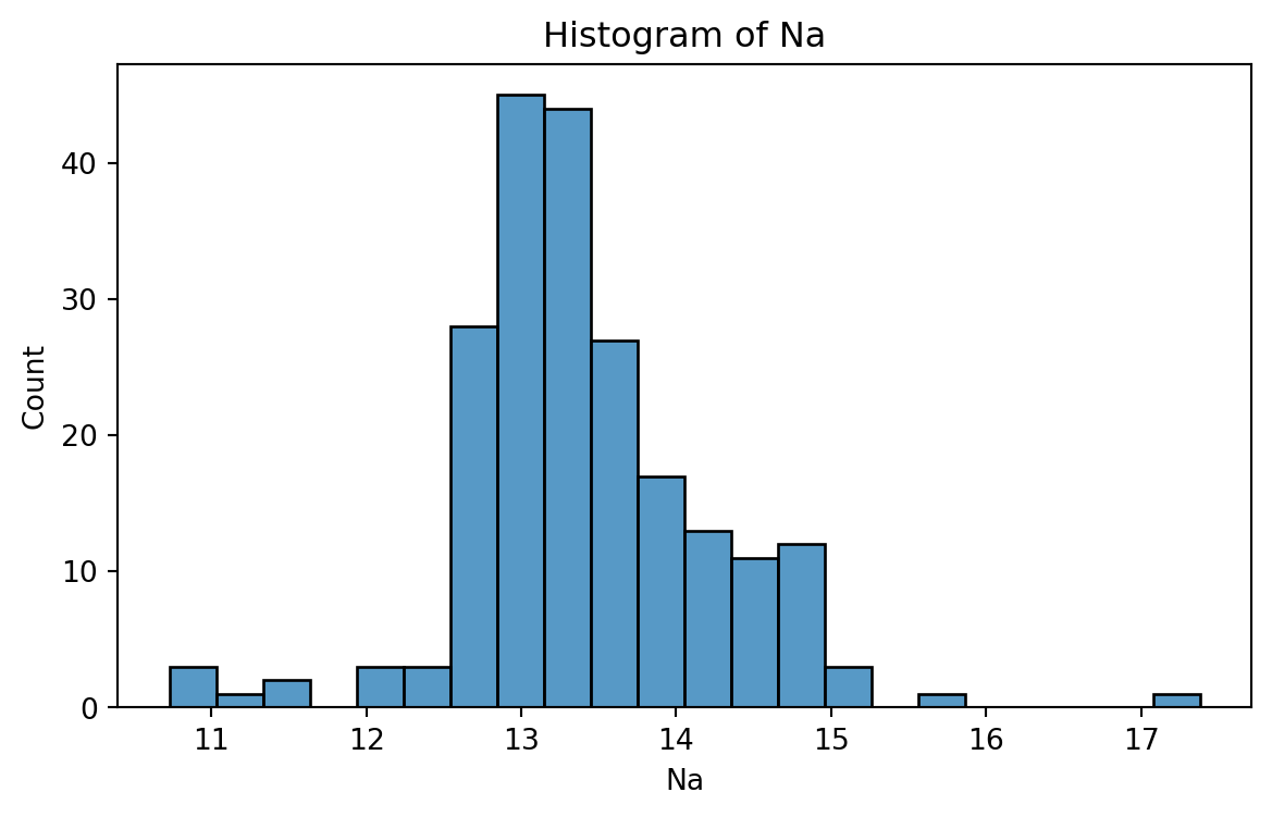
Histogram
Graphical display that gives an idea of the “shape” of the sample, indicating regions where sample points are concentrated and regions where they are sparse.
The bars of the histogram touch each other. A space indicates that there are no observations in that interval.
Histogram of Na
To create a histogram, we use the function histplot() from seabron.
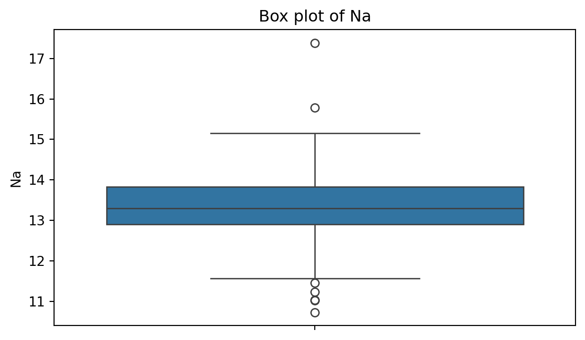
Box plot
A box plot is a graphic that presents the median, the first and third quartiles, and any “outliers” present in the sample.
The interquartile range (IQR) is the difference between the third quartile and the first quartile (\(Q_3 - Q_1\)). This is the distance needed to span the middle half of the data.
Anatomy of a box plot
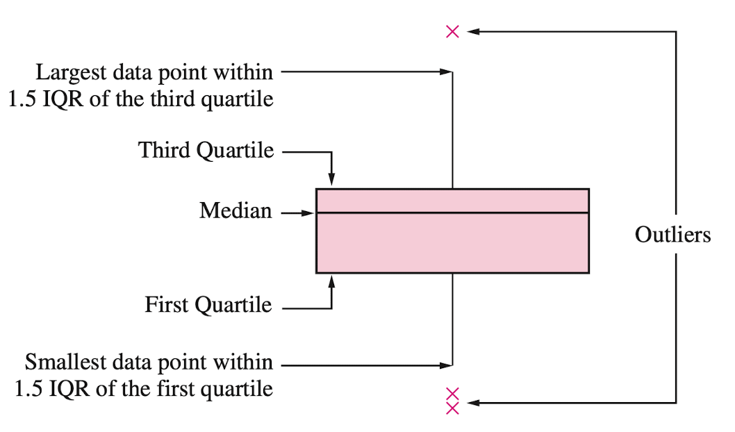
See also https://towardsdatascience.com/why-1-5-in-iqr-method-of-outlier-detection-5d07fdc82097
Box plot of Na
To create a boxplot, we use the function boxplot() from seabron.
Outliers
Outliers are points that are much larger or smaller than the rest of the sample points.
Outliers may be data entry errors or they may be points that really are different from the rest.
Outliers should not be deleted without considerable thought—sometimes calculations and analyses will be done with and without outliers and then compared.
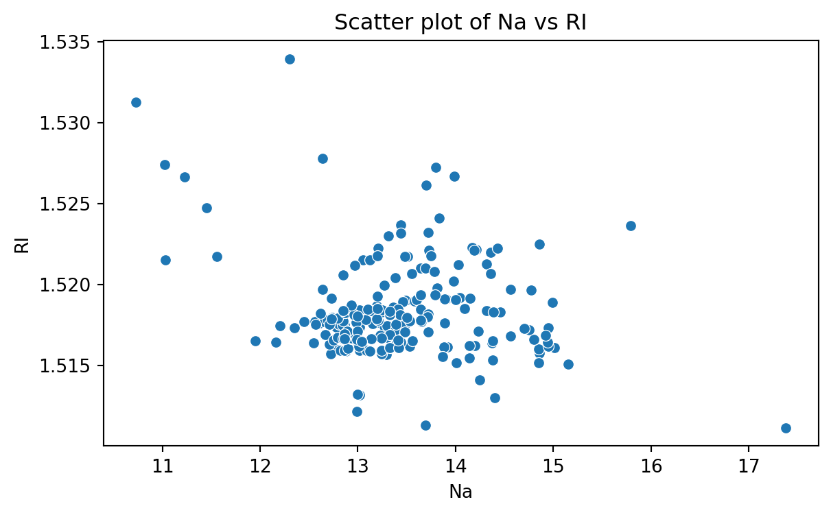
Scatter plot
Data for which items consists of a pair of numeric values is called bivariate. The graphical summary for bivariate data is a scatterplot.
The variables \(X\) and \(Y\) are placed on the horizontal and vertical axes, respectively. Each point on the graph marks the position of a pair of values of \(X\) and \(Y\).
A scatterplot allows us to explore lineal and nonlinear relationships between two variables.
Scatter plot of Na versus RI
To create a scatter plot, we use the function scatter() from seabron. In this function, you must state the
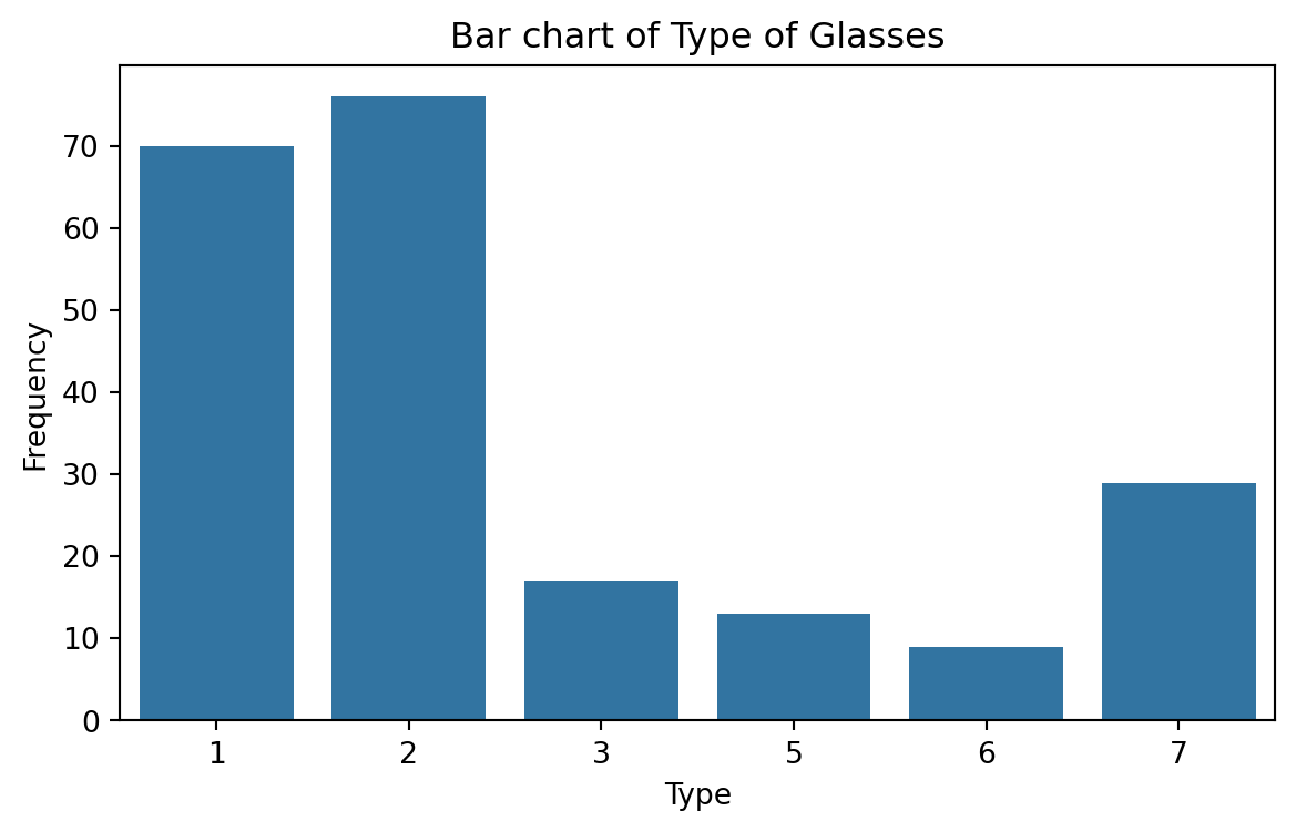
Bar charts
Bar charts are commonly used to describe qualitative data classified into various categories based on sector, region, different time periods, or other such factors.
Different sectors, different regions, or different time periods are then labeled as specific categories.
A bar chart is constructed by creating categories that are represented by labeling each category and which are represented by intervals of equal length on a horizontal axis.
The count or frequency within the corresponding category is represented by a bar of height proportional to the frequency.
We create the bar chart using the function countplot() from seaborn.
Saving plots
We save a figure using the save.fig function from matplotlib. The dpi argument of this function sets the resolution of the image. The higher the dpi, the better the resolution.
Improving the figure
We can also use other functions to improve the aspect of the figure:
plt.title(fontsize): Font size of the title.plt.ylabel(fontsize): Font size of y axis title.plt.xlabel(fontsize): Font size of x axis title.plt.yticks(fontsize): Font size of the y axis labels.plt.xticks(fontsize): Font size of the x axis labels.
plt.figure(figsize=(5, 5))
sns.countplot(data = glass_data, x = 'Type')
plt.title('Relative Frequency of Each Category', fontsize = 12)
plt.ylabel('Relative Frequency', fontsize = 12)
plt.xlabel('Category', fontsize = 15)
plt.xticks(fontsize = 12)
plt.yticks(fontsize = 12)
plt.savefig('bar_chart.png',dpi=300)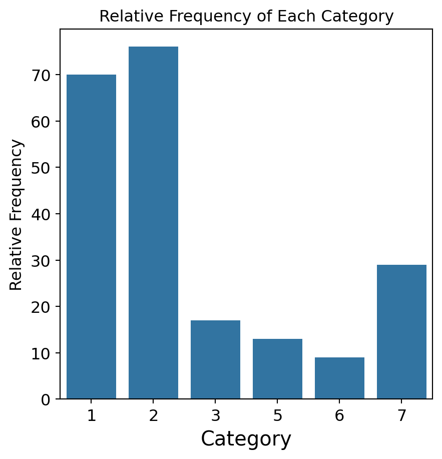
Return to main page
Tecnologico de Monterrey
