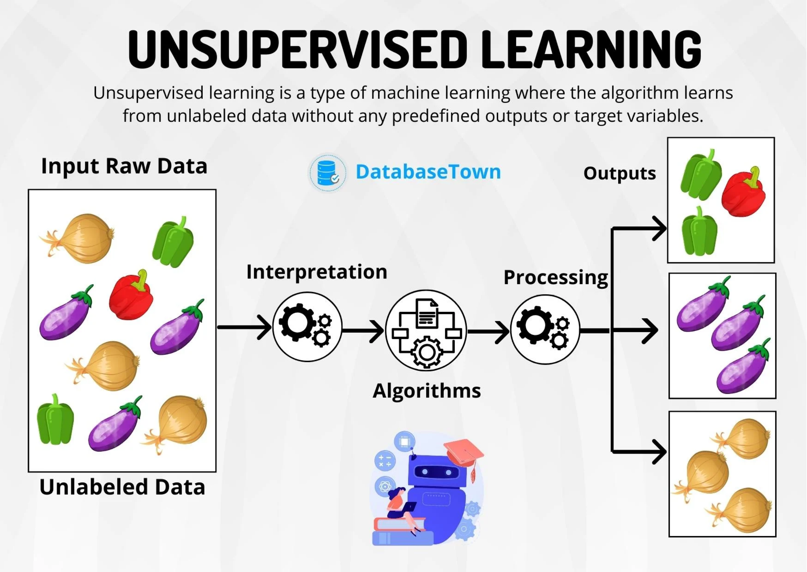
Clustering Methods
IN5148: Statistics and Data Science with Applications in Engineering
Example 1
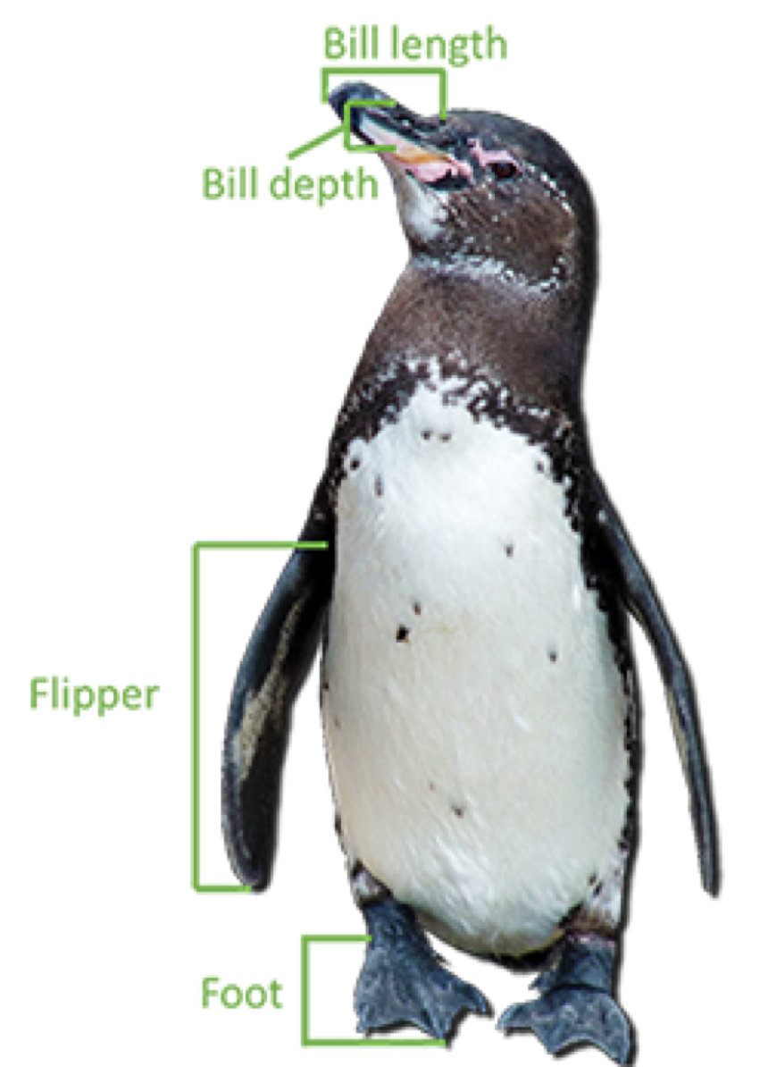
The “penguins.xlsx” database contains data on 342 penguins in Antarctica. The data includes:
- Bill length in millimeters.
- Bill depth in millimeters.
- Flipper length in millimeters.
- Body mass in grams.
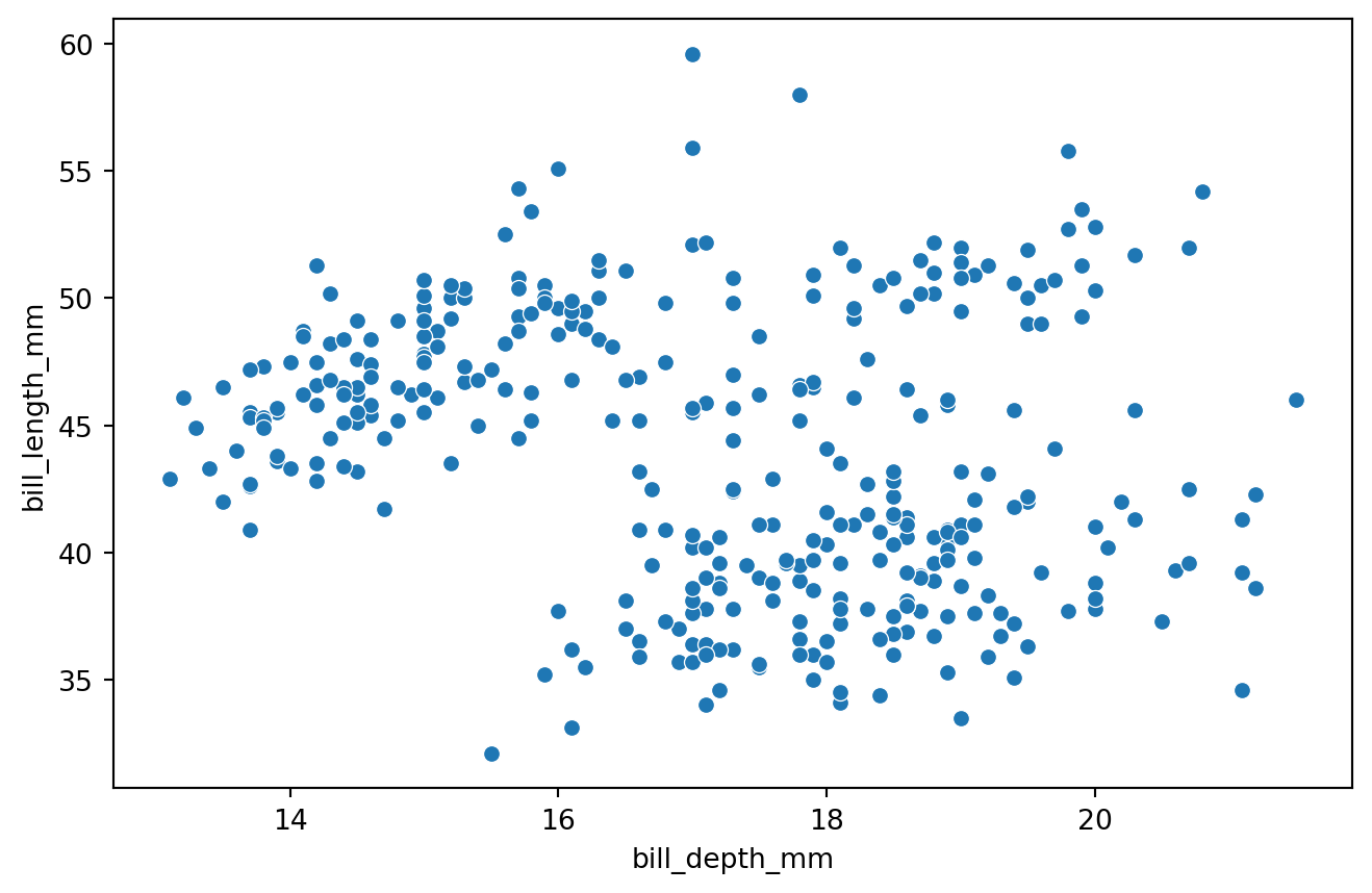
Data visualization
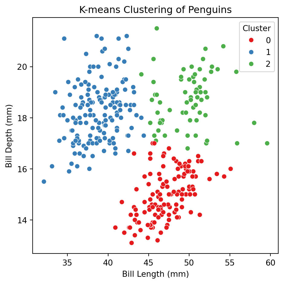
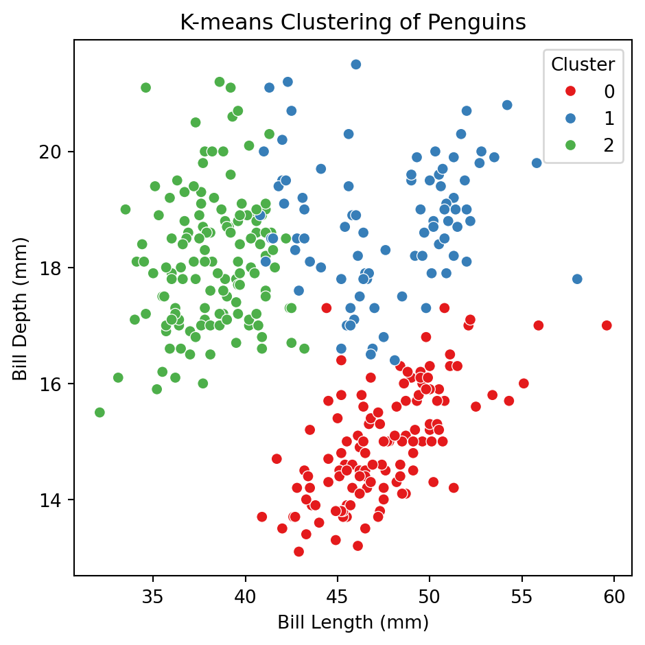
Can we group penguins based on their characteristics?
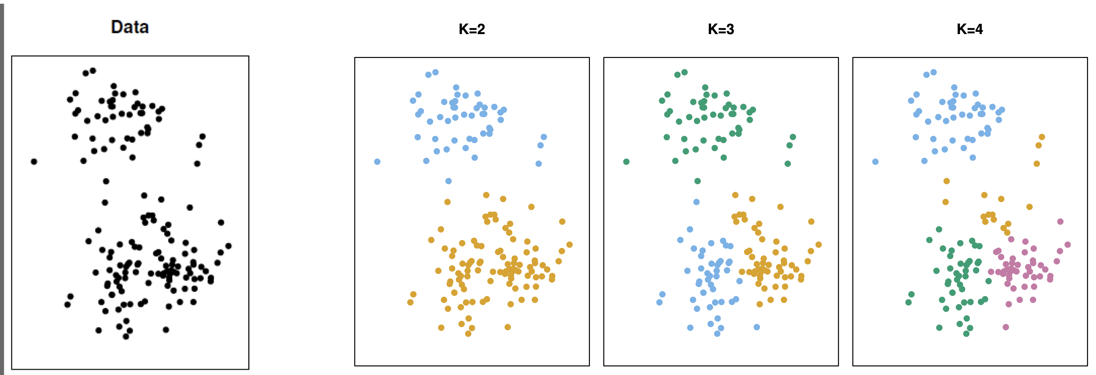
The K-Means method
Goal: Find K groups of observations such that each observation is in a different group.
Euclidean distance
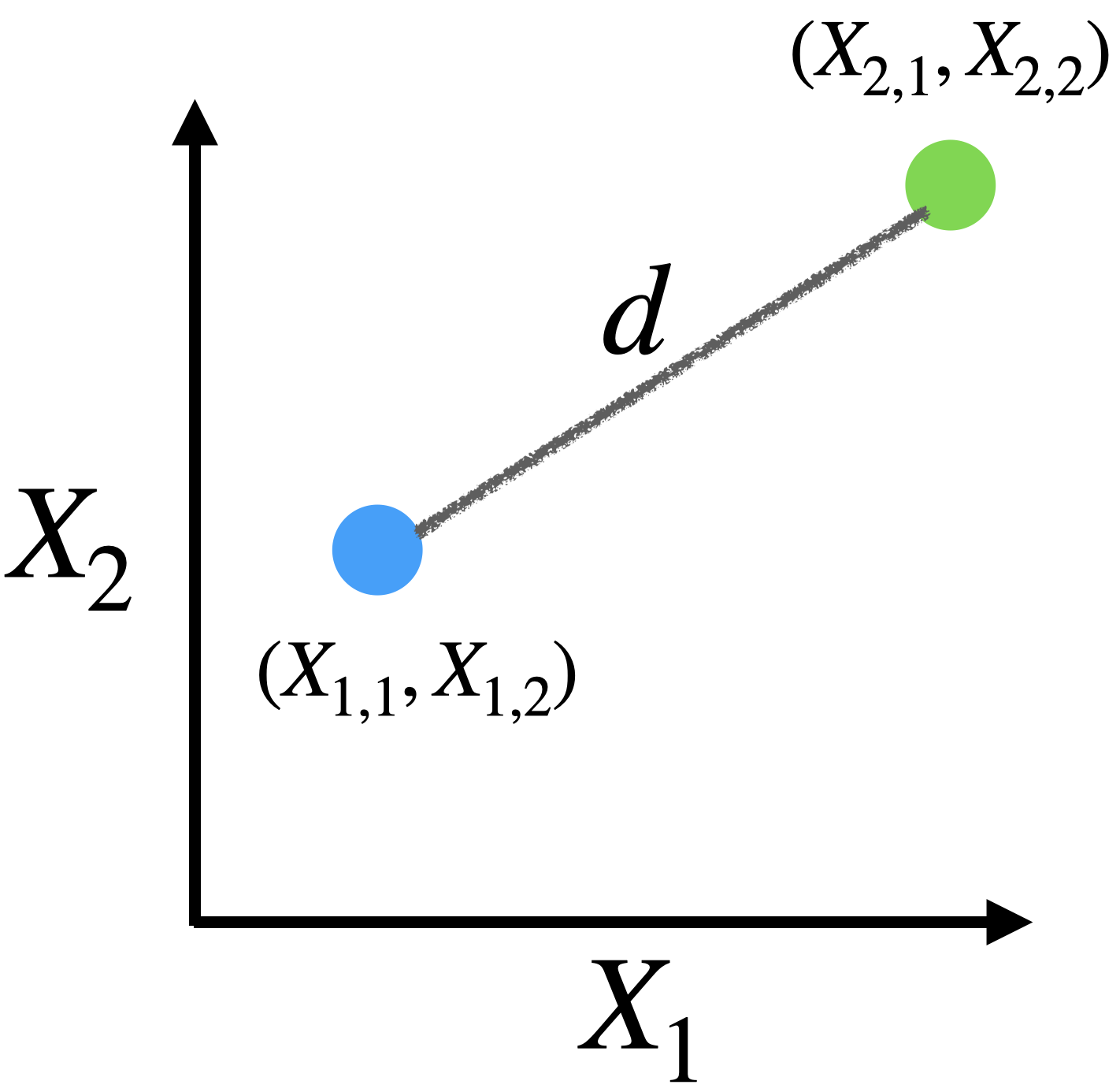
\[d = \sqrt{(X_{1,1} - X_{2,1})^2 + (X_{1,2} - X_{2,2})^2 }\]
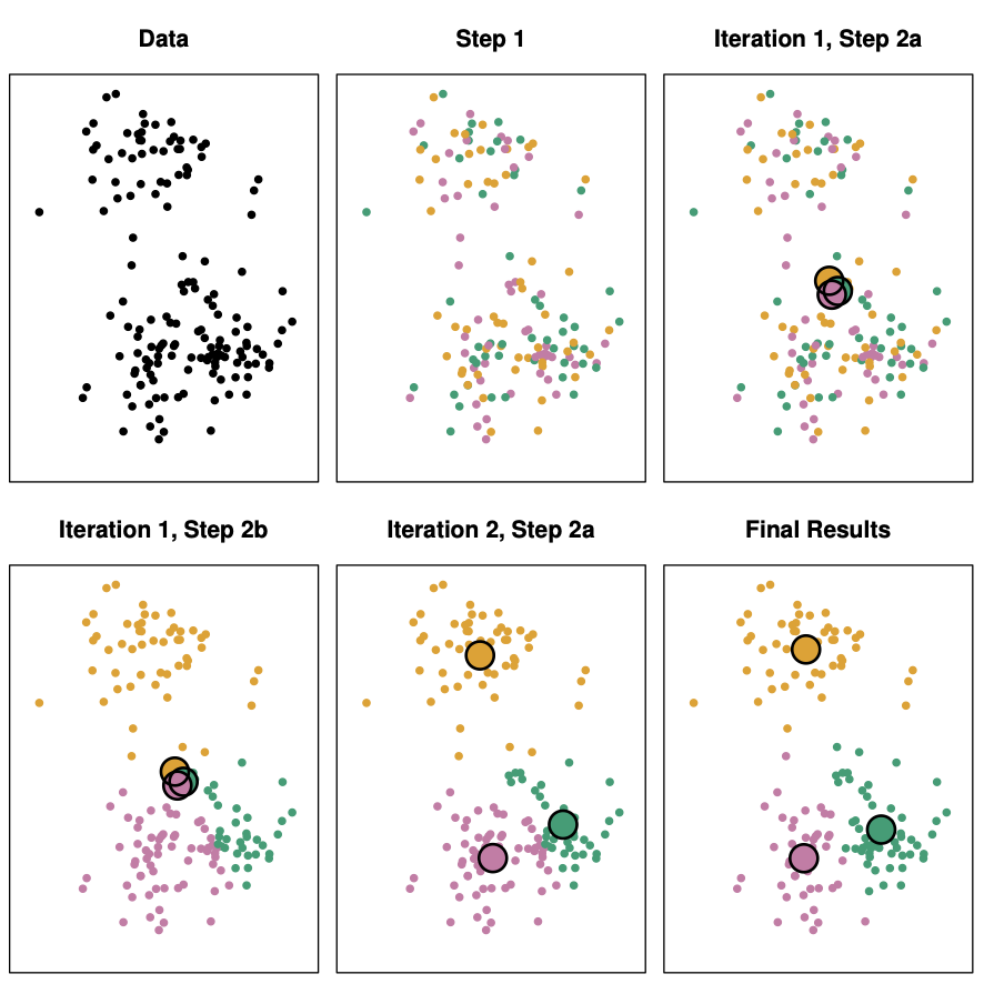
K-Means Algorithm
Choose a value for K, the number of groups.
- Randomly assign observations to one of the K groups.
- Find the centroids (average points) of each group.
- Reassign observations to the group with the closest centroid.
- Repeat steps 3 and 4 until there are no more changes.
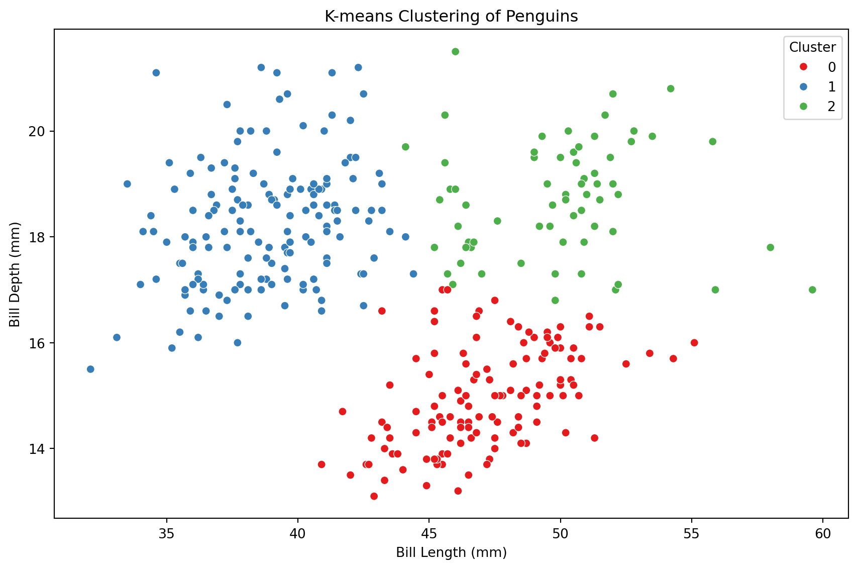
Code
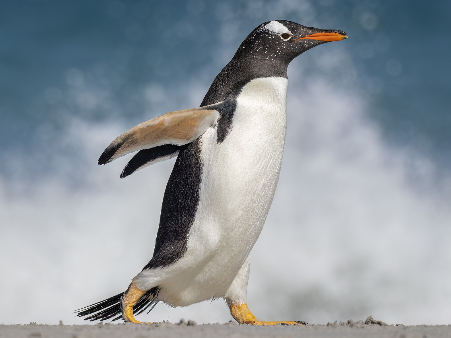
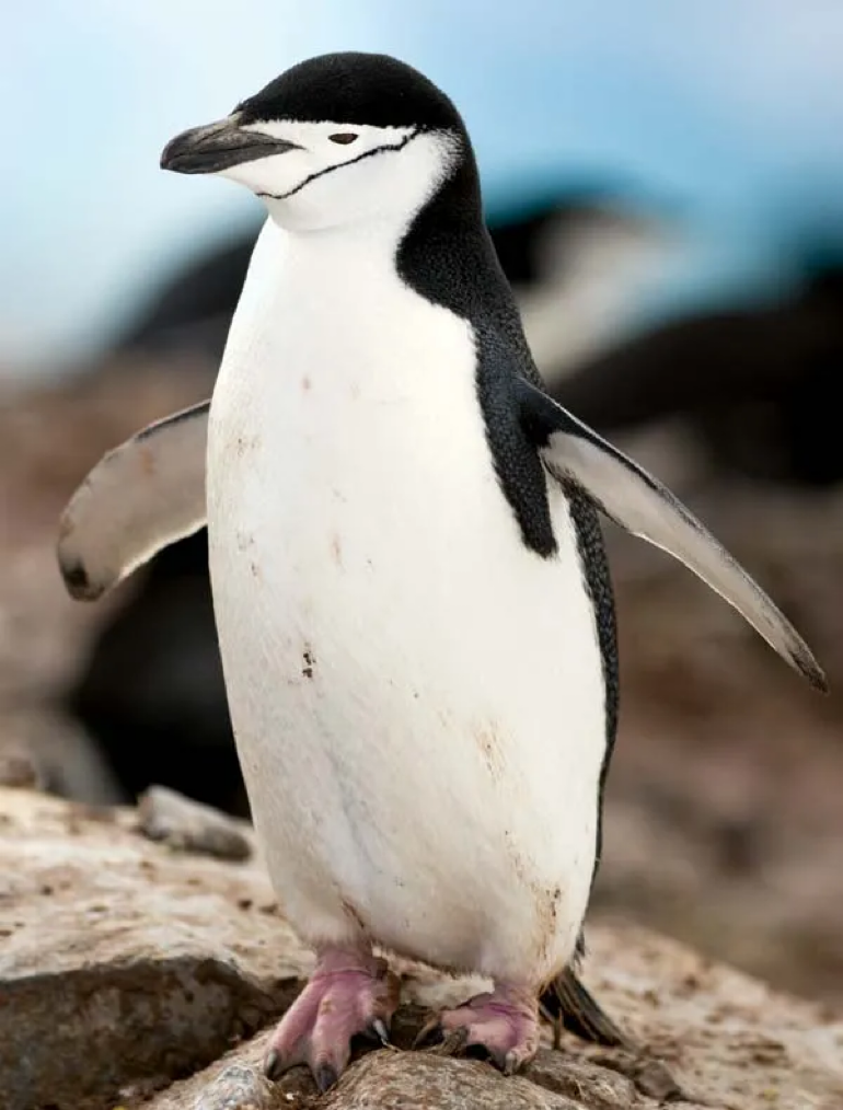
The truth: 3 groups of penguins
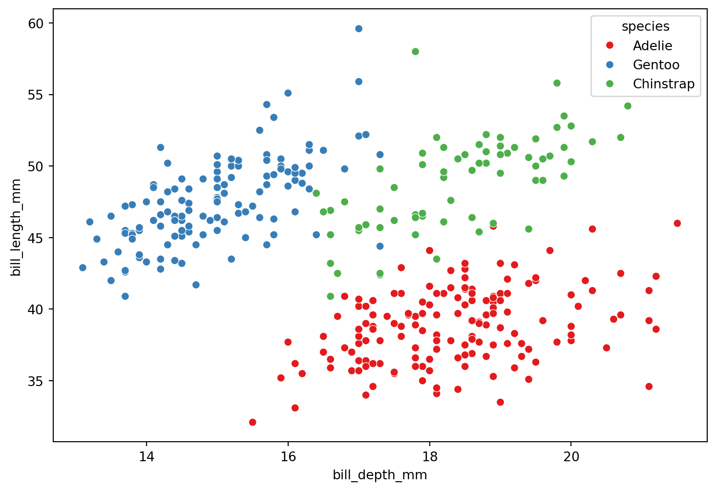

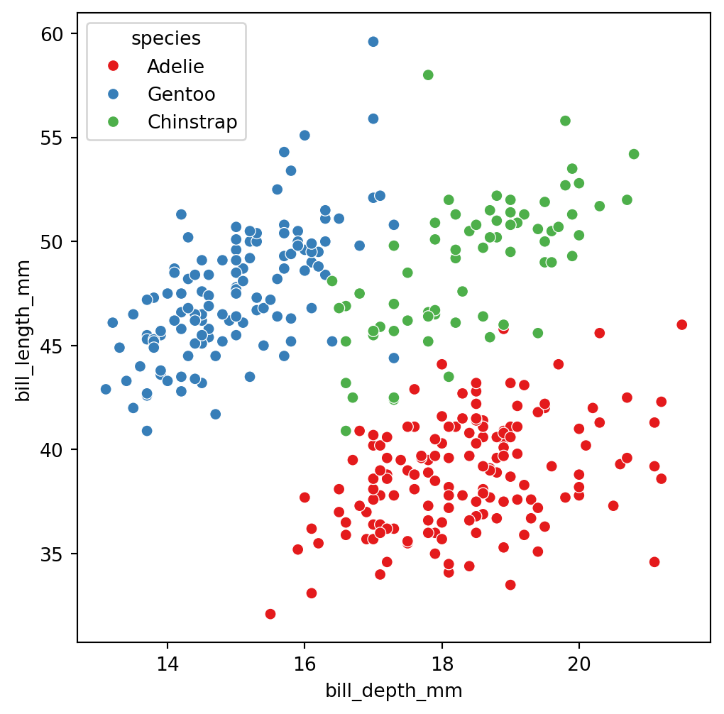
These are the three species
Adelie
Gentoo
Chinstrap
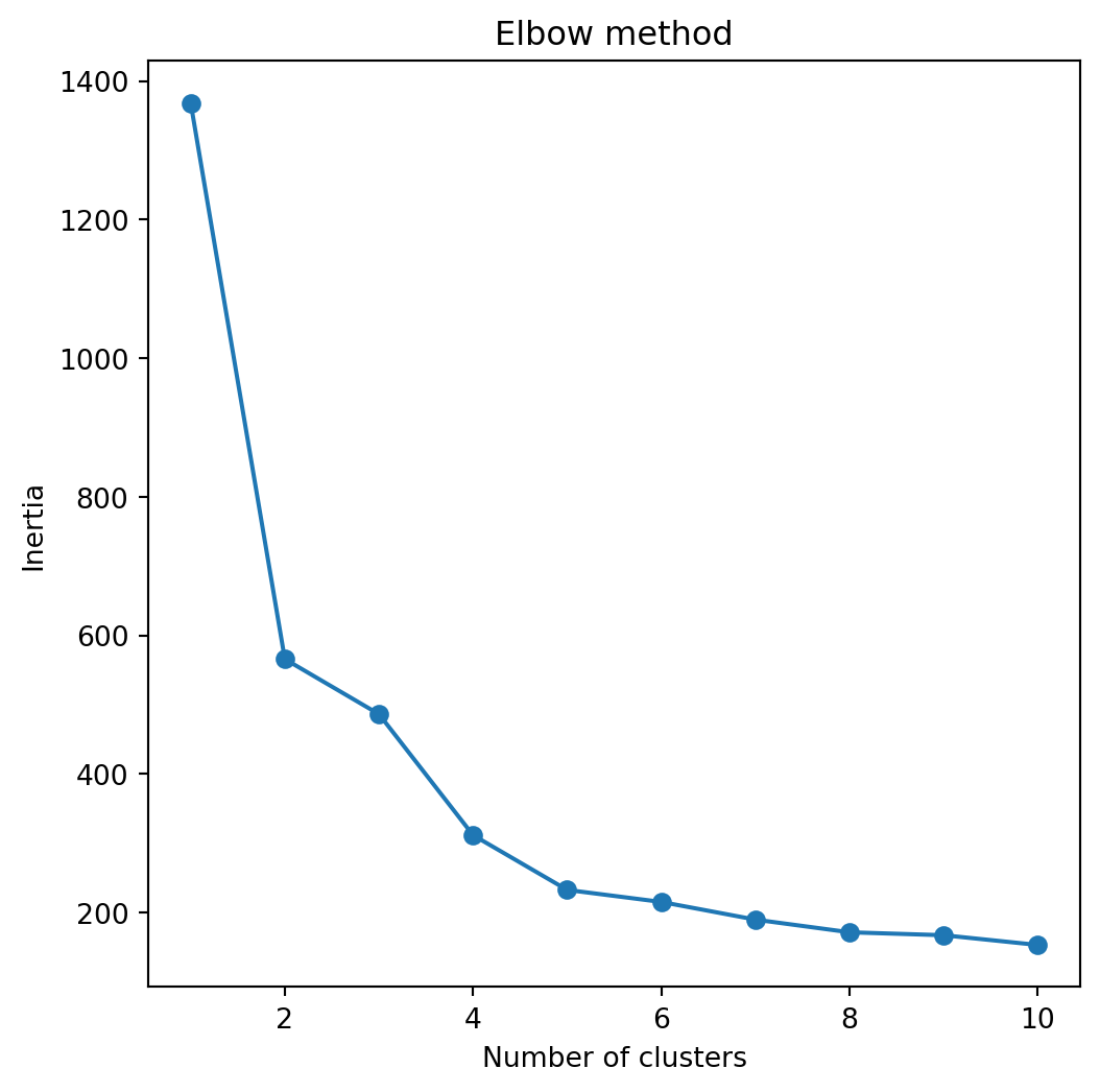
Next, we plot the intertias and look for the elbow in the plot.
The elbow represents a number of clusters for which there is no significant improvement in the quality of the clustering.
In this case, the number of clusters recommended by this elbow method is 3.
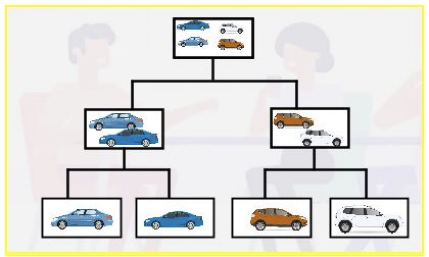
Hierarchical clustering
Start with each observation standing alone in its own group.
Then, gradually merge the groups that are close together.
Continue this process until all the observations are in one large group.
Finally, step back and see which grouping works best.
Distance between two groups
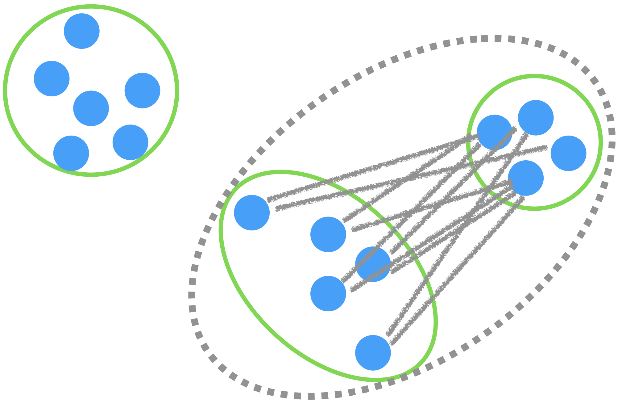
The distance between two groups of observations is called linkage.
There are several types of linking. The most commonly used are:
- Complete linkage
- Average linkage
Complete linkage
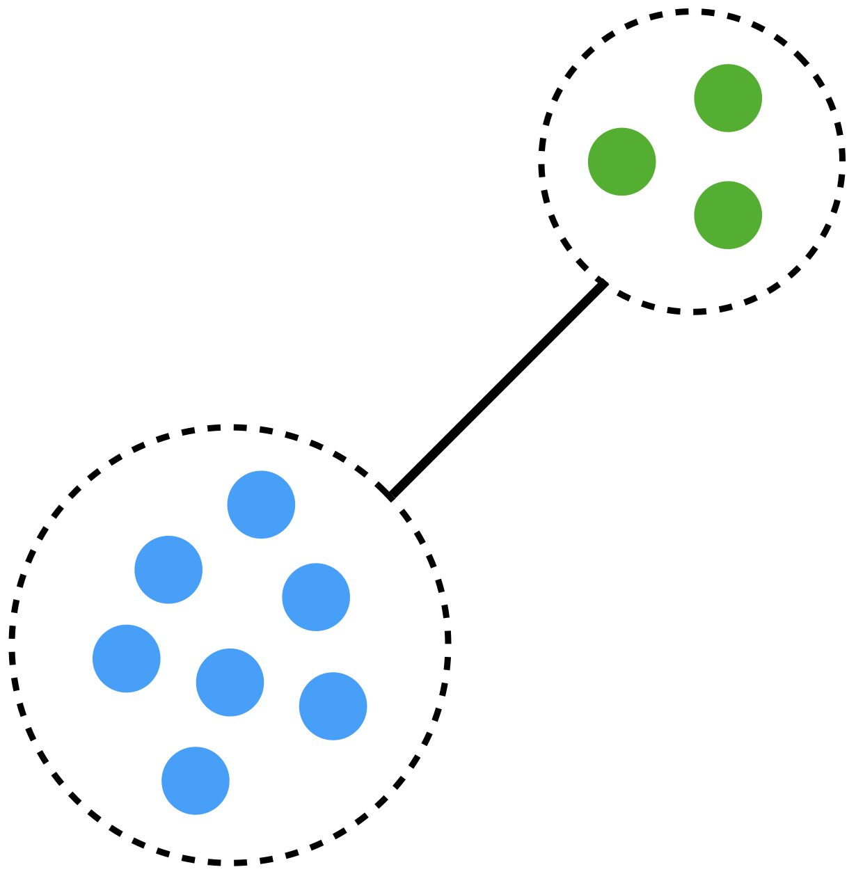
The distance between groups is measured using the largest distance between observations.
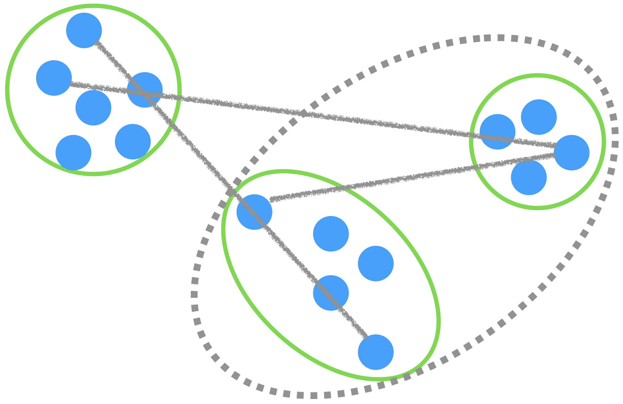
Average linkage
The distance between groups is the average of all the distances between observations.
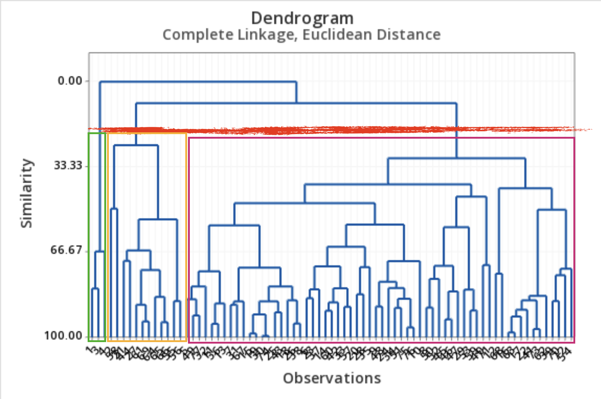
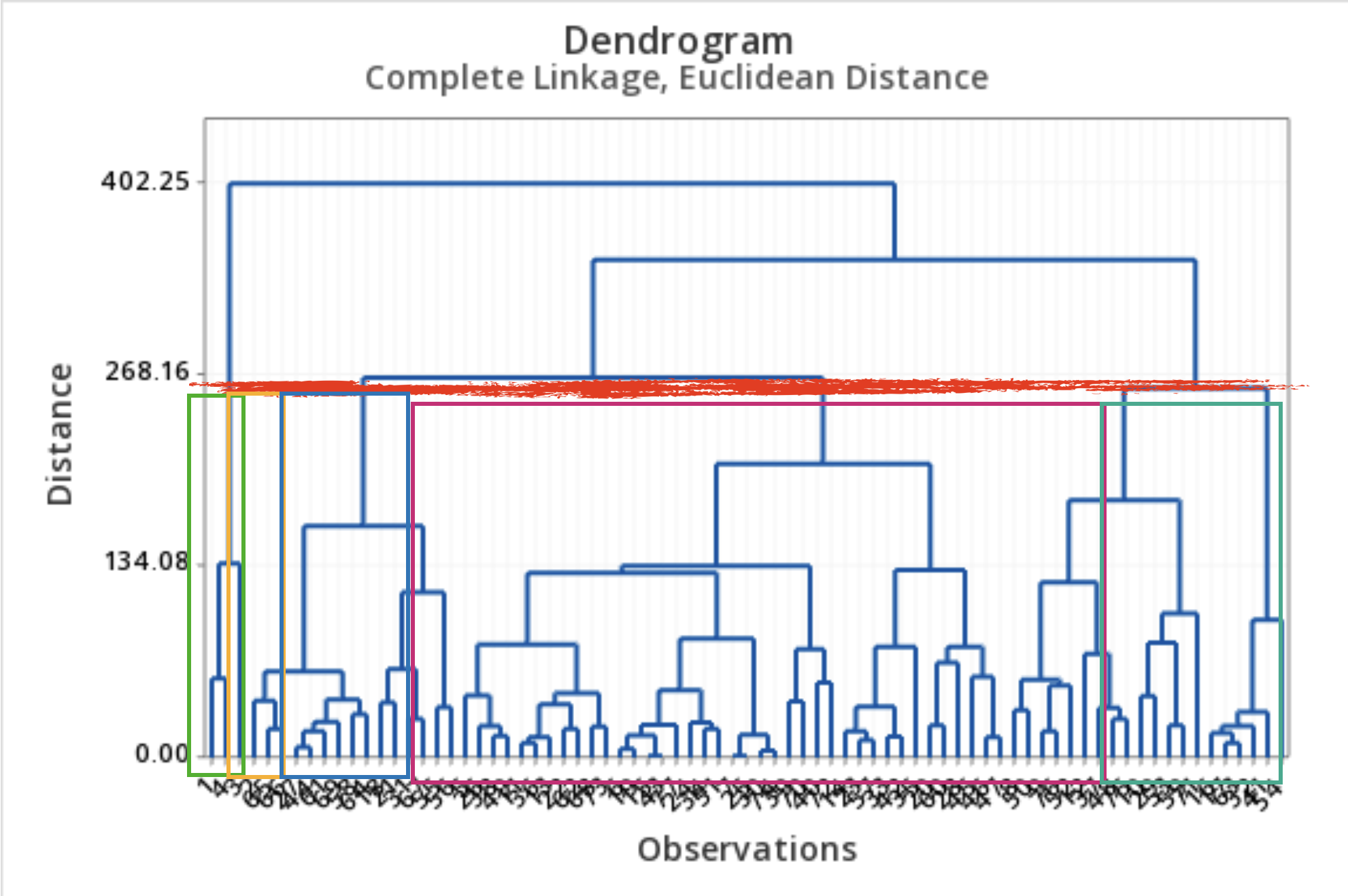
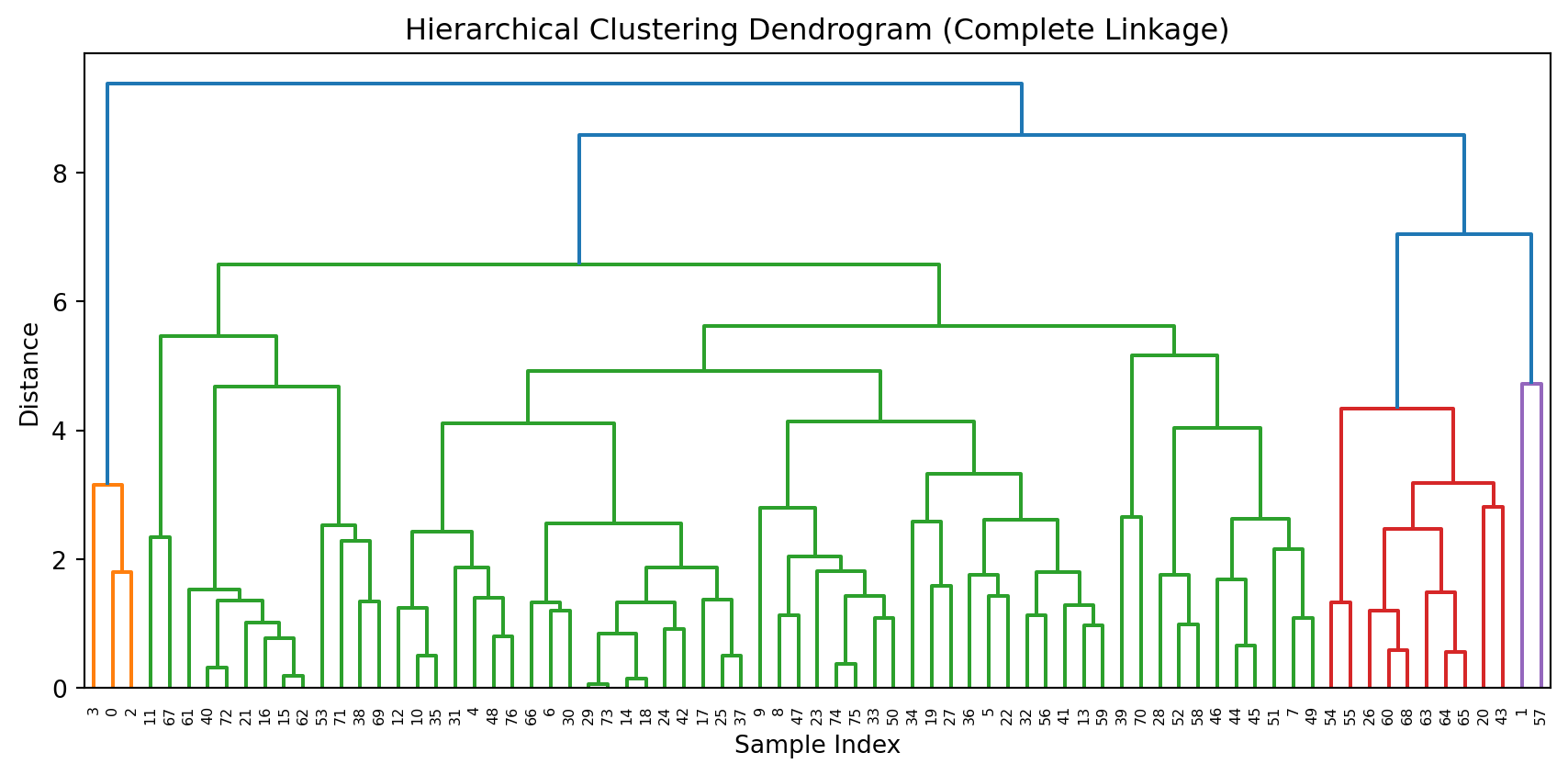
Results: Dendrogram
- A dendrogram is a tree diagram that summarizes and visualizes the clustering process.
- Observations are on the horizontal axis and at the bottom of the diagram.
- The vertical axis shows the distance between groups.
- It is read from top to bottom.
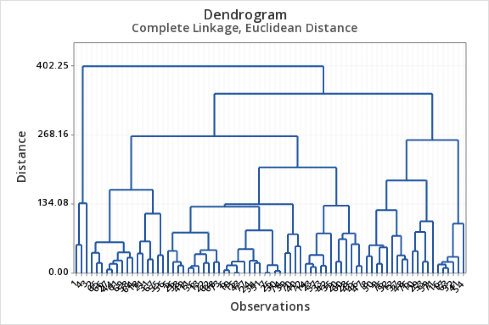
What to do with a dendrogram?
We draw a horizontal line at a specific height to define the groups.
This line defines three groups.
This line defines 5 groups.
Dendrogram in Python
To produce a nice dendrogram in Python, we use the function dendrogram from scipy.
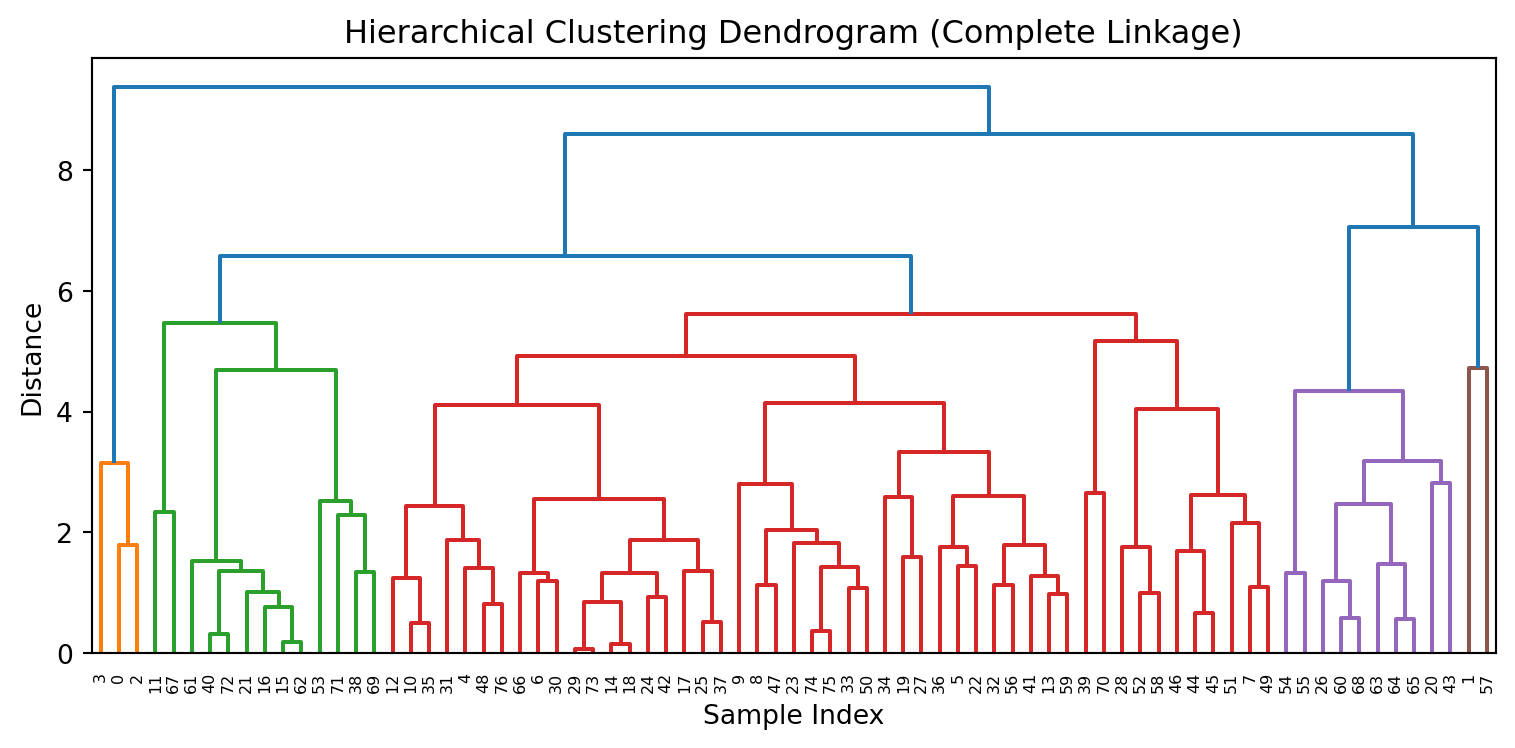
We specify the threshold to cut the dendrogram and set the groups using the color_threshold argument in dendrogram().
Comments
Selecting the number of clusters K is more of an art than a science. You’d better get K right, or you’ll be detecting patterns where none really exist.
We need to standardize all predictors.
The performance of K-means clustering is affected by the presence of outliers.
The algorithm’s solution is sensitive to the starting point. Because of this, it is typically run multiple times, and the best clustering among all runs is reported.