Principal Component Analysis
IN5148: Statistics and Data Science with Applications in Engineering
Dispersion in one dimension
The concept of principal components requires an understanding of the dispersion or variability of the data.
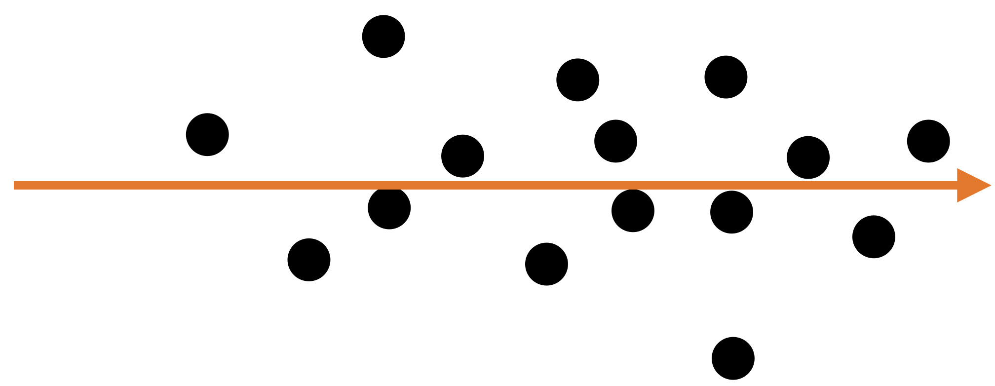
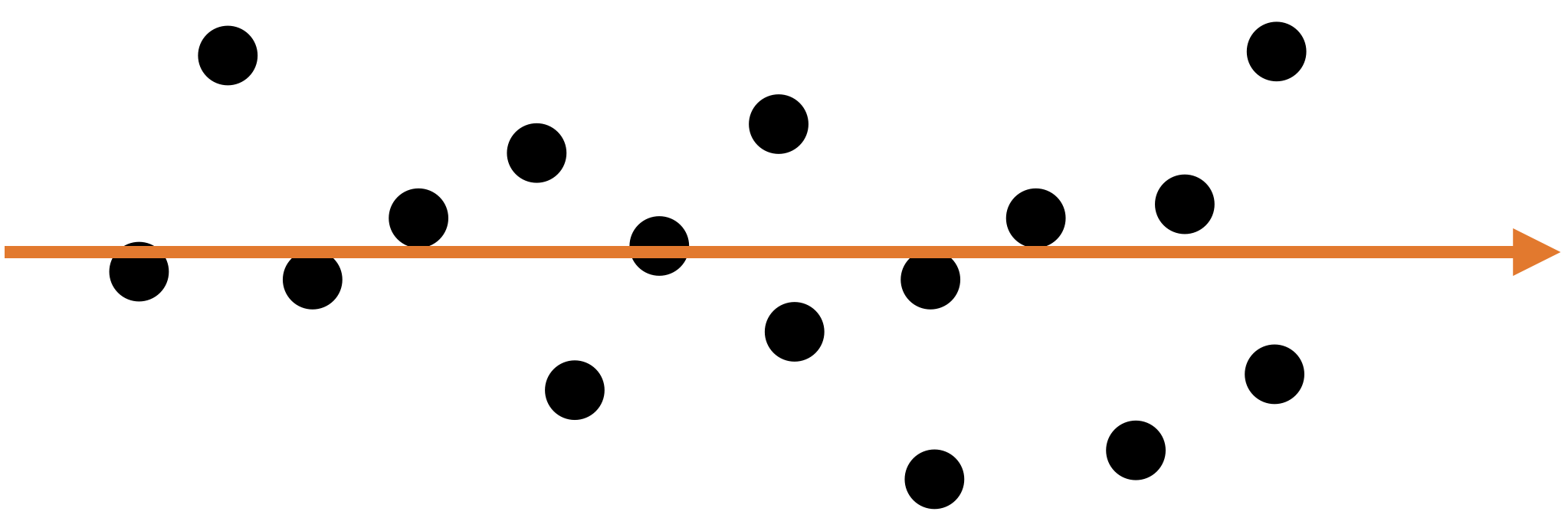
Suppose we have data for a single predictor.

Dispersion in two dimensions
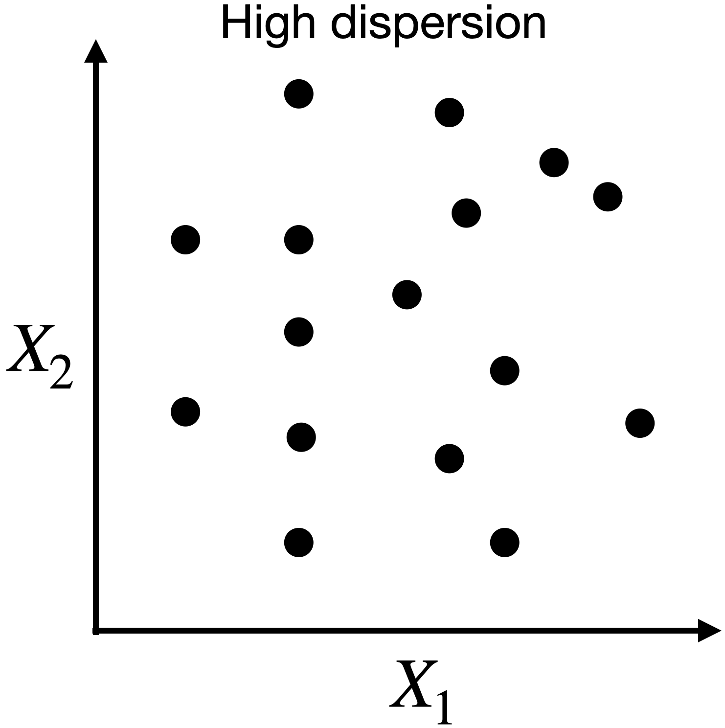
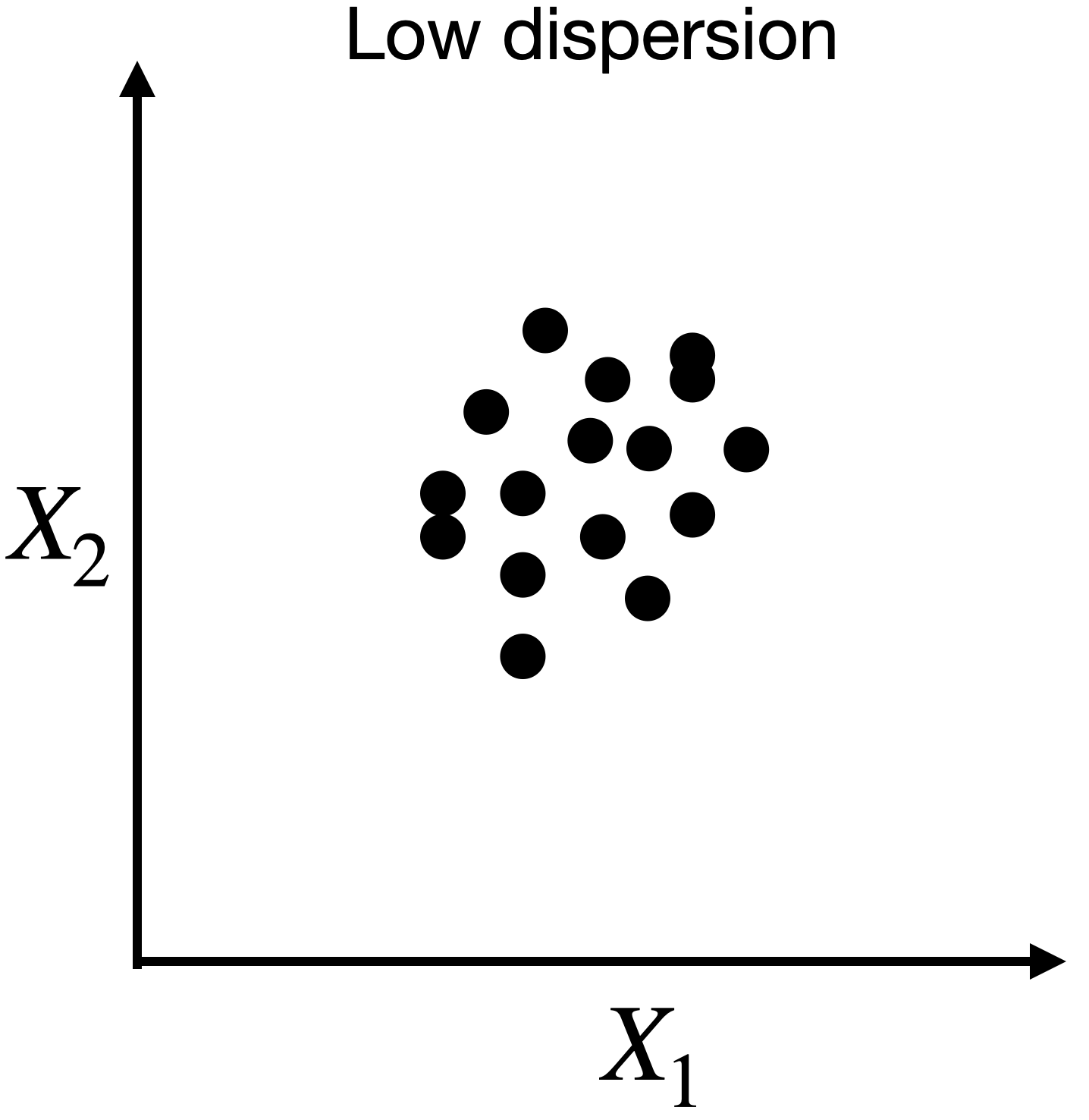
Capturing dispersion
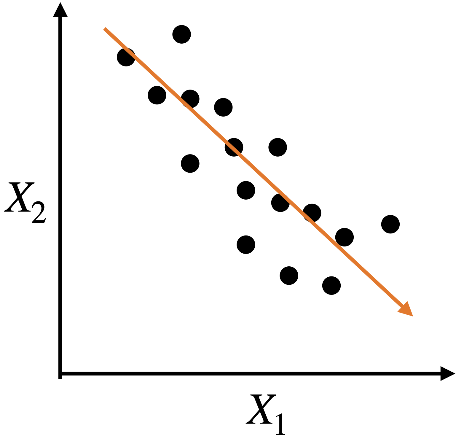
In some cases, we can capture the spread of data in two dimensions (predictors) using a single dimension.
Capturing dispersion
In some cases, we can capture the spread of data in two dimensions (predictors) using a single dimension.
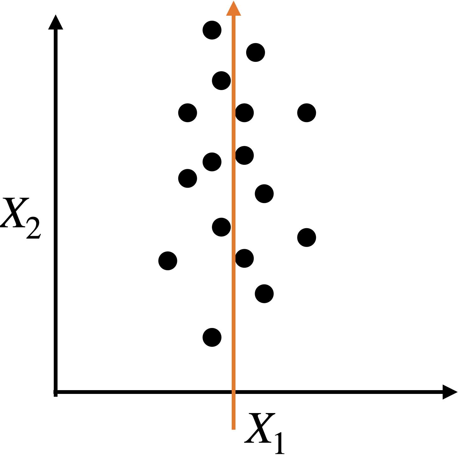
A single predictor \(X_2\) captures much of the spread in the data.
Let’s see another example
Let’s see another example
A single predictor captures much of the dispersion in the data. In this case, the new predictor has the form \(Z_1 = a X_1 + b X_2 + c.\)
Alternatively, we can use two alternative dimensions to capture the dispersion.
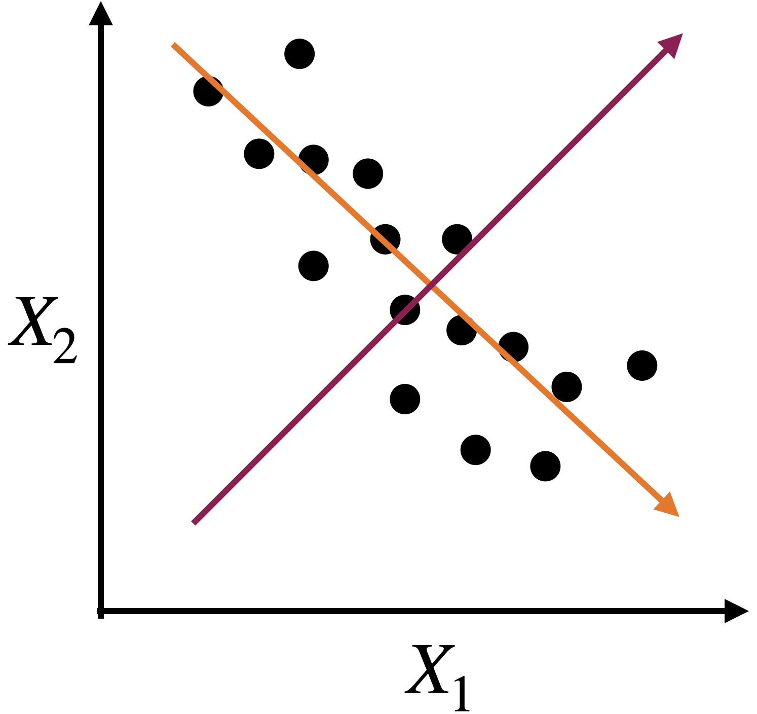
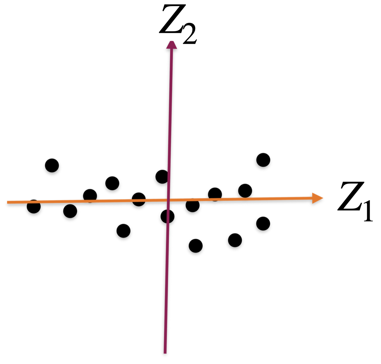
A new coordinate system
The new coordinate axis is given by two new predictors, \(Z_1\) and \(Z_2\). Both are given by linear equations of the new predictors.
The first axis, \(Z_1\), captures a large portion of the dispersion, while \(Z_2\) captures a small portion from another angle.
The new axes, \(Z_1\) and \(Z_2\), are called principal components.
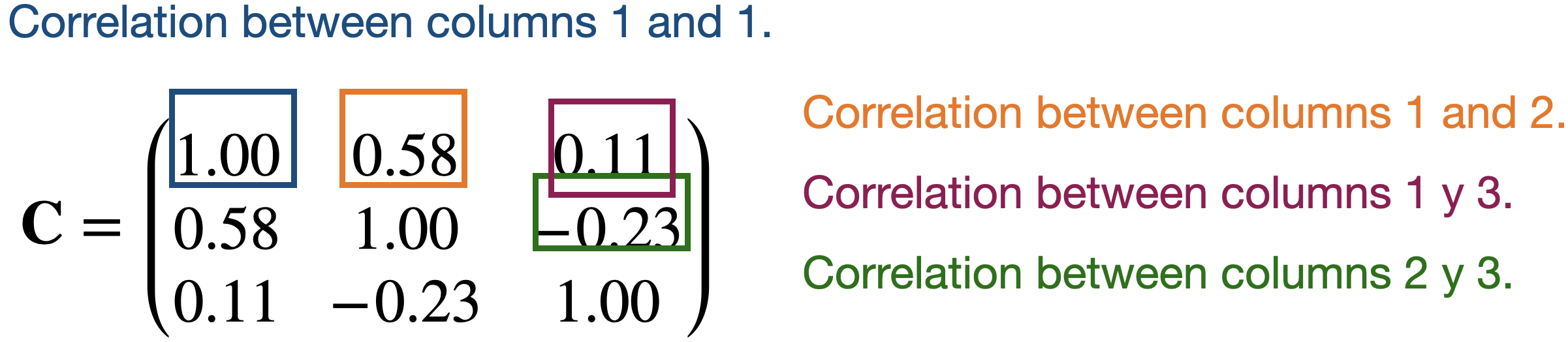
Correlation matrix
Continuing with our example, the correlation matrix contains the correlations between two columns of \(\mathbf{X}\).
Partitioning the correlation matrix
The \(\mathbf{C}\) matrix is partitioned using the eigenvalue and eigenvector decomposition method.
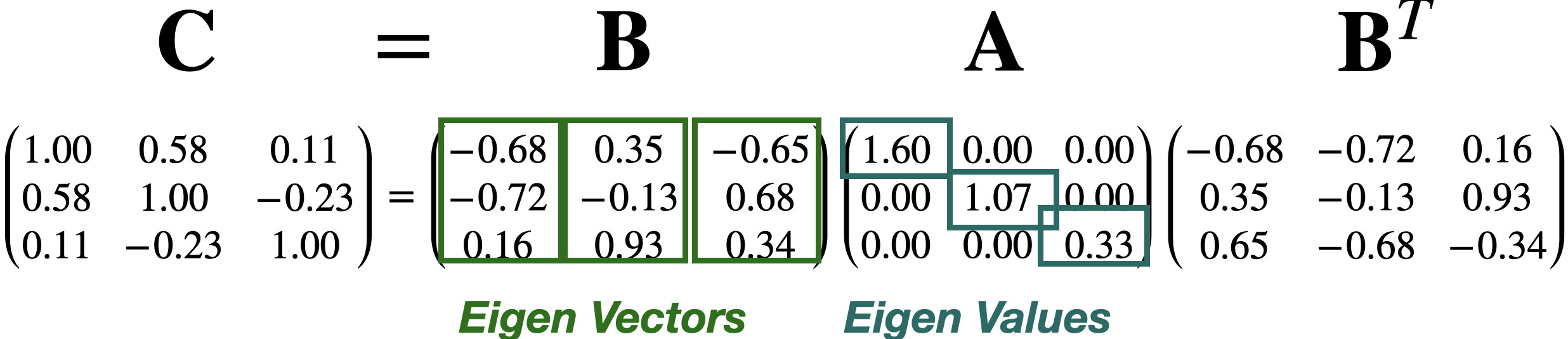
The columns of \(\mathbf{B}\) define the axes of the new coordinate system. These axes are called principal components.
The diagonal values in \(\mathbf{A}\) define the individual importance of each principal component (axis).
Approximations are useful for storing large matrices.
This is because we only need to store the largest eigenvalues and their corresponding eigenvectors to recover a high-quality approximation of the entire matrix.
This is the idea behind image compression.

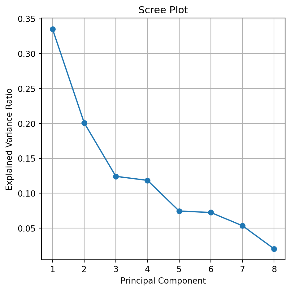
The Scree or Summary Plot tells you the variability captured by each component. This variability is given by the Eigenvalue. From 1 to 8 components.
The first component covers most of the data dispersion.
This graph is used to define the total number of components to use.
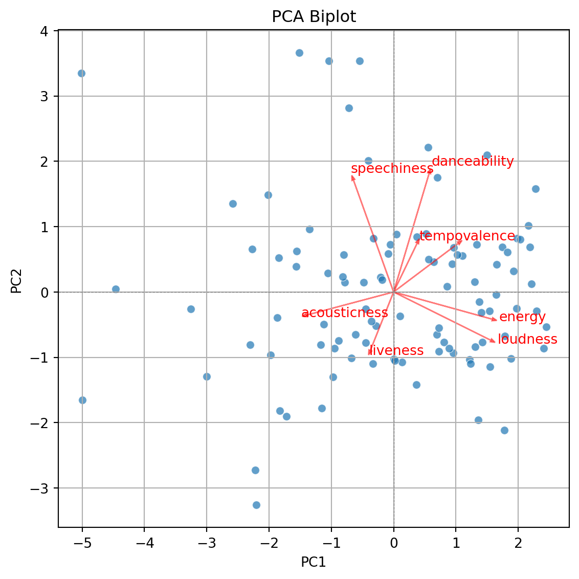
Biplot
- Displays the graphical observations on the new coordinate axis given by the first two components.
- Helps visualize data for three or more predictors using a two-dimensional scatter plot.
- A red line indicates the growth direction of the labeled variable.
Step 2. Create biplot of first two principal components
Code
plt.figure(figsize=(10, 5.5))
sns.scatterplot(x=pca_df['PC1'], y=pca_df['PC2'], alpha=0.7)
plt.xlabel('PC1')
plt.ylabel('PC2')
plt.title('PCA Biplot')
plt.grid(True)
plt.tight_layout()
plt.axhline(0, color='gray', linestyle='--', linewidth=0.5)
plt.axvline(0, color='gray', linestyle='--', linewidth=0.5)
plt.show()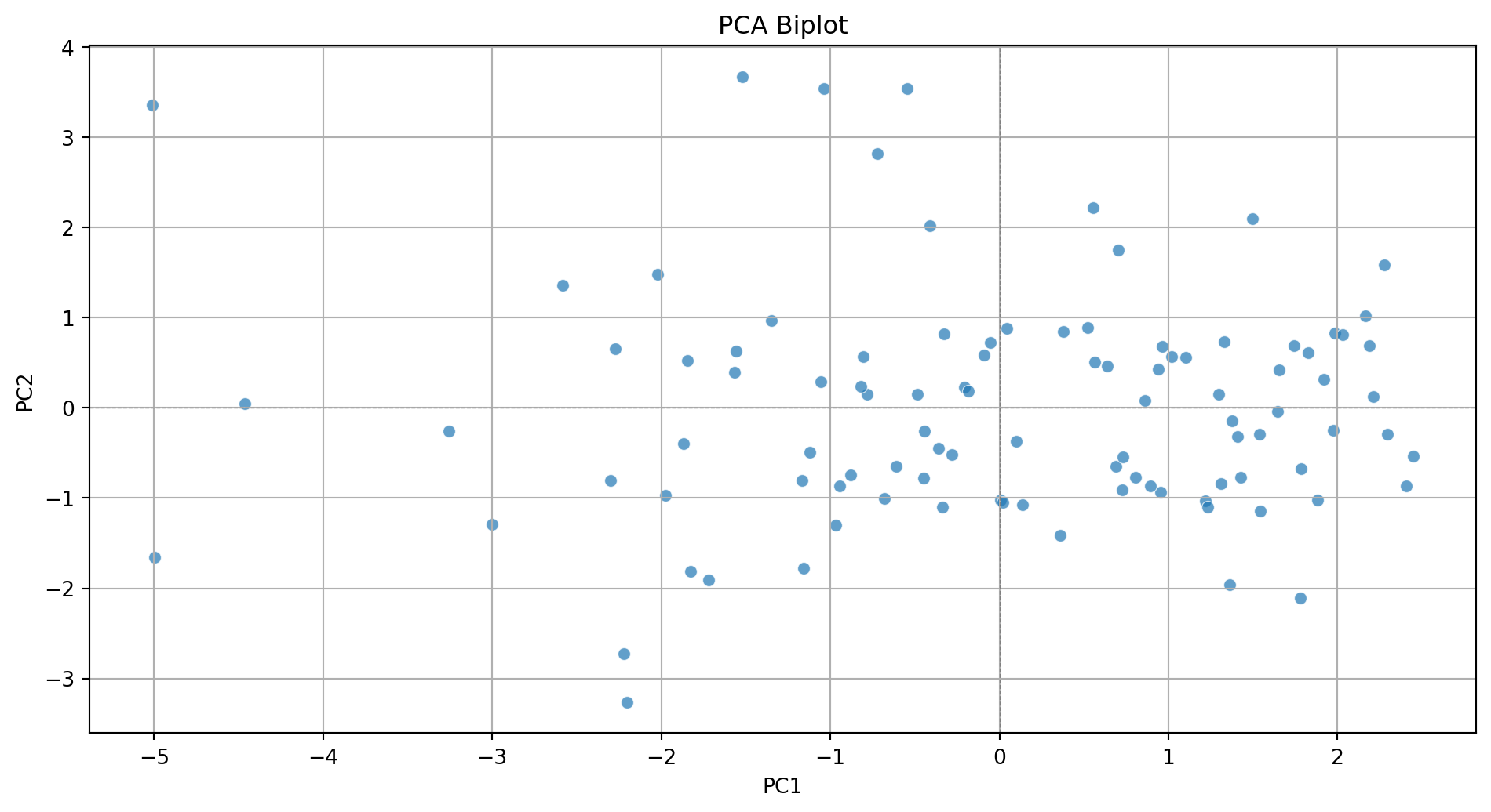
Step 3. Add more information to the biplot.
Code
plt.figure(figsize=(10, 5.5))
sns.scatterplot(x=pca_df['PC1'], y=pca_df['PC2'], alpha=0.7)
plt.xlabel('PC1')
plt.ylabel('PC2')
plt.title('PCA Biplot')
plt.grid(True)
plt.tight_layout()
plt.axhline(0, color='gray', linestyle='--', linewidth=0.5)
plt.axvline(0, color='gray', linestyle='--', linewidth=0.5)

# Add variable vectors
loadings = pca.components_.T[:, :2]  # loadings for PC1 and PC2
for i, feature in enumerate(features):
    plt.arrow(0, 0, loadings[i, 0]*3, loadings[i, 1]*3,
              color='red', alpha=0.5, head_width=0.05)
    plt.text(loadings[i, 0]*3.2, loadings[i, 1]*3.2, feature, color='red')

plt.show()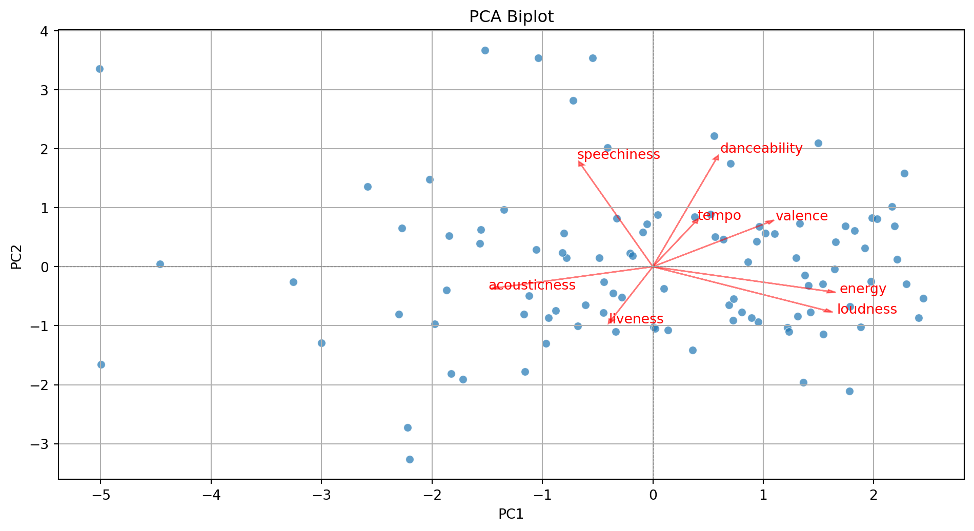
With some extra lines of code, we label the points in the plot.
Code
pca_df = pd.DataFrame(PCA_tiktok, columns=[f'PC{i+1}' for i in range(PCA_tiktok.shape[1])])
pca_df = (pca_df
          .assign(songs = tiktok_data['track_name'])
          )

plt.figure(figsize=(10, 5.5))
sns.scatterplot(x=pca_df['PC1'], y=pca_df['PC2'], alpha=0.7)
plt.xlabel('PC1')
plt.ylabel('PC2')
plt.title('PCA Biplot')
plt.grid(True)
plt.tight_layout()
plt.axhline(0, color='gray', linestyle='--', linewidth=0.5)
plt.axvline(0, color='gray', linestyle='--', linewidth=0.5)

# Add labels for each song
for i in range(pca_df.shape[0]):
    plt.text(pca_df['PC1'][i] + 0.1, pca_df['PC2'][i] + 0.1,
             pca_df['songs'][i], fontsize=8, alpha=0.7)


# Add variable vectors
loadings = pca.components_.T[:, :2]  # loadings for PC1 and PC2
for i, feature in enumerate(features):
    plt.arrow(0, 0, loadings[i, 0]*3, loadings[i, 1]*3,
              color='red', alpha=0.5, head_width=0.05)
    plt.text(loadings[i, 0]*3.2, loadings[i, 1]*3.2, feature, color='red')

plt.show()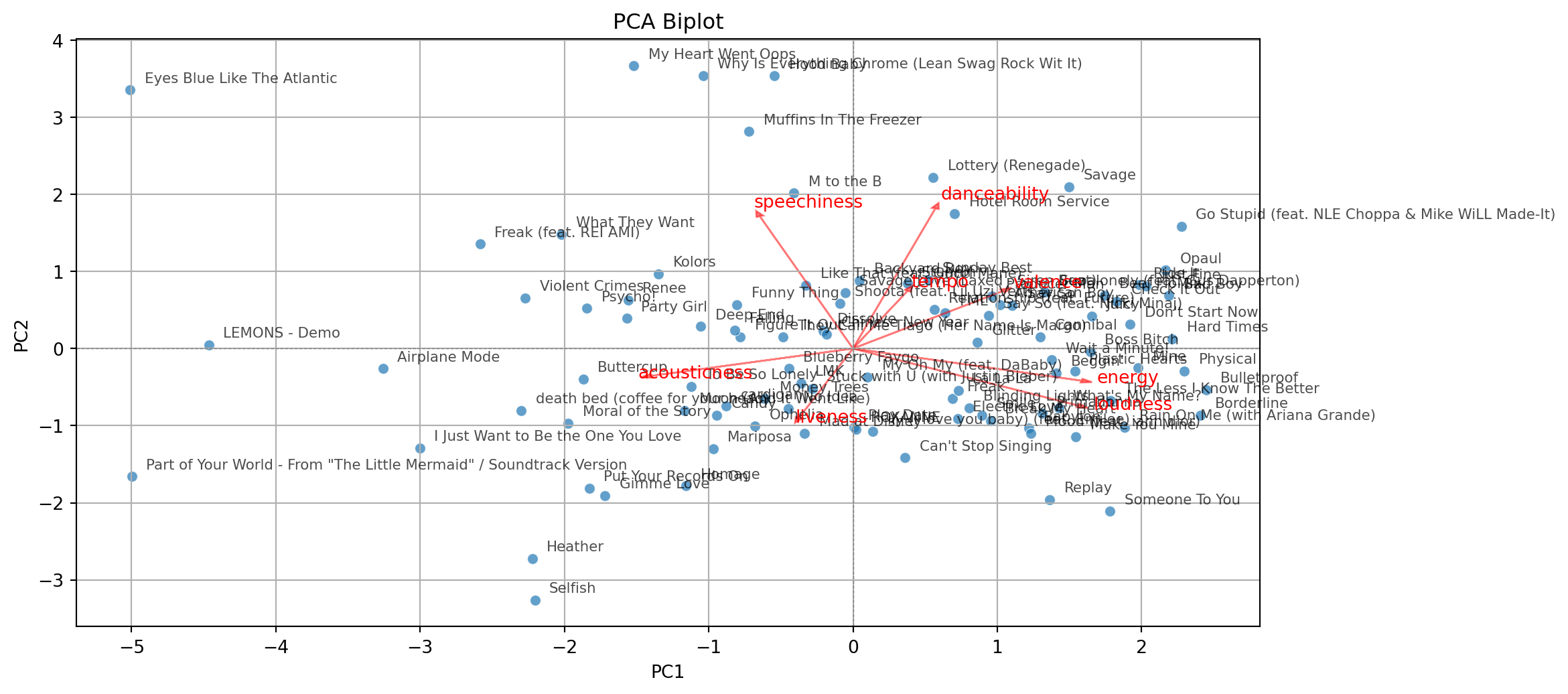
Comments
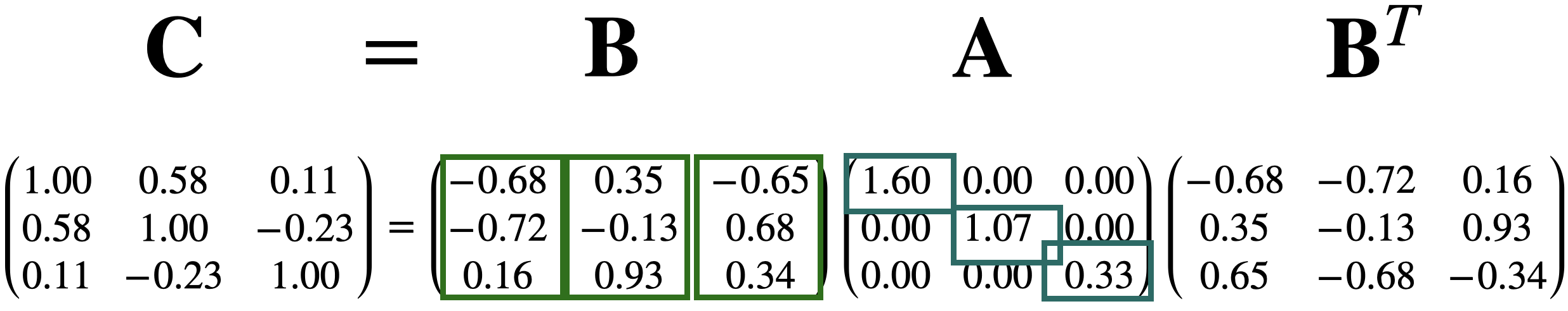
Principal components can be used to approximate a matrix.
For example, we can approximate the matrix \(\mathbf{C}\) by setting the third component equal to zero.
\[\begin{pmatrix} -0.68 & 0.35 & 0.00 \\ -0.72 & -0.13 & 0.00 \\ 0.16 & 0.93 & 0.00\\ \end{pmatrix} \begin{pmatrix} 1.60 & 0.00 & 0.00 \\ 0.00 & 1.07 & 0.00 \\ 0.00 & 0.00 & 0.00 \\ \end{pmatrix} \begin{pmatrix} -0.68 & -0.72 & 0.16 \\ 0.35 & -0.13 & 0.93 \\ 0.00 & 0.00 & 0.00 \\ \end{pmatrix} = \begin{pmatrix} 0.86 & 0.73 & 0.18 \\ 0.73 & 0.85 & -0.30 \\ 0.18 & -0.30 & 0.96 \\ \end{pmatrix}\]
\[\approx \begin{pmatrix} 1.00 & 0.58 & 0.11 \\ 0.58 & 1.00 & -0.23 \\ 0.11 & -0.23 & 1.00 \\ \end{pmatrix} = \mathbf{C}\]